Shack sophisticate: PR House
This new beach house by Architects Ink is an elegant and respectful re-imagining of the original modernist-style shack that once stood on the site.
Port Elliot is one of South Australia’s favourite beachside Fleurieu Peninsula towns. Nestled on Horseshoe Bay, close to Victor Harbor and a little over an hour’s drive from Adelaide, it is popular with young and old alike.
Ask any born-and-bred South Aussie to recall their favourite childhood memories and more than a few will name weekends spent at the family’s Port Elliot shack among them. Many of these shacks remain; a rough-and-tumble mix of late 1960s, early 1970s beach houses are now as much a part of the area’s architectural heritage as they are endearing symbols of nostalgia.
When Architects Ink’s clients Paul and Ren, along with their two young daughters, purchased one of these beach houses, there was some hope it could be renovated. However, there was no avoiding the fact that it was falling apart and the only solution was to demolish the existing two-storey building and start from scratch.
The practice’s co-director Marco Spinelli and interior designer Laura Tisato initially worked with a heritage consultant to ensure that the new build would comply with the heritage zoning. Their resulting concept is an elegant and respectful re-imagining of the original rectangular beach house’s modernist-style aesthetic and form.
Unsurprisingly, the designers drew inspiration from California’s Case Study Houses. But more importantly, their response was directly informed by Paul and Ren’s passion for mid-century architecture and design; the couple has an antiques shop that specializes in the era’s furniture, located in Adelaide’s eastern suburbs, where they also have their permanent residence.

The simplicity and restraint of the overall design are most striking, as is the minimalist material palette, comprised predominantly of timber, concrete and glass. “Our architecture is always fairly simple and that’s the key – keep the form simple and the materials natural and things won’t date, they’ll just happily sit there and weather nicely,” Marco explains.
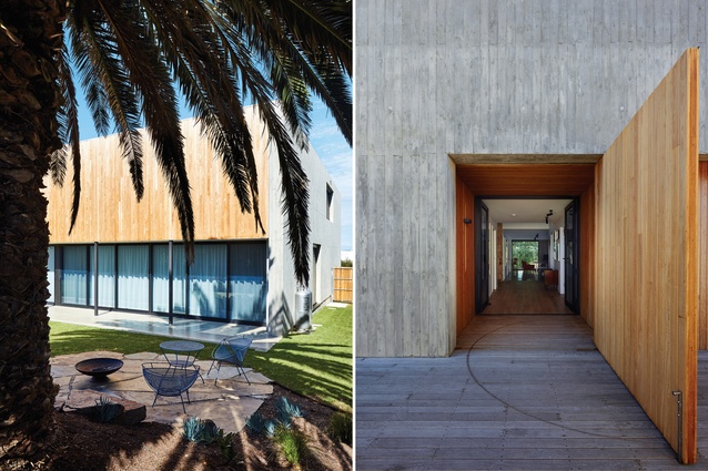
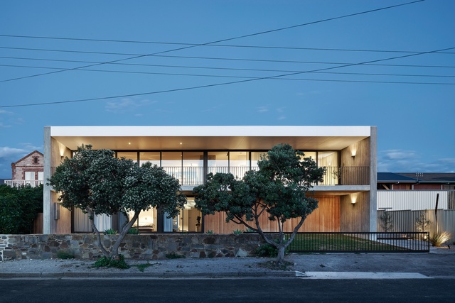
Beyond the original low-rise stone wall, grass meets the building and the clients are able to park their cars on the lawn, as the original owners would have done. It’s a fittingly informal yet neat arrangement that incorporates a ground-level “secret garage” behind the timber cladding on this western facade.
Both levels of the new beach house have floor-to-ceiling glass doors that open up to views of the water, with generous three-metre-deep overhangs that shade the front balcony and verandah from the sun. The north and south side walls are made from impressive in situ concrete imprinted with timber grain, undoubtedly the scheme’s most compelling design expression.
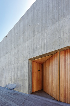
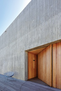
These walls are a feat of construction and the imperfections of the timber impressions add a narrative quality to the architecture, as well as taking the hard edge off the building’s form. “Concrete can be so imposing,” says Laura. “But people generally relate positively to a natural timber grain, so this finish visually softens the walls and makes for a much more tactile experience.”
Concrete is also the perfect backdrop for the south-facing entry, a genuinely unexpected timber reveal with a pivot timber door that’s as dramatic as it is elegant. When open, it signals that someone is home and when closed, it hides the entry and keeps the “boardwalk” clear.
Its threshold is warm and inviting and once inside, the high-end casualness of the interior’s design is a complementary setting for Paul and Ren’s collection of contemporary artworks and mid-century furniture and objects.
The spatial planning is precise and generous, allowing for a configuration of spaces that’s logical and completely family-friendly: three bedrooms, a rumpus room and guest and children’s bathroom at ground level. “We used a strict three-metre grid and kept everything to that grid,” explains Marco. “Establishing a sense of repetition gives rhythm to the plan and makes for a calming effect and as a result, there’s greater efficiency in the design and build.”
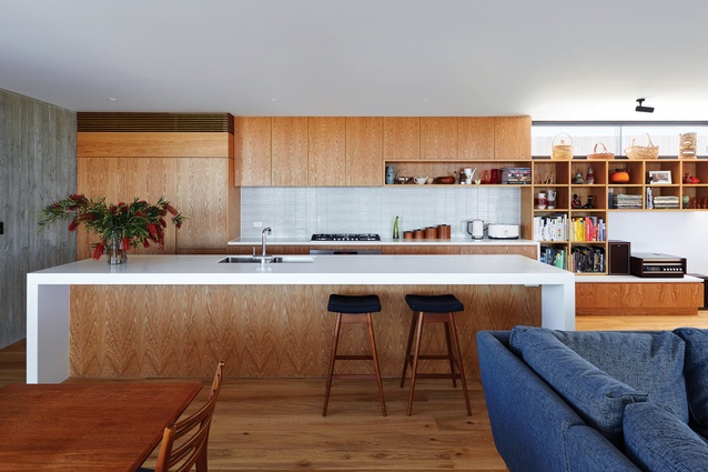
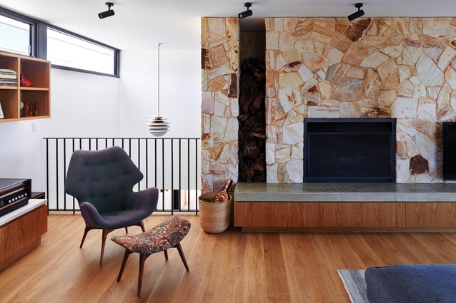
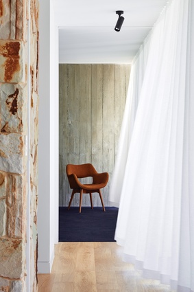
A sandstone feature wall adds nuance to the material palette as well as cohesion between upstairs and downstairs, where it extends vertically to form the first-level fireplace. Positioning the open-plan living areas upstairs takes advantage of the beach views, while opening up the kitchen and lounge to the stair void allows visual connection with the downstairs entry.
The interior appears even more spacious when the full-height glass doors are open to the balcony, making for a light, relaxed atmosphere that also highlights the effortless synergy between interior design and architecture. In the kitchen, crisp lines and oak joinery work particularly well with the north-facing concrete wall, which, along with the southern wall, has been left exposed in a confident and bold move.
This strong attention to detail is evident throughout the design and is often expressed in surprising ways, such as by the floating joinery unit in the main bedroom. The dark navy carpet in all the bedrooms may jar in theory, but in application this finish has great appeal. It was selected by Paul and Ren, as were the tiles in the ensuite, powder room and downstairs bathroom, and this input is testament to the excellent working relationship between the clients, architect and interior designer.
Intelligent design is made all the more sophisticated by the rigorous planning, materiality and detailing, lending this beach house integrity and charm in equal measure.
This article was first published on architectureau.com

