Praktik Bakery
Match-ups in retail have been popular for years: dual programmes that engender cocktail bars in laundromats and bike-repair shops in cafés. They are most successful when friction between the two creates an energy stronger than is the sum of its parts. At first glance, the Praktik Bakery Hotel in Barcelona looks like a mature mash-up. The rough details and materials typical of these often temporary spaces give way to a refined material palette, warm textures and comfort in this new 74-roomed hotel by Lázaro Rosa-Violán. Taste and smell – the two least catered-for senses in interior architecture – take centre stage in this hotel, which understands exactly what it takes to deliver for today’s traveller.
Barcelona defies easy summation, which is probably why tourists continue to flock here. It is a city that is proudly defined by the good design decisions made over hundreds of years – from its medieval streets and plazas to its post-1992 Olympic legacy of showy architecture, efficient transport and urban renewal. What stops this ancient city from turning into a well-preserved museum, however, are its people. Ever present here is an entrepreneurial, fiercely independent spirit which is as much future-focused as it is respectful of its past. There is an energy to the city that is sustaining and is, no doubt, one of the reasons Catalonia has weathered what the Spanish refer to as La Crisis better than have its Iberian compatriots in the rest of Spain and Portugal. Praktik Hotel and its designer Lázaro Rosa-Violán exemplify this Catalan attitude. The partnership of client and designer has spanned five hotels: four in Barcelona and one in Madrid. It has established a mature relationship based on trust where both client and designer understand the changes in the hotel industry over the last decade (namely the power of the internet to reach your guests and the power of design to improve their experience).
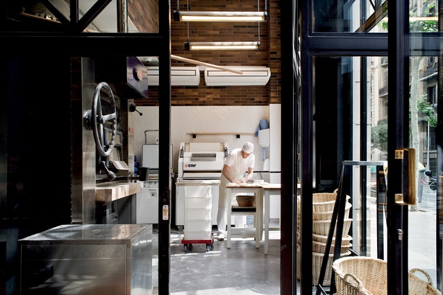
Piero Mocellini from Lázaro Rosa-Violán (LRV) describes how the project began: “at the beginning, the bakery was not part of the project – with the only requirement being a commercial activity on the ground floor”. Anna Bellsolà was already famous for her bread and ran the successful bakery Baluard in the waterfront neighbourhood of Barceloneta. She was looking for a location for a second bakery when she met the hotel’s owners. The success of a bakery in a hotel, while untested, was obvious to all parties, and takes on an almost performace-like role in the hotel. With a poetic touch Bellsolà explains how “the smell fills the bakery with a night-time aroma of serenity”. There is also no doubt the bakers welcome plenty of early morning requests from guests returning from a night out in the many adjacent bars and restaurants.
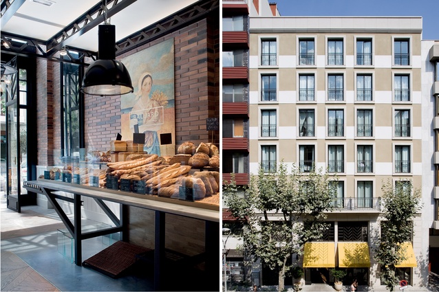
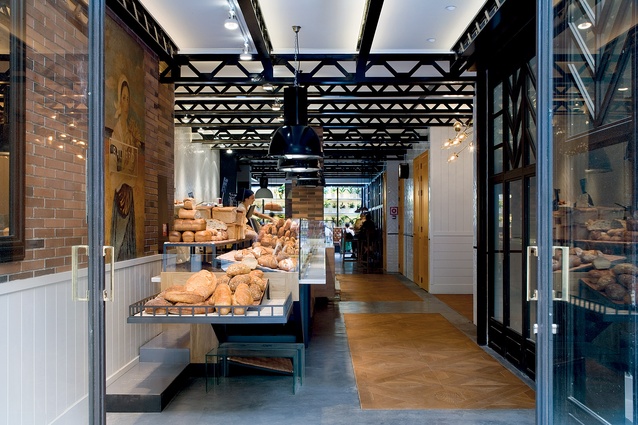
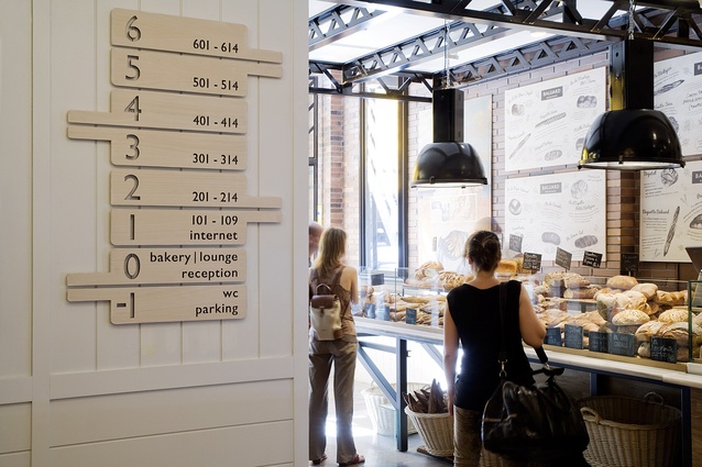
The client and designers have a clear focus on the basics of running a hotel. This starts online where the hotel’s web presence is inviting, clear and well designed. From street level, the entire ground floor is essentially a large open space. Extending from the street to a ceiling-lit breakfast room in the back is an imposing 10m-long oak and marble island containing both the reception and the bakery counter; a practical measure for staffing and security, it sets the scene and focuses attention from the minute a guest enters the door. Deciding to go all-in on the bakery theme, Mocelini explains how the addition of the bakery influenced the ideas for the rest of the hotel where “everything should remind you of bread: the colours, textures and art”.
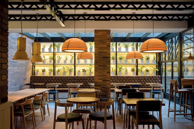
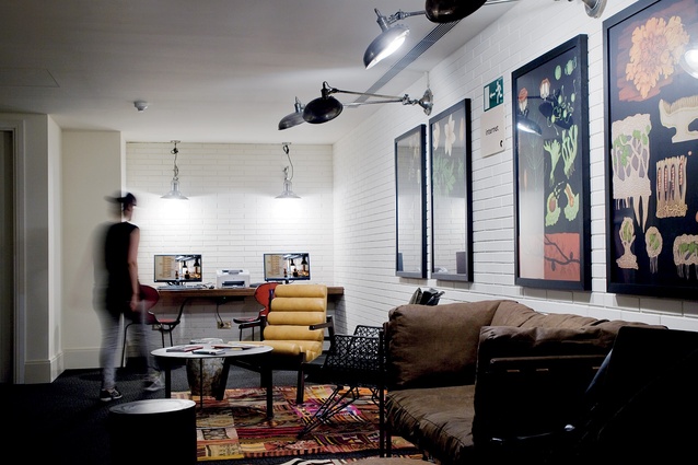
With wafting aromas of baked bread and a name including the word ‘bakery’, breakfast here, understandably, takes on special significance. Guests eat in a quiet space at the end of the reception where a large skylight runs the full width of the room set out with tables and chairs. Visible from the street and the main focus of the room is the back wall lined with pot plants. This green wall extends out past a glass wall and into a small courtyard where patterns of brick and tile create a calm space in which to enjoy a coffee. Strong black lines define the interior of the lobby, from the repeated ceiling trusses to the frames on the windows, doors and furniture. The bread-toned colours and textures that line the walls give a warmth to the space that feels fresh and crisp, courtesy of some fine detailing and subtle lighting.
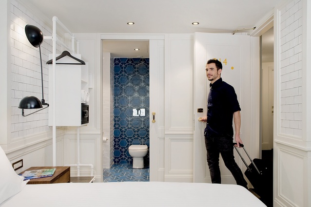
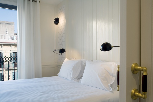
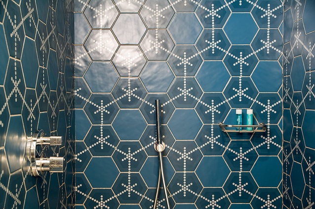
Upstairs, guest rooms are small but well appointed with comfortable beds, fresh linens and the usual gadgets. Guest bathrooms inject character, with quality fittings and colour and texture brought out in the tile-work. The resulting aesthetic of calm background tones and feature elements with heavy use of natural materials creates a lot of individual character. This approach helps to blur the classic distinctions of the hotel star rating system. For what is, in effect, a budget-to-mid-range hotel, Praktik has the look and feel of a four-star boutique hotel.
Barcelona had 18,569 hotel beds in the early 1990s; this had risen to 63,500 in 2012. The list of attractions in Barcelona is well known. From Roman ruins to Gaudi’s joyful, individual architecture, to golden beaches and an enviable nightlife that manages to please both hipsters and their parents, Barcelona is a mature tourist market which will continue to draw crowds. It is hotels like Praktik and designers like Lázaro Rosa-Violán that have helped build the city’s reputation, making travel enjoyable by getting the basics right. In this case designer and client prove that being careful with the basics does not have to mean being boring. With the inspired injection of a bakery into a lobby, they established not only a theme but an attitude that reflects the city and defines the hotel. In doing so, it builds the case for good design making it possible to have your cake and eat it too.

