Privacy and openness: Coogee House
This new home by Chenchow Little is a private sanctuary that maximises the impressive panoramic views to the Pacific Ocean, while also contributing to the neighbourhood itself.
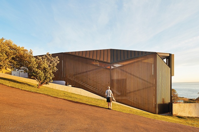
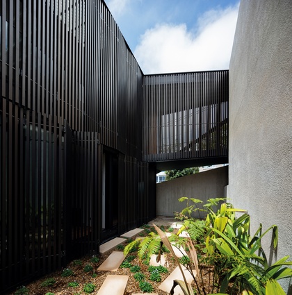
Emerging from the sloping terrain of Sydney’s Coogee rises a dark, faceted form that incites curiosity. If on approach you pause for a moment to focus your eyes, layers appear and you can see through the battened, dark bronze, anodized aluminium screen to three flights of a finely detailed concrete stair. If the door on the middle level is open, you can vaguely see deeper into another layer of space within.
What first seemed like a foreign object in the streetscape is actually a “veiled” private home. The veil, retractable in places, continues across the entire building like a fly to a tent, with external living areas, decks and stairwells occupying the space between the masonry structure and the lightweight skin.
The screen engages passers-by – a mix of locals and visitors, including a large number of athletes who train up and down the adjacent street. Beyond creating intrigue, the skin allows the occupants to see out while affording the desired privacy.
The clients for Coogee House had been living on the site for a number of years prior to engaging Chenchow Little to design their new home. They used this time to develop a deep understanding of the environment and how they wanted to live, considering weather patterns, their desired aspect and the need for privacy from a number of neighbours.
The informed clients went to Stephanie Little and Tony Chenchow, co-directors of the practice, armed with a sectional arrangement of spaces – they wanted living spaces on the top floor, bedrooms on the middle level and a guest room in the basement. How the planning worked across these three levels was then up to Stephanie and Tony – and the result clearly illustrates that the architects went above and beyond simply arranging the rooms.
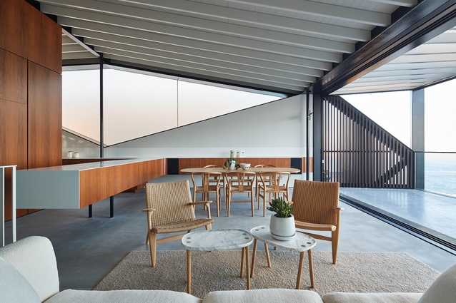
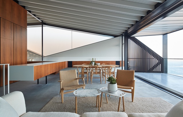
With this house, Chenchow Little has continued to refine one of its signature skills: solving the difficult contradiction between privacy and openness that is common in residential projects. The need for both retreat and connection is addressed by the veil, but also by the arrangement of the interior spaces. Although planned openly, the entire living area isn’t visible at any one time. Strategically placed cores “slice up” the plan to create more intimate zones and break down the main volume.
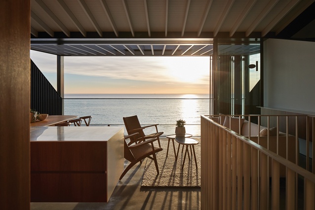
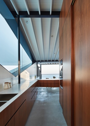
The kitchen takes prime position within the public area of the home, offering views across the Pacific Ocean to the horizon. This was particularly important to one of the clients, who regularly cooks for friends and family. The ocean is strategically framed to eliminate all neighbouring properties from sightline, enabling the occupants to enjoy a more intimate connection with the waterdespite the home’s suburban context.
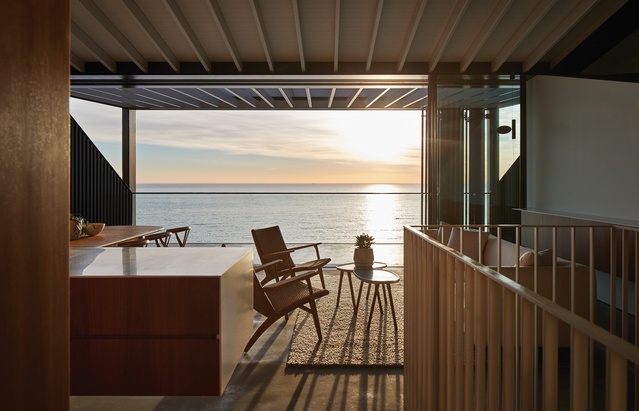
Wrapping around the pantry/storage core, the kitchen bench transitions from the main space to the smaller family room. This intimate space opens onto a courtyard to the west – a place to curl up with a book in the sun or catch up on some television in the evening. As you move from this area back through the kitchen, the ocean view is revealed once again, with almost the same delight as the first time around.
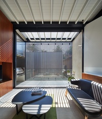
Before this project commenced, the clients spent time analyzing other projects completed by Chenchow Little, to the extent that they could identify solutions for the design of their own home in these other schemes. The screening system at Freshwater House, the beach feel of expressed purlins used at Stewart House and the use of a stair along one elevation in Semi-detached House are elements that have been adapted to suit Coogee House.
Although this latest home sits neatly within Chenchow Little’s suite of residential projects, it also takes on its own character, influenced by its location and occupants. The shape of the building is modulated according to the site’s topography and the views to neighbouring properties. The building is dark bronze, allowing the house to “recede and announce itself at the same time,” Tony says. “Because there is a lot of this colour [dark bronze] in the Australian landscape, it works well in our environment.”
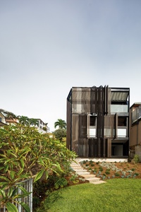
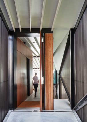
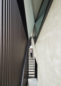
The three-level stairwell behind the timber veil not only animates the southern elevation, but also adds a touch of drama to the entry sequence. At the highest point of the site, an elevated timber bridge leads from the garage into a transitional space between the protective skin and the masonry structure.
From this point there are two options – the front door to the left and the three flights of stairs to the right that cascade down the site, roughly following the contours of the land. The faceted angles of the structure exposed within the compressed walkway amplify the dramatic effect. At the base of the stairwell, a self-contained guest room opens out to the rear garden via a tiered concrete pit, again contained within the screen.
This is a house that responds to its spectacular site but doesn’t rely on it. While the main living area is a portal to the external view, it’s much more complex than that – and the visual interest within the home itself is undeniably strong. The layered structure is a refined private home that hints at the activities occurring within to engage those who might be curious.
This article was first published on ArchitectureAU.com.

