Architects in Profile: Crosson Architects
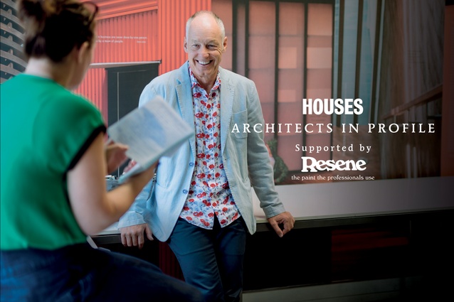
In the first exclusive Houses Architects in Profile series, supported by Resene, Justine Harvey talks with Ken Crosson, presenter of The New Zealand Home television series, who has an enviable portfolio that challenges our typical expectations of house design.
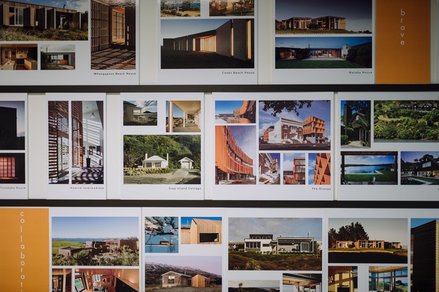
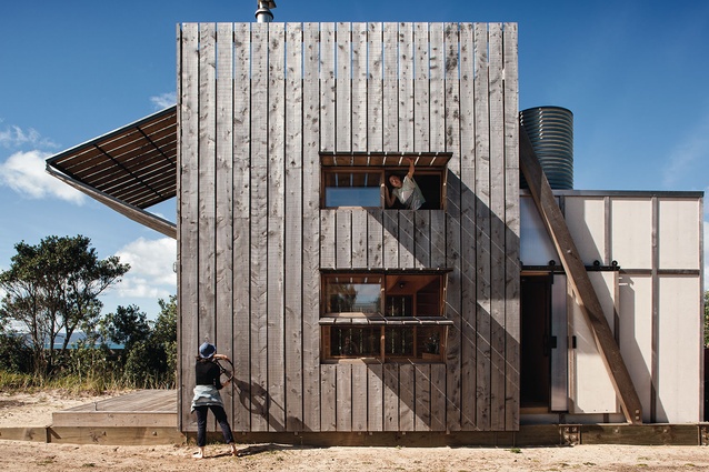
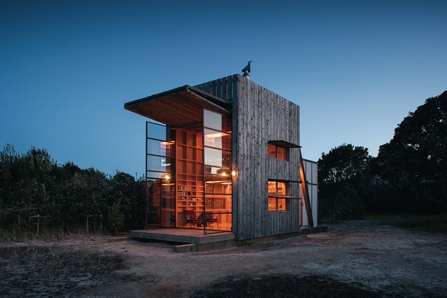
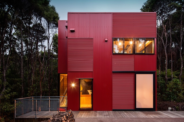
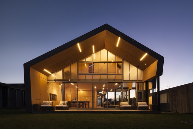
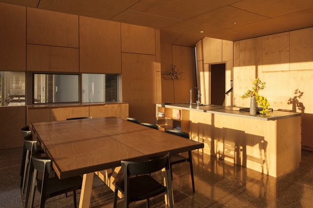
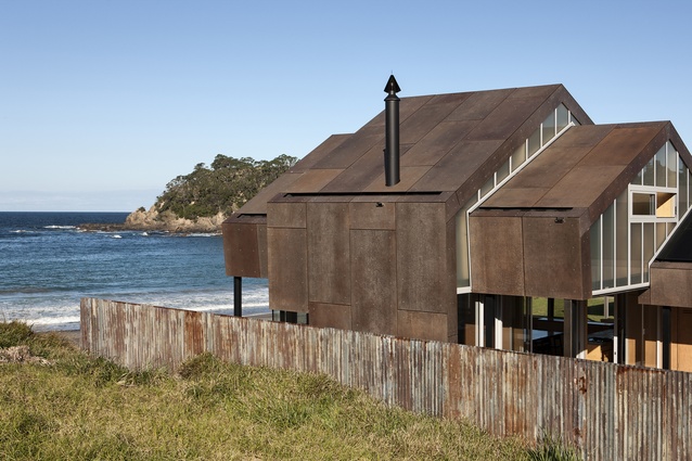
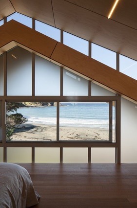
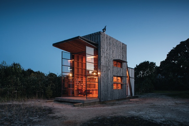
Working from a small but lively studio in Auckland’s Parnell, Crosson Architects still produces award-winning, internationally-recognised designs after 30 years in practice, from the celebrated Hut on Sleds to Ken Crosson’s own family bach, seen recently on The New Zealand Home and George Clarke’s Amazing Spaces.
His firm’s success is in part due to a design approach that really considers people and how they operate within spaces, as well as houses that intuitively respond to each site, absorbing the cultural and social context. There are also plenty of surprises for the owners and their guests; Ken seems intent to create ‘a sense of joy, wonder and delight’ in every design.
Justine Harvey: How did you start out in architecture?
Ken Crosson: I grew up on a farm in mid-Canterbury, and I was always going to be a farmer; the family had been farming in the area for 130 years. One day, I travelled through to Christchurch, and the Christchurch Town Hall had just been built. There was a whole series of Sir Miles Warren’s architectural drawings in there, and the spaces were beautiful, the materials were beautiful and I thought, ‘That’s what I want to do – I want to be an architect’.
Justine: That’s amazing to be inspired by one project.
Ken: Well, it had been lambing time, and it was freezing cold. We’d had two weeks of nasty weather, and here were these warm, plush interiors and it was beautiful. I remember being inspired.
Justine: What did your family think of this change of heart?
Ken: Mum and Dad had six sons and none of us went farming, so it was a bit bizarre really. I also think that growing up in Methven, at the hinge of the Canterbury Plains and the Alps, was quite pivotal to my decision. It was a good learning spot for an architect because you realise that you can manipulate but you also have to defer to the majesty of nature as well. You need to know when to intervene and when to pull back. It also teaches you that you can make beautiful things.
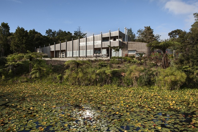
The patchwork of Canterbury is quite lovely, and some of the old houses are quite beautiful, so you can intrude on nature and you can enhance nature. People are fearful of putting architecture in our landscape, but good architecture can enhance the landscape just as a good landscape can enhance architecture. We know that in the Spanish and Italian hilltop towns and the Greek villages. The landscape and architecture actually add to each other; you couldn’t have one without the other, so I think we need to re-educate New Zealand about this fear.
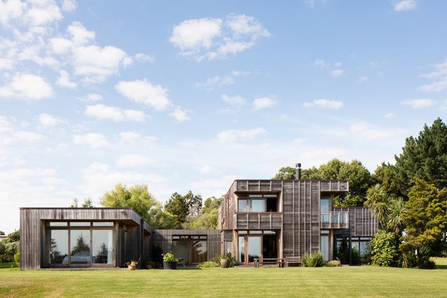
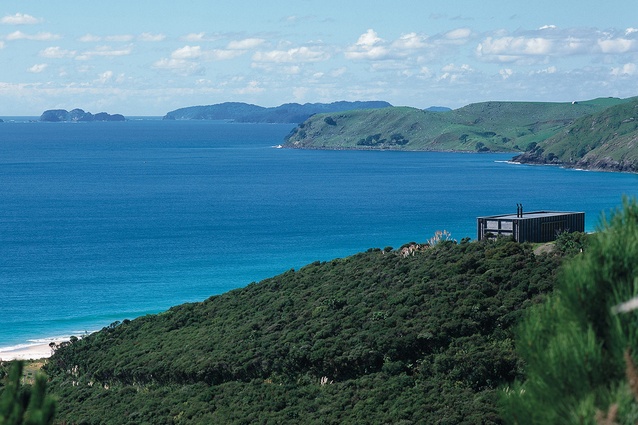
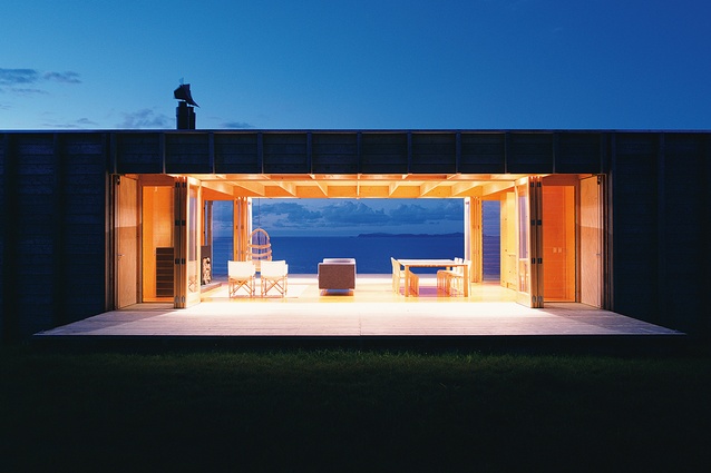
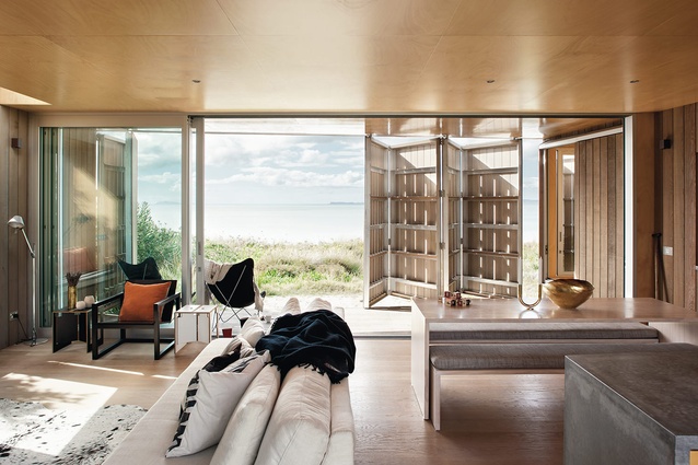
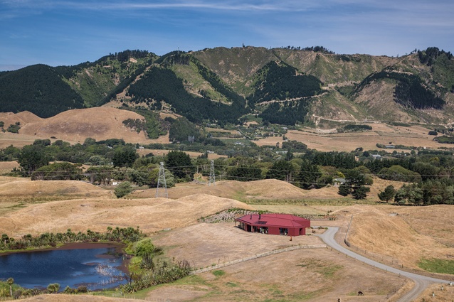
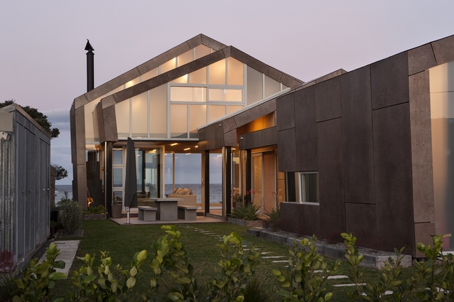
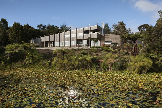
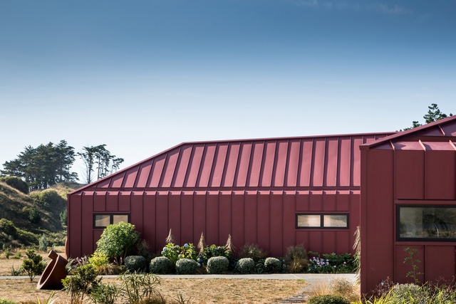
In our practice, we’ve been fortunate because we’ve had lots of opportunities where we can put buildings in the natural landscape; we’ve designed quite a few coastal houses and rural houses as well. And you can make architecture a contrast within the landscape as well.
Justine: Where did you study?
Ken: At the time, the only school of architecture was in Auckland, so I studied here and have been here ever since, as well as working for a large commercial firm in London for a few years. I set up my firm 30 years ago in January this year.
Justine: Is that why you’ve just produced a book?
Ken: No, this is our third book. We just thought, ‘We have another ten completed projects, why not do another book’. Thirty years – I must have been so young when I started the practice.
Justine: Haha. Of course. Did you start it on your own?
Ken: Yes and we added people as we needed. We started doing house alterations and new houses, and now we’re designing bigger projects as well, from multi-unit residential to commercial.

Justine: The multi-res projects are important work at the moment.
Ken: Yes, we’re really excited about this combination of social and affordable and how that can work and, also, making the city better. If I can be a bit critical, you know; Auckland has a beautiful natural landscape but, in parts, we haven’t treated our architecture in the same way.
But, having said that, I’m so buoyed by the last ten years. We are becoming design-led and that’s where the city is going. When you look at places like Britomart and the Wynyard Quarter and the shared spaces like O’Connell Street, we are thinking about people and good urban spaces.

Justine: What are the things that define your architecture?
Ken: With our architecture, the clients that we push out of their comfort zones are the ones that become most engaged and become our advocates in a way, because people like uniqueness and excitement – even conservative people. They like something that responds to them and their context in the best way, that’s the tack we take with our architecture.
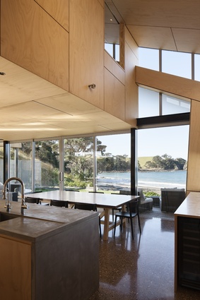
You asked, ‘What defines our architecture?’ Hopefully, there’s no definition; hopefully it’s an appropriateness. We’re interested in moderating space: high and low spaces; volume and tightness, openness and enclosure – those contrasts.
We’re not into that modernist, minimalist horizontality or one size fits all. We like to pick up ideas from the sites and to have an analysis process that’s slightly different; to pick up the germs of site and client that actually give us broad design directions. We like appealing to the child in a person, if we can. We like towers and bridges and nooks and dens – those sorts of things as well.

