Q&A: Paul Hecker
Interior discovers just how Paul Hecker and his team at Hecker Guthrie have mastered the art of less is more.
Your style has changed dramatically in the last five years. How would you describe it now?
We’ve shifted away from decorative, adorned interiors towards a European aesthetic. Our work is about creating beautiful architectural spaces that also lend themselves to being ‘dressed’. Interiors are becoming less about permanence. You walk into a club with lined walls and panelling and struggle to relate to it. We’re into quirky, crafted things – things with a story. It doesn’t really matter where those things are from but a lot of them happen to be Scandinavian because of the craft involved in their production. It’s an easy way of describing what we like. The elements we add can easily be removed. We like to think that if the building becomes something else, people can take away the loose additions and have a beautiful base to start again.
David’s, a Chinese restaurant in Melbourne, looks very different to your average Asian eatery. What was the idea behind the look?
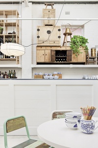
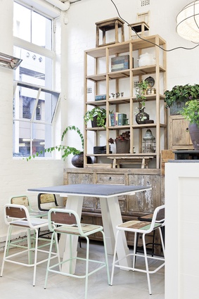
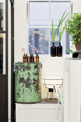
When we stepped in it had a typical palette of maroon, black and white. There were ugly timber floorboards, plasterboard on the walls, red lanterns and synthetic fabrics. We removed the plasterboard and other s**t. Underneath, it was an art deco warehouse with a pitched roof, exposed bricks and steel window frames in the front. After finishing the paring-back process and lining the ceiling with timber to make the most of the beams, we began adding in objects. The joinery is made from Chinese antiques stacked on top of one another, but using blonde wood gives it a Scandinavian feel.
It sounds like a process of restraint.
Yes, and we did the same thing with The Old Library in Sydney. It was, obviously, once a library, and a Methodist Church prior to that. All we did was return it to its beautiful state and then add in objects. We rigorously avoid interfering with the architecture, especially when it’s nice. We may be architects, but we like to leave the architecture alone.
What if what you find beneath is hideous?
Look, very rarely is architecture truly hideous. And if it is, we’ll modify it. If we’re not reinstating architecture, we’re trying to create architecture or, at least, to create a future for it. Even if the building is ugly or you don’t find any bones with which to work, we try to add architectural integrity to take it through to its next life. Hamish and I have discussed the direction we’re taking in terms of aesthetics. We’ve invested a lot in trying to figure out what makes a meaningful interior.
To look at things slightly differently, what would you say makes an unmeaningful interior?
Hmm… I wonder if I can find something I really object to. [Hecker leaves the room to hunt out some ‘unmeaningful interiors’ and returns with some magazines under his arm. He opens the page to an angular feature ceiling.] Things like this seem so arbitrary. It’s not a response to a building or architecture; it’s not a response to anything. It’s expensive, it’s corny, and I don’t know what the idea is. Some of it does come down to taste but I ask myself: how would I sell that? Maybe someone likes it and thinks it’s sculpture, but wouldn’t you be better off spending your money on an actual sculpture? Otherwise, you’re probably spending $30,000 on a ceiling that will ultimately get ripped out. No one’s going to love it forever.

What’s the essence of your work?
We’re very much about curating spaces. Well-decorated interiors filled with beautiful objects are the nicest places to be in.
How does the ‘curation’ process work?
It’s an art – and we generally start with base pieces and then start adding. It’s something that develops over time. I’ll sometimes think of a very obvious furniture solution and convey that to the team. That will trigger a response of: ‘No, let’s find something more unusual.’ I know I don’t always have all the answers but I’m working with a team. Together we’ll find the best solution. We often have an aesthetic in mind and try to steer the client in that direction. But I also like the serendipity of finding a specific object – a mirror, for instance – that you know is just perfect. I love that you can’t plan everything. The greatest moments come from random finds, not from sketches on a drawing board. In one of my previous architecture jobs we spent a lot of time being arrogant about the things we didn’t do. Consequently, our palette of colours and ideas was very small. I’ve now realised the right approach is to consider everything and then discard what won’t work.
Have you had instances when you’ve had to put your foot down? As in, “Look, I know you love this chair, but like hell is it going in this interior…”
Oh, all the time. But we’re also very open. If you love something, tell me and I’ll try to incorporate it. If it’s disastrous we’ll try not to, but generally it can be included. We want to take people on a journey in which, at the end of it, they understand the space and have the ability to manipulate it – particularly in a domestic situation. I’d hate to come back in a year and find everything in the same spot. Using the term ‘educating’ sounds a bit wanky, but I hope we give our clients the confidence to work with what we give them.
How do you feel about being considered more of a decorator than a designer?
I see absolutely no division between architecture and decoration. We just won an interior decoration award for one of our projects and were thrilled. All of us are interior decorators. As soon as I buy something, add something else and arrange them in a certain way, I’ve decorated. People criticise that it’s ‘just decoration’ but it’s incredibly skilful. If you can put objects together in a beautiful way, what more can you ask for?


