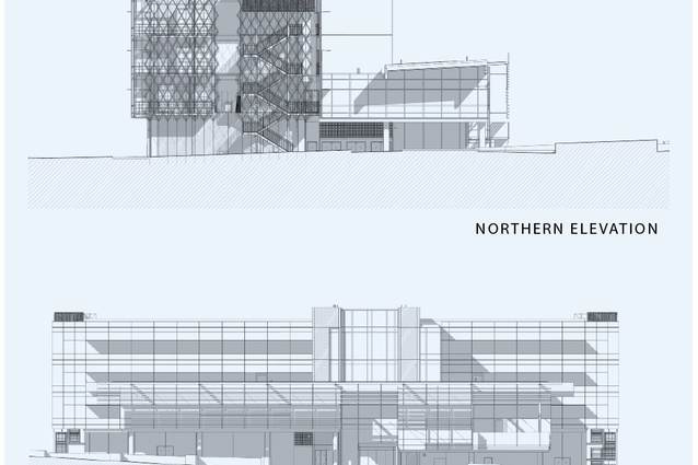
Quad5
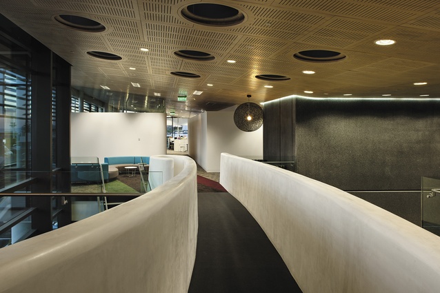
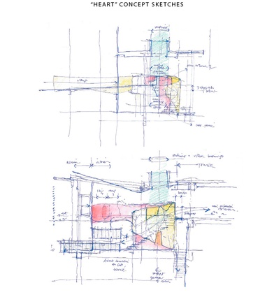
This “integrated design” makes interior use a driver of exterior form. At Quad5, this has yielded a number of positive results; perhaps the most impressive is the plaster-clad bridge and “heart” of the building.
What a joy to see something different, something curving, sinuous, a deviation from the rectilinear world of commercial office space, those matryoshka-like places of rectangular box housing rectangular boxes, buildings, meeting rooms, tables and desks.
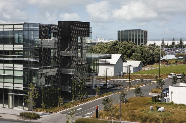
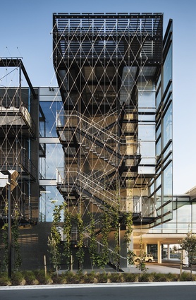
It’s not a criticism; there are obvious organisational efficiencies to be had in the repetition of this form and, of course, you only need to take one look at this building, Quad5, at Auckland Airport, to see that it’s unabashedly rectangular and designed to be efficient. Its only exterior deviation from the straight and narrow is street-side, where the face of the building, which is penetrated with spandrels, is gently curving, not unlike an aircraft’s wing.
Those spandrels, to begin with an aside, are provided to shade the glass exterior face, but they have another interesting application, says David Pugh, Jasmax architect on the project.

“The shading is linked into the ESD side of things. We’re going for five Green Stars, so we knew because it’s a totally glass façade that we were going to have to do a lot of shading. There are two ways you can do that: you can put a shade on the face, or you can use spandrel panels that cut out a bit of light and add more insulation. On the inside, however, the spandrels continue through the facade and become a ‘light shelf’. And what that does, is bounce high-level light off the shelf and reflects it into the building.”
The light shelf, for those of you who may be wondering, is not a new device. “It was a technique that was used in the 70s,” explains Pugh.
“What it means is that you don’t need artificial lighting until you’re almost three metres back, which is a bit of a power saving.”
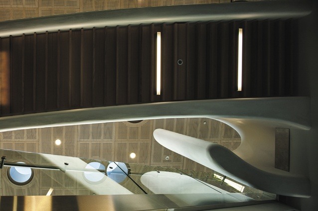
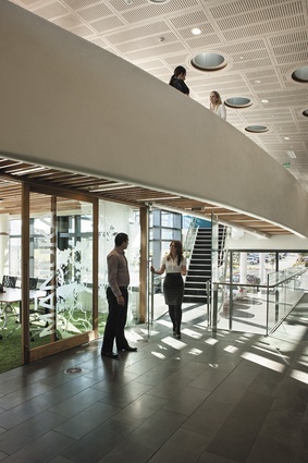
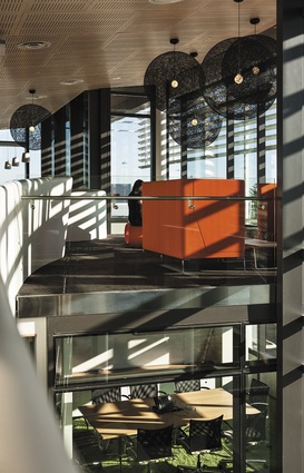
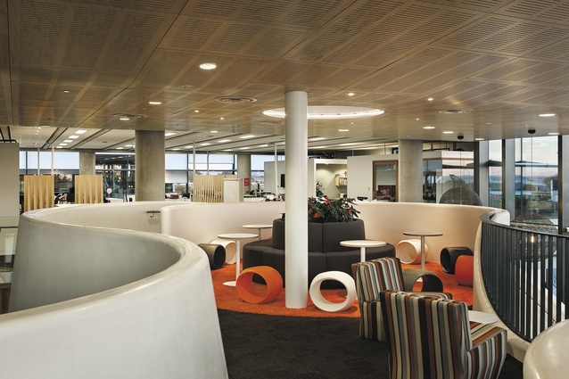
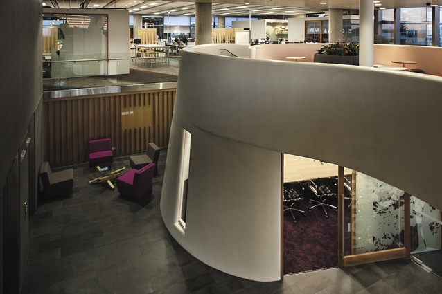
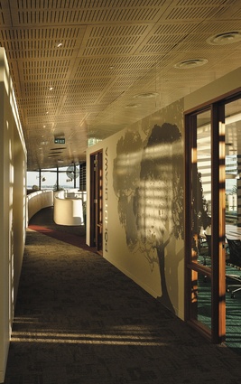
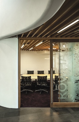
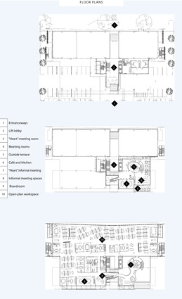
But back to the interior, which is where, to my mind, you’ll find the drama. In the double-ended foyer, it can be entered from either the road or the carpark, is a double-space void that incorporates a sinuous, Sto plaster-covered bridge that terminates (or begins, depending on which way you approach it) in what is described as the “heart” of the building – an informal meeting place that sits underneath a large oculus and atop a more formal meeting room. The plaster and the elevation vaguely make things feel a little bit like a Greek hilltop village, in the nicest possible way, and there is a generosity of space, vantage points to many parts of the building, and plenty of colour and excellent furniture. Interestingly, the evolution of the plaster-clad forms had its origin in something that sounds altogether less romantic than a Greek village – “integrated design”.
Integrated design is the term used by Jasmax to design a new building project that is, in a way, interior led. The building solution is firstly based on how the building will be experienced, and then how it is viewed. In essence, the form of a structure is devised based on a process of audits and interviews, undertaken by interior director Tim Hooson and his team, who analyse the needs and requirements of an institution before designing interior and exterior forms synchronously. In some instances, the land holder, developer and tenant are separate parties, such as at the NZI Centre, on Fanshawe Street in Auckland. On that project, Jasmax’s work with IAG, the anchor tenant, influenced the design of the building. It was future-proofed for the tenant, you might say and, as the Green Star report on the project made mention, the integrated design “allowed the tenant and design team to have a positive influence on base build items which has subsequently improved both the base build and interior project outcomes”.
At Auckland International Airport, the property owner and tenant were one and the same. As with NZI, although the buildings are completely different, at Quad5 some interior elements sit within the building, such as meeting rooms, without quite touching the building structure. As with NZI, the fit-out creates filtered and layered views, especially from the circulation route, that allows occupants to sight each other, “bump” and interact. It was the integrated design style that made this possible.

“We got to know the tenant very early on,” says David Pugh. “We discussed all their workplace strategies, everything about how they work at the moment and how they wanted to work in the future, and how that would effect the building.”
The outcome of this investigation led to a few changes to the building’s planned form. The original structure, nicknamed “the tower”, is the very linear, rectangular part of the completed building, with floor plates of 1,000m2.
“After Tim did all the workplace analysis, they discovered that the airport couldn’t all fit onto one 1,000m2 floor. So, the options were, do you take two floors, or do you make it bigger? The decision was to increase the size, which then provided 1,850m2. Once that decision was made, it unlocked a number of interesting things that had an impact on the interior.”
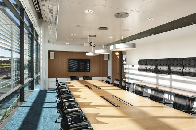
One such thing this solution enabled was the double-height void, now with the circulation bridge running through it, which is exclusively for the airport’s tenancy. It’s clearly a great result for the occupants. “Using the integrated design approach”, says Pugh, “we established that we’d need more floor area, so then question became, how do you use it? While we provided an extra 850m2, they only needed 600m2. That allowed them to be more generous with the meeting rooms, and the plaster, the hub and viewing platform.
Auckland Airport knew it wasn’t perhaps the most efficient use of space, but they bought into it and liked the idea and we made a decision to activate it. That’s why we’re great supporters of integrated design.”

