Queenstown kitchen
What constitutes a sexy kitchen? Tactility, bold lines, visual warmth with an added element of glamour? This is not something often associated with a utilitarian space, but it was what kitchen designer Sian Gillanders CKDNZ was tasked with designing – a “sexy” kitchen.
As a renovation, the designer had the added challenge of incorporating an existing ceiling beam and a large traditional timber dining table.

“I needed to start there,” says Gillanders. “Not to fight these elements but include them in the transition to create something that works. For me, with a kitchen, function comes first.”
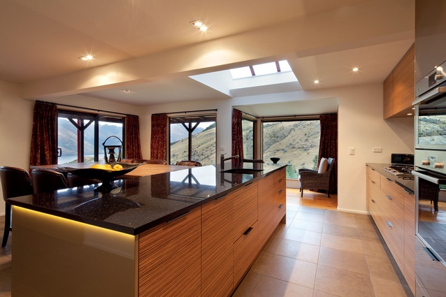
The existing white kitchen lacked sufficient storage and had minimal connection to the style of the house or to the lake and alpine landscape.
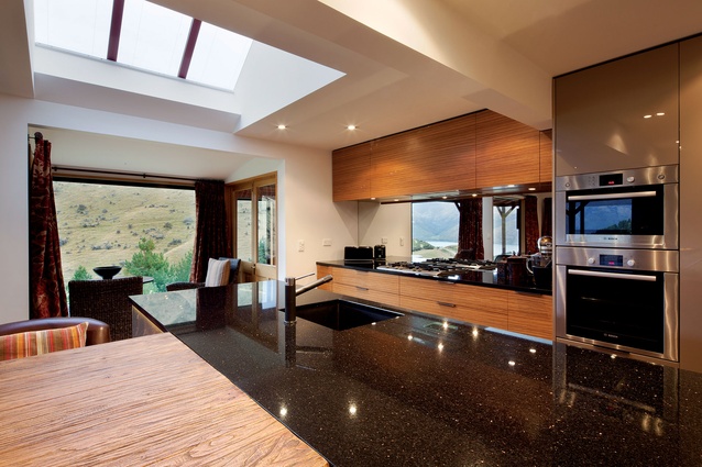
“The home is immersed in nature with beautiful views, so we wanted to ensure we didn’t lose sight of this; not only capturing the vistas, but as inspiration for the design – yet, we didn’t want it to be too rustic.”
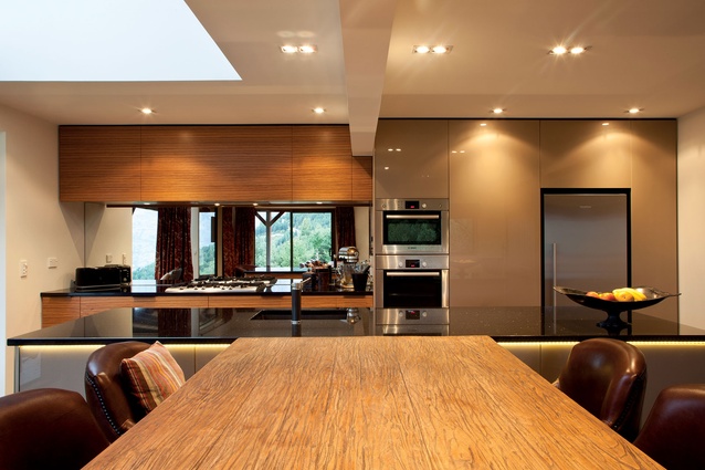
The beam dictated the space, acting as a natural division between designated areas. The timber table was raised to a height level with the long stone kitchen island, sitting exactly centred below the beam.
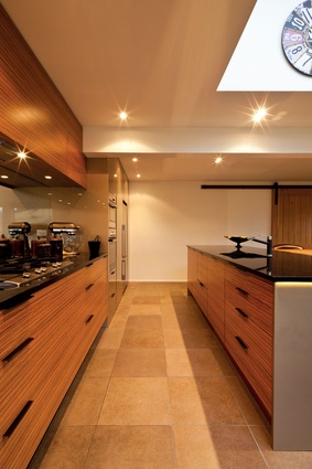
‘Sexiness’ was achieved via the texture and tone of the materials – grain timber, dark granite, graphite-coloured tapware and deep tan leather, complemented by the client’s choice of a mirrored splashback.
“It’s a great visual connection to the outdoors, reflecting the view while other areas recede and blend into each other,” says Gillanders.
Push-release cabinetry with inset handles and a horizontal grain veneer adds to the sleekness, while LED lighting running the length of the bench enhances the soft mood.
It is these details that provide warmth and tactility, a place with both style and substance, in short, a kitchen sexy enough to cook in.


