Rebuilding better: Sheppard & Rout
Camille Khouri visits the unique Christchurch-based premises of architecture firm Sheppard & Rout, and discovers how the tailor-made space caters to their needs.
“In the Chinese language, the word ‘crisis’ is composed of two characters, one representing danger and the other, opportunity.” This is according to John F Kennedy in a 1959 speech to US military – and is a trope used by a number of motivational speakers since.
While there is debate about whether this translation is accurate, the idea behind it carries weight. No one would have wished the 2010 and 2011 earthquakes on Christchurch, but it has provided the city with the opportunity to rebuild and build better.

For Sheppard & Rout, the earthquakes forced them out of the villa that had been the base for their architectural practice since 1982. Aside from the building needing repair, the earthquakes had generated more work for the practice and their numbers had grown too big for the office. They moved out and took a central-city warehouse, and so experienced a new way of working, explains David Sheppard.
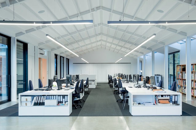
“Up until then we were working within the confines of a two-storey house and, while the spaces were pleasant, it was quite compartmentalised. In the warehouse we found ourselves all working in one large space. Within weeks we were all very happy and adjusted to the open-plan layout, but we knew we had a limited lease on the building.”
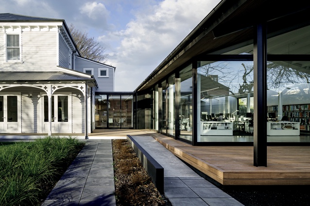
As owner of the villa, Sheppard considered adding to it or knocking it down. “But in keeping with our architectural philosophy, I decided to find a way to save the building and add a warehouse-type structure across the back, a large loft studio space.”

With the staff numbers doubling, the practice required a reception area, printing zone and meeting rooms, which at the time were hard to come by in the central city. The original villa was converted into the reception and meeting rooms, and the new building created to house studio space for up to 30 staff. The main hallway that leads from the villa’s front door became the entrance to the studio. In order to save the old building, a new RibRaft foundation had to be laid, which was also used for the new structure.
“We didn’t want to go through the expense of raising the villa as it had lovely verandas around it. We sacrificed the original floor joists and put in a new RibRaft, which connects sideways to the old foundations, so they work together as a structure,” says Sheppard.
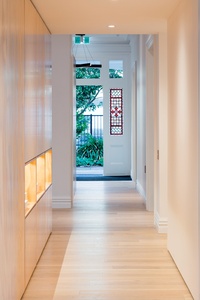
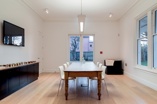
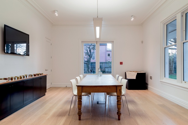
The concrete floor in the villa was overlaid with pale oak flooring. Some of the wall linings and door widths had to be changed to accommodate fire ratings and accessibility, in accordance with a change in zoning from residential to commercial, but generally the restoration was in keeping with the building’s history.
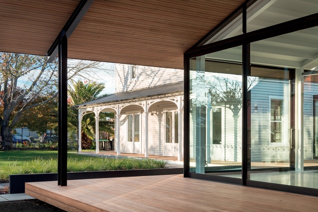
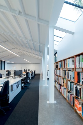
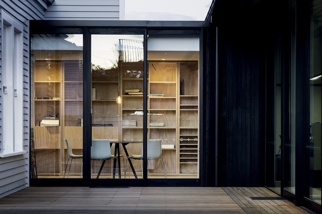
The new building is a simple steel portal structure, painted all white and lined with Lundia shelving and storage spaces. Four heat pumps provide an even temperature year-round, and the carpeting and battens on the ceiling – which appear like barn rafters – provide good acoustics. The new building was designed to open out onto the villa’s gardens with its established trees and new planting.
Sheppard says that rather than match the new building with the existing, they aimed to marry the two with contrast.
“The old house has a very simple sequence of windows and simple proportions, which we liked; yet for the new building, we wanted to create something of today, where we could get lots of natural light in. We were also governed by budget to a large extent. We had a limited amount of insurance money which went into the old building. From the street front, people see the house with these very simple lines at the back. There is an element of surprise as visitors enter the villa and then walk into the new, modern space.”
Sheppard’s staff were kept up to play on the intentions for the new offices, and the plans were pinned to the walls of the temporary warehouse space, but generally the design was created by Sheppard himself, with the documentation and project management overseen by associate Jonathon Kennedy. So, was it daunting to design offices for your own practice?
“It’s a standard problem for architects. That’s why their own houses take most of their lives to design, because you don’t have any parameters. It was a bit simpler here as we have a staff of 30 and we wanted to repeat the experience we had with the industrial building in town. We enjoyed the prospect of wrapping ourselves up in a simple, open-plan building.
“We didn’t want to replicate the old and end up with a whole number of double-height windows peering through from the new space. And since we lost so much in town, people are hugely relieved when a building is saved.”

