Refreshing the Inn: Auckland Airport hotel
The newly renovated Holiday Inn near Auckland Airport presents a bright and welcoming front with a contemporary, Pacific-inspired aesthetic.
“We nicknamed it 50 shades of brown,” laughs Designworks senior spatial designer Erini Compton, referencing the dated and shabby state of the Holiday Inn before she and her crew took hold of it. The three-star hotel, located close to Auckland Airport, hadn’t been touched for decades and was in desperate need of a facelift.
For the Singapore-based client, it was imperative the new design reflected a New Zealand look and feel, explains Compton. “When we did the Crowne Plaza in Christchurch, that client wanted guests to feel like they could be anywhere in the world: a real international flavour. For the Holiday Inn, it was the opposite; the hotel needed to feel like a contemporary, New Zealand place. So, we took a modern interpretation of New Zealand, using elements of Pasifika and local flora and fauna.”
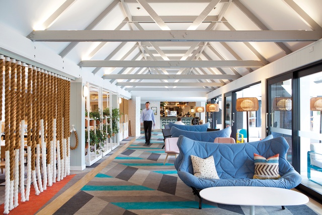
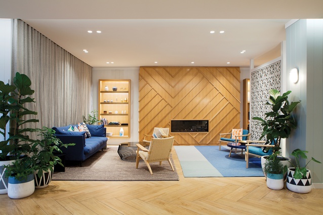
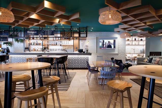
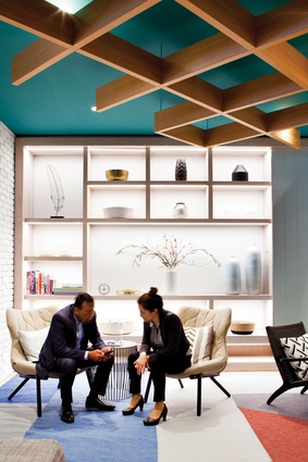
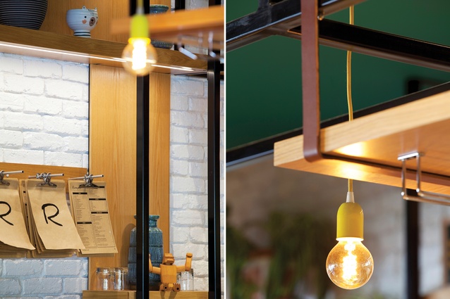
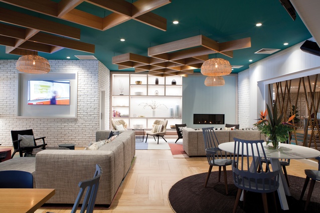
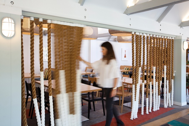
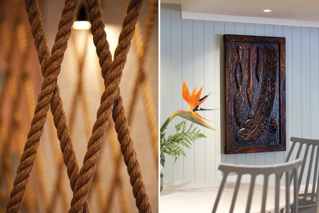
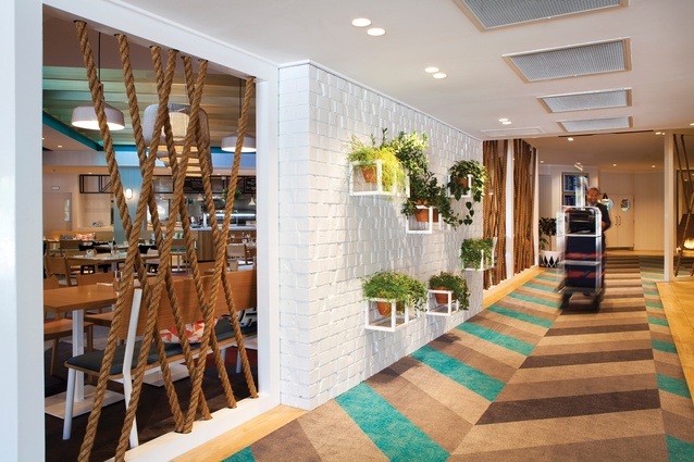
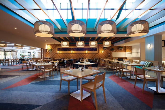
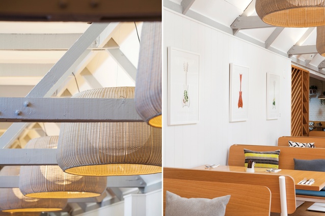
With a palette of natural materials – such as timber, woven fibres and brickwork – the Designworks team transformed the interiors of all the public areas of the hotel, more than 5000m2, creating spaces that are inviting, bold and bright. The custom-designed carpet used in the hotel corridors and restaurant has a chevron pattern that references tukutuku panels and Pacific weaving. Screens are created from simple, unexpected materials, such as nautical ropes dipped in white paint. Overhead, timber grids and woven light shades hark to traditional Pacific and Māori craftwork.
It was important to set the tone for guests upon their arrival, says Compton. “We didn’t have much of a budget for the porte cochère area so we painted it, re-panelled the walls and put oversized pendants there.” In the lobby, the fireplace was re-clad and cross-hatched timber screens were used to balance an existing Maori carving.
The fish tank behind the reception desk, a relic from the hotel’s former days, was given a new lease of life under the Pacific design theme. “The existing reception desk had to stay but was designed with custom terrazzo and timber. Staff members were shocked when they saw the terrazzo because it is quite unusual but, now, they love it. We had to be confident with our choices,” says Compton.
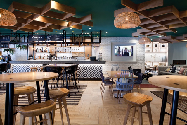
A major part of the renovation was the transformation of the central lounge area, which was previously a kind of ‘man cave’, Compton explains. “It was a lounge area that was like a bunker and open only from 5pm. So, for most of the day, it was a big, dingy block in the middle of the hotel that you couldn’t get into. We took some of the brick walls down and made it one level. This underpinned the entire concept. It increased visibility and natural light through the spaces and this area became the heart of the hotel.”
Another major element of the renovation was outside, where the delipidated pool area was gifted new timber decking and glazed balustrading. Brightly coloured wire furnishing adds a Miami Beach vibe to the deck, which is completed by the established palms.
“We had to make big choices that had big impact,” says Compton. “One was connecting the bar to the outside. We added glass sliding doors that make the inside furniture feel like patio furniture, bringing those connections in. We also added an awning to make the pool deck available in all weathers.”

The design team made multiple visits to the hotel over the five years it took to complete the project, including a 24-hour visit for each team member so they could have the full guest experience. Their aim was to make public spaces in which guests would want to linger, rather than disappear up to their rooms after check-in or dinner.
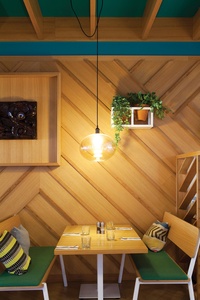
“The lounge area is a soft space where we’ve put board games and books. Conferences are also held there so it was important to give choices in terms of break-out spaces. We have sofas, leaners, tables and connections to the outdoor area. It is seamless in the way it is divided up. We tried to treat the spaces holistically,” says Compton.
As well as conferences and trade shows, the hotel had an existing relationship with the local community, which uses it for watching sporting events and for large family occasions, such as weddings. Furniture and spatial arrangements needed to be flexible to cater for these different uses. To solve this problem, Designworks engaged Tim Webber to create custom, adaptable furniture pieces for the restaurant.
Auckland artist Flox was contracted to create three original artworks for an adjoining corridor. “This is away from the rest of the hotel so we needed something special to make a talking point there,” says Compton. “She created three individual artworks, which are a modern interpretation of New Zealand, using Pasifika design and modern art methods to bring the story to life.”
With a creative mix of textures, bold patterns, bright colours and natural materials, the updated Holiday Inn has certainly left its palette of browns behind. The result is a fresh and contemporary hotel that is welcoming to all.
This article first appeared in Interior magazine.


