Silly analogies from a serious practice
I've always enjoyed stand-up comedy. Not just because it offers a hearty belly laugh but, mostly, because I’m in awe of people who can perform this art at a high level, over and over, night after night, getting better each time.
The best of them, Rock, Chappelle, Brennan, Hicks and Notaro, all manage to perform this high-wire act, between the serious and the silly, in a way that uncovers deeper thinking, social commentary and personal reflection.
I listened to a lot of stand-up while writing my PhD thesis. The levity helped distract me from the word count. But the format also seeped into my architectural communication. My view of architectural practice as an art form, honed over time, with its joys and responsibilities (with the distinct risk of ‘bombing’ every time you go out on stage), also has parallels. I believe that architecture, like comedy, can be used to elevate spirit while also providing a way into complex issues within society. Moreover, architecture can and, in my view, should be fun, if not also funny. I use ‘funny’ here not in the sense of a joke. Architecture is often too brutal a force in the environment to be treated as a joke. But, rather, I use the word as a synonym of ‘strange’ or ‘uncanny’ in that it provokes thought on the status quo.
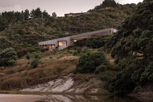
Over the last eight years, I have practised with Aaron Paterson and a group of wonderfully talented people under the name of Pac Studio. Together, we have embarked on creating a practice that balances the duty to consider deeply what we build while doing so in a way which is enjoyable and accessible. So far, we have developed a few architectural fascinations with academic underpinning and well-defined research methodologies. But we have, by and large, tried to communicate those internally, using analogies and phrases, addressing the serious with the silly.
This is a collection of silly things that have become useful in our serious design discussions and characterise much of the banter within the studio and around our built work.
TOO MUCH TAN
In our use of form and colour, we are looking for the unusual. The odd. The unexpected and, sometimes, the downright loopy. But, with every project, there is a sweet spot for this: a state of natural equilibrium where the design satisfies multiple concerns without losing its ingenuity and, critically, without descending into self-parody.
Around the time we formed the practice, a documentary following legendary fashion designer Valentino Garavani was released. The film’s climax was a huge retrospective show of his work set within the Coliseum. The great designer takes his final walk down the runway, exits the building under a sky of fireworks and enters a waiting limousine, where his longtime partner waits. As he sits down, he asks his partner how he thinks it went, and without hesitation, his partner says, “too much tan”, referring to the prodigious quantity of orange spray tan that has been applied to Valentino’s face. Throughout the fanfare of the film and the thousands who have come to pour their adoration on every decision Valentino has ever made, no one has mentioned that the man has painted himself the colour of a tangerine and that it’s rubbing off on his collar.
If there is a lesson in this exchange, it’s about being humble, being honest with one another as designers and remembering you can go too far. The question within our office on each project has always been: “Is this too much tan?” Some projects require more tan, some less. The freedom to push the perceived boundaries and the humility to hear the answer to the question have become important to us.
CHICKEN STOCK
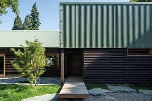
There are several architects and academics whose erudite writing on the topic of research by practice should be diligently read. Leon van Schaik, Richard Blythe and Peter Downton come to mind. Having read these through my thesis, I found them perplexingly difficult to communicate while talking over a sketch in the studio with collaborators and clients. Like crushing a walnut with a sledgehammer, they felt a bit much. Instead, within our office and our teaching, I prefer the analogy of a well-prepared stock.
As all Julia Child aficionados will tell you, a good stock underpins the delivery of flavour in many dishes, no matter the cost or complexity of their other parts. It can elevate something simple through the application of technique. I see the knowledge we gather and develop through years of practice as being this stock. Once created, we add it to each new project, imparting flavour from previous experiences and projects into the creation of a wholly new project, but with respect to the process that brought us to this new point.
The analogy holds when you think about how a good stock is made. It’s a slow simmer; time is a central element in the development of quality. The stock also relies on what Anthony Bourdain describes as the ‘nasty bits’ — the bone, gristle and stalks. Anyone who has had occasion to read the fine print of one’s Professional Indemnity policy will understand that we learn not only from things that go well and those experiences serve, in the long run, to make the stock better. Master stocks are also added to consistently, gaining flavour from new ingredients — relying on past success isn’t the aim.
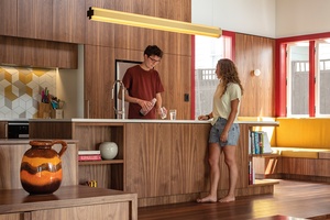
When you consider that architectural practice is, for many, a lifelong journey with several hundred projects of various sizes, it’s worthwhile thinking about the ways in which this architectural stock might develop over time, and when you might need to add some new ingredients. Fundamentally, we choose to look at our work as a continuous journey where all projects are connected: a process where each new project is infused with what we have learnt from the past.
THE HAMBURGER
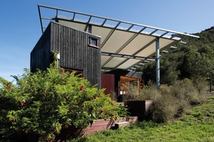
You might be seeing a theme here. We are an office that has always liked to eat together or, more accurately, I like to eat and talk. But, that aside, the hamburger metaphor has become useful in describing a common but usefully silly way of discussing architectural elements.
If we consider a hamburger in section, we have three zones: top bun, bottom bun, everything in between. It is my solemn academic assertion that architecture can be considered in the same way.
“If we consider a hamburger in section, we have three zones: top bun, bottom bun, everything in between. It is my solemn academic assertion that architecture can be considered in the same way.”
The top of the bun in architecture is fundamentally about protection from the sky — the basic need for shelter from above. It responds to climate and, in doing so, acknowledges place, seasonality and the sheer magic of natural lighting. Roof.
The bottom of the bun in architecture is about grounding and protection from the earth. Making a different connection to place, this grounding element must take account of geology, the way we have worked the land through history and our innate connection to it through gravity. Ground.
The bits in between this architectural burger make it more than just a bun. They add life, diversity of texture, flavour and colour, and allow for endless variation. The zone of diversity between the buns of foundation and roof allows for an expansive experience of all the things that are to be enjoyed in life. They encompass the stimuli in which Juhani Pallasmaa rejoices. The area between the buns is the stuff of humanity. Life.

So, when I talk in the studio about the need for more lettuce on a project, what I’m saying is that we need something fresher: something that acts to give lightness. If a new project needs to attend to complex ground conditions or topography, I might highlight to the team that “the bottom bun on that one is going to need work”. Every now and again, someone wryly proposes the inclusion of an onion ring (something odd and unexpected) and that makes me happy because our silly shorthand develops. Criticism can be delivered gently, with humour, and then, ultimately, in the service of projects rather than egos.
NOT DEAD YET

This attitude, that nothing is as yet final, allows us to address problems with the knowledge that we can change the future with our designs. The mantra has also ironically been adopted each time a project returns from a presentation, Council or the QS unscathed.
Our practice has endured what many small practices have faced in recent years: ups, downs, ups and, again, downs. It seems we have a knack for publishing some of our best work as the market is disrupted by a pandemic or a recession. But, as we ride the roller coaster with the rest of the profession, we often use the affirmation of ‘not dead yet’ to remind ourselves that there is more to come and we can ultimately have control of what our response to a situation is.
APPLES AND PEARS
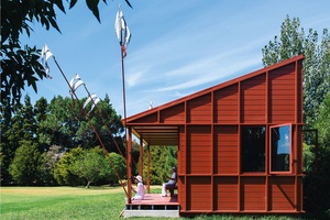
The Cockney rhyming slang for ‘stairs’ is ‘apples and pears’. Three words instead of one is perhaps less efficient but they come with a lyrical enjoyment. Aaron and I both love language and, in particular, regionally specific colloquialisms. The way we use language in the discussion of projects sets the tone for the office within our open space. Design ideas need to be strong enough to be presented using the most colloquial of descriptions. Quoting Derrida or Deleuze in support of a scheme would be so ridiculous that it would be instantly assumed to be a parody of the self-important academic/architect and dismissed out of hand as nonsense. Instead, the design ideas have to be accessible and lyrical in the way of the best rhyming slang so that they can be communicated with enjoyment and a little bit of self-deprecation.

Often our ideas are first communicated to clients not with drawings but with a phrase. For instance, we have one project at the moment that is described as ‘two scoops, one scoop’, referencing the roof form and also the client’s interest in selling ice cream from adjoining commercial space. Another project is lovingly referred to as ‘the pizza hut’, referencing its confident roof height. Another interior project is described as a ‘leather jacket’ in reference to the mixture of black and polished stainless steel for a particularly bad-ass client.
The rejection of deeply earnest insights and esoteric references as the measure of architectural quality is important if we see architecture as a craft that should be accessible and engaged in the culture of its production. If our architecture is considered to be fun and a little funny, then I’m happy. The intellectual rigour and undeniably serious parts of practice can happily stay in the background, only tangentially approached through the silliness.
Pac Studio was founded by Aaron Paterson and Sarosh Mulla in 2015. The studio sits between professional practice and academic research at the University of Auckland, where both hold positions as senior lecturers. Pac Studio has gained notoriety for its unusual projects, which balance design excellence and sustainability with outright fun. The studio practises across New Zealand and, in 2022, won two NZIA National Architecture Awards for Housing for Crinkle Cut and Waimataruru.


