Retail 2.0
The shift from being a mass-market brand to a premium one is challenging. Doing so via bricks and mortar while digital retail is gnawing at your heels takes courage and a clear strategy.
Federico Monsalve and Sam Dylan explore how Fisher & Paykel are preparing for the future of retail.
Appliance brand Fisher & Paykel has recently opened two ‘Experience Centres’, one in New York and one in Sydney. Both were designed by Fearon Hay Architects. The showrooms do not sell anything, they act as a bridge connecting consumers’ online research of the appliances with the physical manifestations of these products.
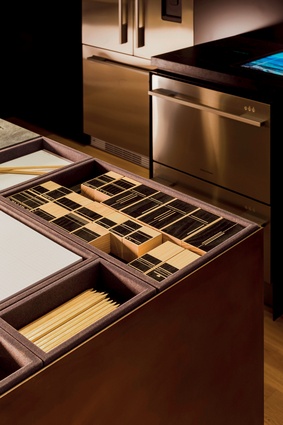
People can test, trial and, through high tech display units and NFC enabled pens track their preferences and get those delivered via email to themselves or their architecture and design professional. The spaces are also used to introduce people to the brand.

Experience Centre - New York
Located on the eastern side of midtown Manhattan, the A&D Building is a monument to the New York metropolitan area’s frenetically paced real estate, business and luxury markets — and, with the Bloomberg HQ across the street and yellow cabs streaming up and down adjacent Lexington and 3rd Aves, certainly feels it.
Behind the monolith’s handsome, futuristic art-deco façade on East 58th Street, there are 35 large-scale showrooms dedicated to luxury and high-end kitchen and bathroom brands from around the world. Most recently, it also became the East Coast foothold of New Zealand import Fisher & Paykel.
Like its newly opened Sydney counterpart, this Experience Centre was designed as a place for international customers to not only see the appliances in action, but engage and interact with the brand.
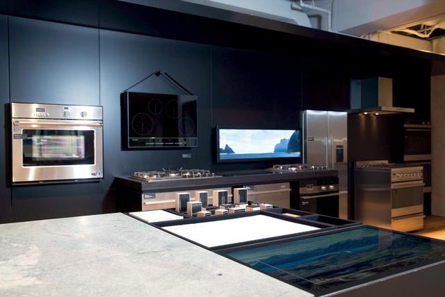
Of course, interactivity is not a new concept for global brands operating in multiple markets, but where Fisher & Paykel stands apart in its new location is in the ability to present something that is specifically a New Zealand-accented, contemporary design sensibility. This was achieved in collaboration with design firm Alt Group and the Auckland-based architecture practice Fearon Hay, which was responsible for realising the physical manifestation of these concepts.
The American aesthetic, while influenced by Europe at the more adventurous end, still often tends towards the traditional, if not outright conservative. The central tenet of the design is that it is not site specific, but can be applied as a system to different locations around the globe, says Fearon Hay principal, Jeff Fearon.
“The brief was specific about how Fisher & Paykel would like the local audience to relate to the product and its qualities,” he says. “However, the NYC centre was a specific challenge, in that the scale of a Manhattan kitchen is different to that of Australia.”
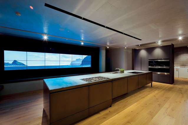
Bijou living quarters aside, the brief also needed to include the DCS brand — a heritage American appliance brand specialising in high-octane outdoor grills and a professional-style indoor collection. To achieve this, many of the same design features were carried through. The materials — a palette of reclaimed wood and concrete that reflects the monumental qualities of the New Zealand landscape, reiterated by screens with moody time-lapse photography of west coast beaches — define different spaces within the centre.
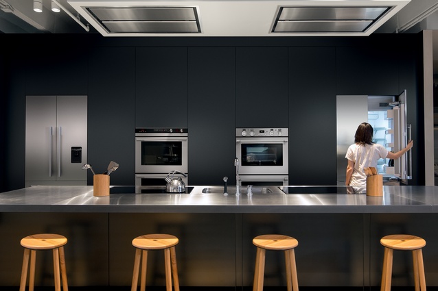
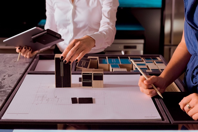
There is a central “courtyard” with a long table, flanked by zones that foster varying interactions with the products; a sleek working kitchen, and the design-focused product collage and adjacent planning table where architects and their clients can assemble a kitchen using scale-model blocks and graph paper.
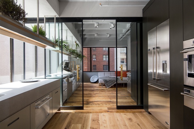
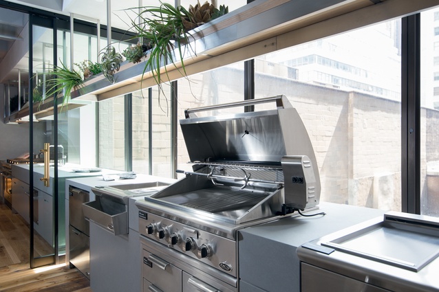
Leading out from the DCS indoor kitchen via sliding doors, Fearon Hay constructed an “outdoor kitchen” in corner of the space with windows on two sides to showcase the impressive outdoor built-in and freestanding grills.
MATERIALITY F&P SYDNEY
A key driver for the design of the Experience Centres overseas was that they carry a real sense of place, of New Zealandness.
According to Mark Elmore, head of design at Fisher & Paykel, “We wanted to reflect where we are from and the place that drives a lot of our thinking. Since we are from here it was an important way to make you feel at home while at the same time be a little aspirational.”
The Experience Centre in Sydney uses exquisite materiality and a series of experiences to express this. At the entrance, for example, there is a moment to stop and drink tea before arriving at the space. “We felt this was evocative of arriving at someone’s home and someone putting the kettle on. Talking about tea, sharing a biscuit. Plus that gives us a signature experience right at the door,” says Elmore.
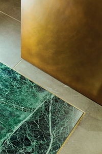
From there you move left where there is a narrow passageway into the core of the space. To get there, visitors must step over a luscious slab of green marble hone finished with a brass edge. This is a reference to pounamu river stones often placed at the threshold of buildings. Once inside you step into a large open space, on the left there is a large communal table atop recycled barn oak floorboard reminiscent of a deck.
Elmore: “It feels like an outdoor space – a courtyard for community and the sharing of food.” The next, most obvious space is a hero kitchen, according to Elmore, the Fearon Hay materiality here was crucial in delivering something reminiscent of New Zealand while, at the same time, “being incredibly contemporary.”

