Review: Vitruvian Tunnel
Matt Liggins can do lots of things but he doesn’t sit easily in the usual categories. He has positioned himself as equal parts teacher, architect and artist. Some days, you’ll find him energetically teaching design and technology courses in the architecture programme at the University of Auckland. The rest of his time is spent in a practice that combines the making of art and of buildings. He has produced a series of crisp, elegantly composed houses around Australia and New Zealand, and has exhibited drawings, paintings and sculptures that exude wry wit, communicating a thought with a few lines of fat pencil or oil stick.
But it is Liggins’ work that sits in the space between art and architecture that has attracted the most attention. In 2016, he drew both media play and industry awards for The Real Pyramid Schemer, a charming, pyramidal plywood booth that popped up in public spaces. Concealed within, Liggins would chat through a small hole with passers-by, drawing on the conversations to create for them quick, free, life-affirming artworks.
Last year, he produced his House of 9783 Plastic Bags/House for the Homeless 2. To create a simple shelter for rough sleepers, Liggins collected thousands of plastic shopping bags (seems so long ago), sorted them by colour and used them to insulate clear polycarbonate walls supported in a simple triangular wooden frame. In this project, the most basic of materials – 2x4 timber and recycled plastic – were invested with the vibrant intensity of stained glass.

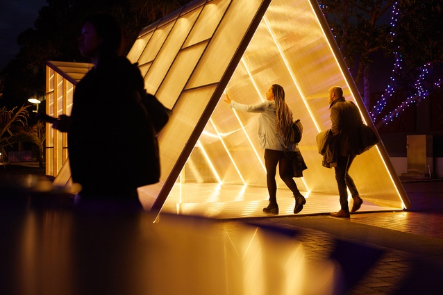
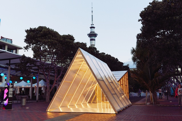
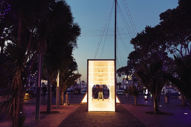
Liggins’ most recent and ambitious crossover project is the Vitruvian Tunnel, built originally for the Bright Nights festival at Auckland’s Viaduct Harbour during May but which will be making other appearances in Auckland and Palmerston North. Liggins’ structure extends Leonardo da Vinci’s iconic Vitruvian Man diagram into a three-dimensional form. Timber and polycarbonate are composed into a triangular and a rectangular tube, a circular hole marking the transition point between them, and the whole is outlined with strips of LED lights.
Once again, this was just a simple framework of plastic and sticks but the LEDs and shimmering surfaces refracted and reflected da Vinci’s diagram of ideal human proportions into a dazzling funhouse of geometry and light. Visitors savvy to art history picked up the reference and hoisted themselves into the circle like da Vinci’s man. Others gathered friends and occupied the structure as a photogenic selfie background.
The cleverness and charm of Liggins’ work remind us just how public-spirited and engaging architecture can be. His relentless audience focus highlights the extent to which we architects tend to work within what might be called professional conventions. The people who most appreciate what architects do are other architects. It is they who appreciate the refined aesthetics, the technical sophistications and the elegantly resolved details. But, most of what we spend our time worrying about is invisible to most people.

The theorist Walter Benjamin argued that architecture is received by the public in a state of distraction. For most people, architecture rarely intrudes into the foreground of consciousness; it is merely the backdrop for daily life. The Vitruvian line is that architecture is about commodity, firmness and delight. If it is deficiencies of delight that allow architecture to slip into the background, it is Liggins’ ability to conjure delight that makes this work so arresting.
He makes architecture and experiences designed to capture the imagination and incite participation. Purists might be tempted to deride this work as Instagram architecture but these are projects with depth; they make references to the histories of art and architecture, they draw in environmental issues, they address social concerns.
This work is also remarkable for Liggins’ ability to shape such vibrant spaces with such humble means. Charm is under-rated but is inexpensive and has its uses – it saves us billions, for example, as the core of New Zealand’s just-be-the-one-everyone-likes defence strategy. As Liggins’ practice becomes more established, it will be exciting to see how he uses this skill in larger, permanent projects. What would a ‘charming is more’ architecture be like?
This article first appeared in Architecture New Zealand magazine.


