Rich and robust: Brick House
A layered arrangement of volumes and materials gives this new home by Andrew Burges Architects a spatial richness and complexity that balances privacy and outlook.
The streets behind Sydney’s North Bondi Beach have a strange quality about them – they are not as relaxed as one would hope. There are few beach views, sporadic breezes and a constant air of street parking angst. The houses here are, for the most part, built to maximum width, with a maximum block footprint. Some houses are oversized adaptations of beach bungalows, while others are new.
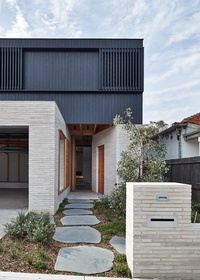
Brick House by Andrew Burges Architects falls into the latter category. The site was once home to a badly altered bungalow and original houses remain on either side. The clients came to Andrew with some experience of the process, having worked with other architects. Their brief was concise – they wanted something interesting, and they wanted to use the pale bricks developed for Peter Zumthor’s Kolumba museum in Cologne, Germany.
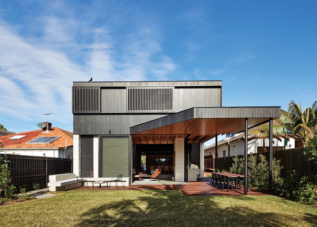
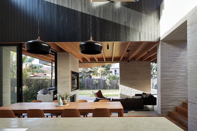
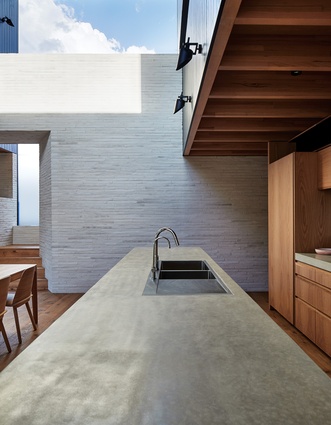
This benchmark brick became the basis of a robust palette of materials that Andrew developed. Andrew’s other beachside residential projects have shown a delicious preoccupation with indoor and outdoor layering, and he has continued to explore and enrich this theme in this project. The soft grey external brickwork, with wide mortar joints, turns and wraps into the house to form major structural walls and the fireplace surround.
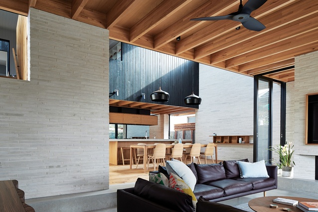
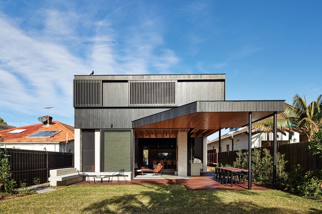
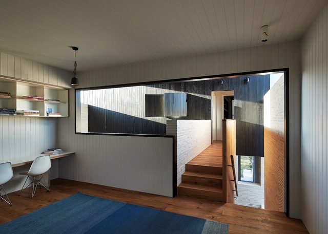
Blackened timber wall panelling clads upper walls inside and corresponding first floor walls outside. Blackened timber shutters appear on the front and back elevations, but are echoed with different shutters inside. The timber beams and ply soffit of the main living spaces seamlessly extend to covered outdoor areas. The clients have three boys and the house has a robustness that suits its occupants well.
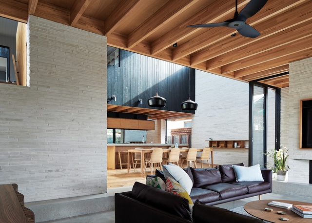
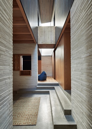
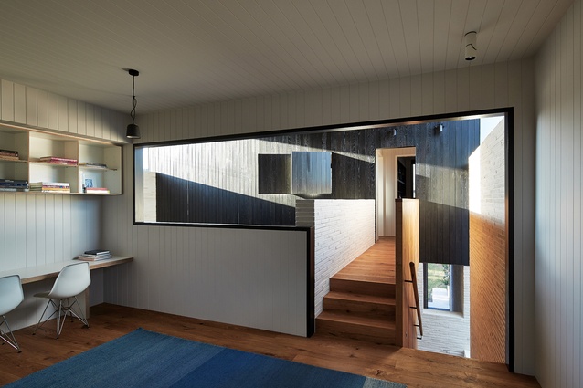
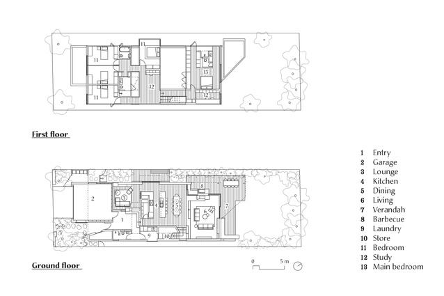
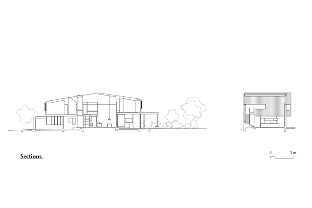
From the street, the house presents as a cubic form, but once inside, the mass of the house breaks down immediately. A series of double-height voids divide the upper rooms into smaller forms and towers. Several bridges are visible above, traversing the soaring slivers of space. The voids are lit from the side by huge window panels showing only sky. This strategy is an extremely clever tactic, where occupants forget their close proximity to neighbours, and is further strengthened by smaller side windows (in bedrooms and bathrooms) that are mirrored inside to reflect the garden, rather than the abutting neighbours’ side walls and roofs.
For a house on a flat site, the ground floor has a surprisingly rich and subtle topography. One steps from the entry’s concrete floor up to the core of the house, the kitchen and dining areas, which are marked by a timber floor. This has void areas above it, so feels like the heart of the house. After crossing this space, one then steps down to the living room at the rear that addresses the wide garden.
Here, Andrew has reverted to a concrete floor, and therefore the space feels much more like a covered garden room. The repeated pattern of three to four concrete steps marks most thresholds, as well as the entry point to the stairwell. The area surrounding the stairwell is a masterful combination of brick, natural timber panels and blackened wood cladding, drawing together the four constant house materials.
At the first floor, three separate “footbridges” head in disparate directions. This gives wonderful privacy between adult, child and guest zones. The voids at this level of the house allow voices and family life to waft up from the lower level.
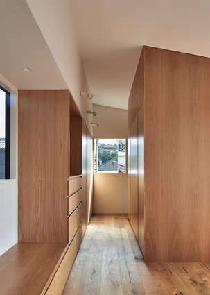
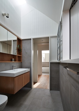
The hallways are lit from above, and mirrored shutters at the end of the hallways reflect glimpses of sky, garden and the house. Each hallway is lined with cupboards made from one of the main house materials. Bathrooms are concealed at the end of a circuitous route.
At present, the garden is simple – a lawn for the boys to tumble on with some perimeter planting. Ever self-critical, Andrew hopes the house will seem less like a “box” once more embedded in a fully developed native garden setting.
The project has a great richness of architectural terrain, and a remarkable range of volumes and spaces to it. It must surely surpass the clients’ greatest hopes for “something interesting.” Most importantly, the house has a calm, robust quality about it – it is a beach house that belies a big build on expensive land in an area of frenetic construction.

