Roche
When Swiss global healthcare company Roche went to design its new New Zealand headquarters, its objective was to combine the brand’s European roots with a distinctly Pacific flavour. “One thing that wasn’t to change was Roche’s family-like culture,” says David Morgan, creative director at Stack, a business interiors firm which has completed fit-outs for the likes of Air New Zealand, Generator and AIG.
“The company has an international policy of fostering internal relationships and encouraging collaboration, so that needed to be respected.”
However, while still adhering to a global workstation size guideline, Roche NZ was keen to experiment with various open-plan workspace configurations and meeting settings, “to allow for that collaborative work ethic while still maintaining a relatively quiet workspace for the concentrated activities”, Morgan explains.
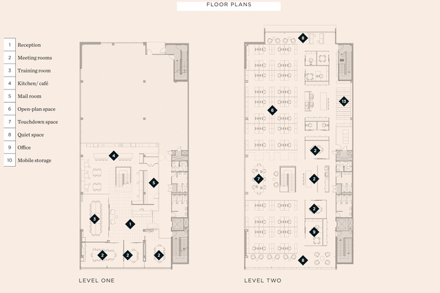
Responding to such a brief, Stack set aside an entire upper floor of a regenerated Newmarket office building as the primary workspace. A lower floor, joined by a new internal stair, is where one enters Roche NZ’s head office. Front of house is slick and simple, and introduces the hexagon, Roche’s signature shape – inspired by the molecular structure.
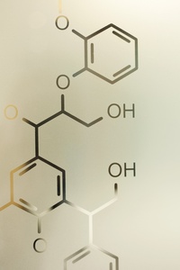
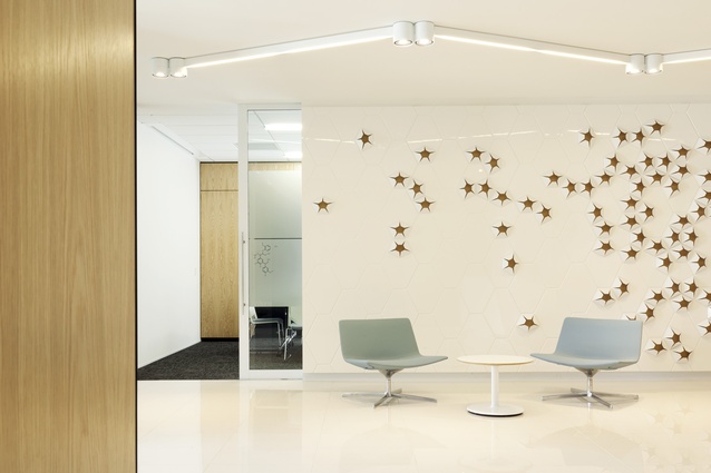
“The architectural geometry of molecular structures synonymous with medical science have inspired the reception counter, stair, lighting and other furnishings,” says project designer Jesse James Smith. A white-lacquered reception desk uses such a shape in its construction, ensuring every visitor knows exactly which company resides in these offices. The wall opposite the entry ensures the welcome area has a definite Pacific identity, Smith explains.
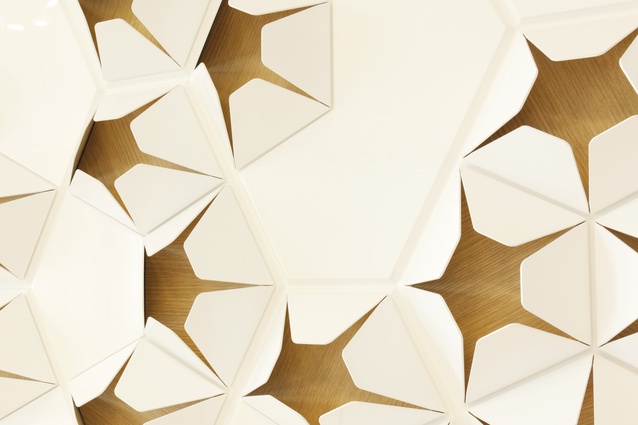
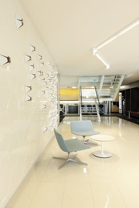
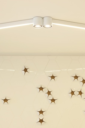
“The ‘living coral’ inspired feature installation in the waiting area uses the common molecular geometry but with a decidedly more organic appearance. The smooth and glossy 3D pentagons are softened with a natural timber inlay.” Growth-like in appearance, these pentagons conform to the wall’s rigid hexagonal grid, however they disperse and fill the grid at random.
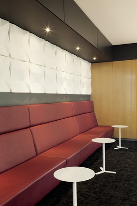
Flowing through from the feature wall is the central waiting area, flanked by 5.5m-long umber-coloured bench seat, made of high-performance vinyl. Above it, ‘Fractile’ hexagonal acoustic tiles are used as a 3D feature on a charcoal wall.
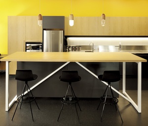
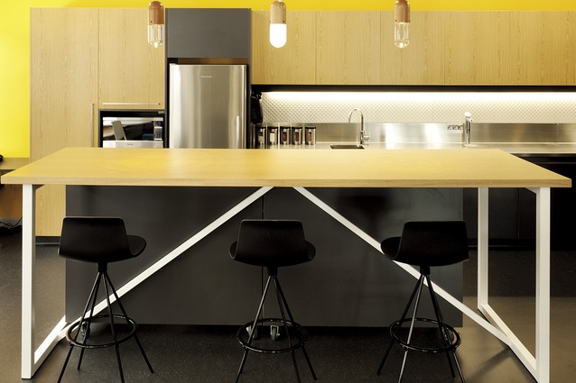
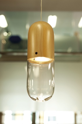
The open staff café, extending to the western side, is visible to all with its bright yellow pop of colour. Beech-coloured oak kitchen joinery serves to reflect Roche’s Swiss roots, and capsule-shaped pendant lights sit atop the island. Combined with the 3D wall panels spread throughout this floor, these shapes contribute to an aesthetic referential of the science behind Roche’s work.
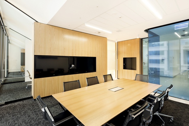
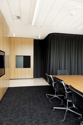
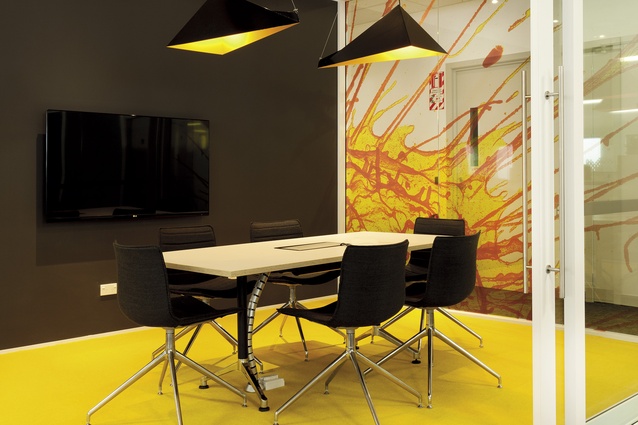
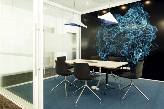
Each room features enlarged graphics of Roche molecular photography, setting colour themes for each space (blue, orange, and yellow: the Roche brand colours). The meeting rooms contain wire-hung geometric lighting, and every powder-coated aluminium pendant features one panel of the respective theme colour from the room in which it sits. The formal meeting rooms veer away from bright colour in favour of oak panels, warm whites and a contrasting teal wall, which represents the clean, calm Swiss aesthetic without being overly sterile or medical.
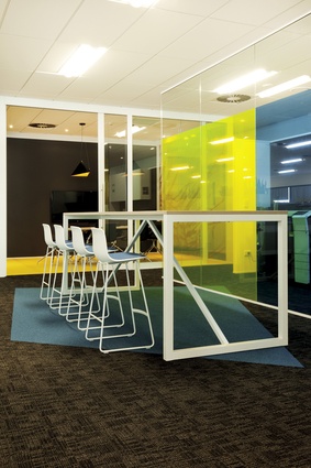
In the centre of the lower floor is a suspended stair. Up this stair, an entire floor is designated as the workspace for 50-plus staff. “The workstations are arranged as ‘streets’, generally with a separate department on each street’,” says Morgan. Hexagonal dividers provide privacy between streets, as do box planters (containing Sansevieria and Dracaena compacta). Coloured glass room dividers break up administration areas, and full-height clear glass sliders divide individual management offices and ‘quiet spaces’ from the main workspace.
“The workspace surrounding the stair is a collaborative space, designed to foster interdepartmental meetings and communication through various open and private meeting settings,” says Morgan.
“This is in contrast to the peripheral space set aside for contemplative, quiet tasks.”

