Rosie Café
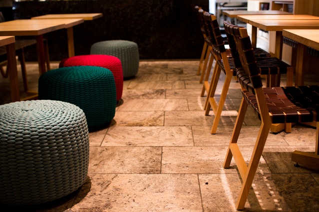
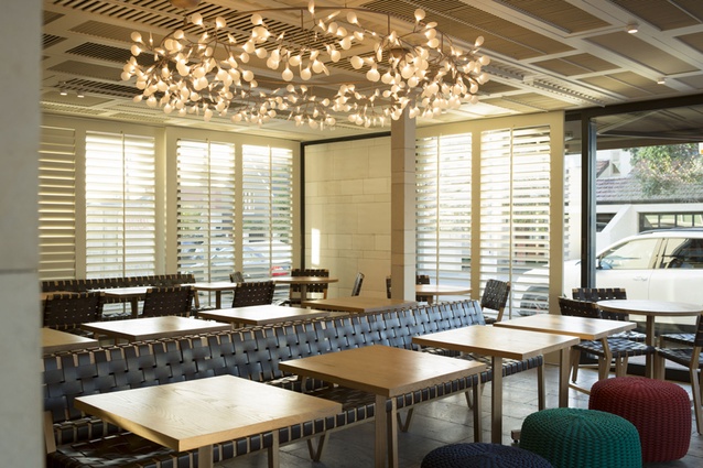
It is light, both natural and artificial, that activates this overtly comfortable space. Woven into the area is a pared-back palette, juxtaposed with bursts of colour in the form of bright, monochromatic ottoman stools and an array of subtle nods to its location (adjacent to Auckland’s Parnell Rose Gardens).
The eatery is ever popular and, as Hip Group’s Jackie Grant says, the refit may have created its only thorn: the consistently stable queue of customers mingling and waiting at its doors for table space.
The café’s original owners installed the former fit out more than a decade ago. As architect Jack McKinney says, it had aged sufficiently enough to develop an almost-seedy feel about its red vinyl features.
When Hip Group acquired the eatery six years ago, a plan began to form and today’s sleek fit-out is the result of four years’ planning, and a three-month construction process.
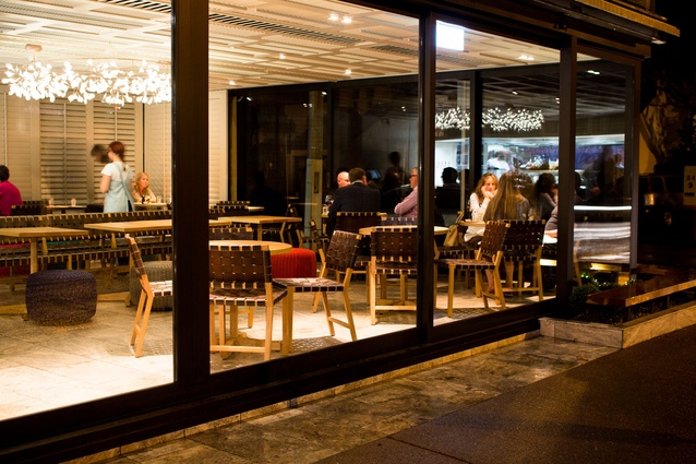
As part of the refit, the floor area was extended, taking the former outdoor area in and encapsulating it within sliding glass doors, which allow the entire space to be opened to the elements. Flexible wooden shutters on the interior mean diners can be shielded from the sun at various points – the shutters also act as vessels through which light protracts and creates ever-changing prisms in the interior.
Due to an unusually low stud, McKinney says creating a feeling of space was imperative. His solution involved the purchase of scores of old shutters on Trade Me, which were repurposed as a faux ceiling. The open elements of the shutters offer the feeling of an extended lofty space above and ameliorate any sense of this being the lower floor of a two-storeyed building.
As well as their interesting lines, the shutters hide acoustic panelling, speakers and the like – as with various other aspects of this design, they cleverly disguise more functional elements of the space.
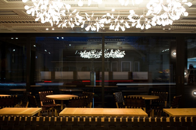
A circular chandelier above the centre of the dining floor offers a subtle nod to the gardens; its many branches hold LED lights, which form a petal-like formation and drop light on the area below. Its shallow depth, though, gives it an unrefined subtlety in the relatively small space.
“We wanted to create a space that just felt good,” Grant says. “A calm, easy space. So many different people use it; we wanted to make sure everyone still felt they could come along, from cyclists to dog walkers to professionals.”
McKinney says the result is a holistic space without any one particular feature. “The idea is people walk in and they just feel good without noticing any one feature above others,” he says.
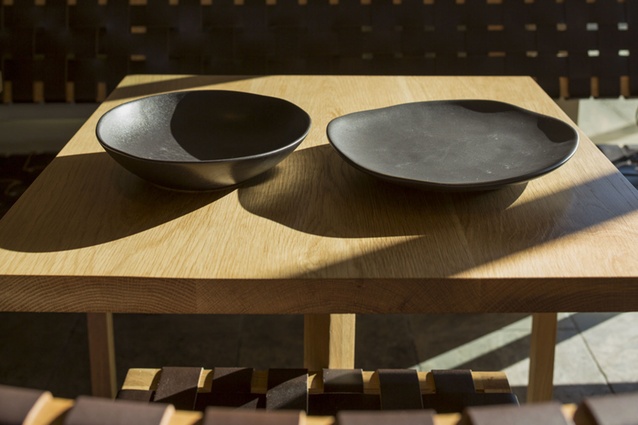
Bespoke bench seats were designed by Douglas and Bec specifically for Rosie; their woven backs let light meander through, departing from what could have become a stilted space if more solid furniture were utilised.
The tumbled edges of the silver travertine marble floor tiles have a rustic, organic permanence, which is echoed, in different forms, throughout the fit-out.
Despite the very limited wall space, due to the vast amount of floor-to-ceiling joinery, it has been cleverly used to articulate this permanence, and a democratic flow linking different areas. One interior wall runs from the dining floor to the rear of the kitchen, which is entirely open to the diners.
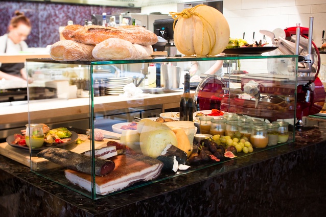
A low emperador granite cabinet, which is accented with a rosette pattern forming subtle garden references, is all that separates the kitchen from the dining area. The under-side of the cabinet is fitted with refrigeration, allowing food to be presented atop and cooled as required without visual interruption.
A glass splashback adorns the rear wall of the kitchen. It is covered in a replication of the rosette patterns on the granite cabinet, tying the kitchen area together, and separating it, albeit only visually, from the rest of the space.
Half-spherical lights adorn the interior sandstone wall, which separates the entrance area from the kitchen and provides a ‘wind lobby’ for guests who can enter through a separate entrance should the sliding doors be closed. The lights sit, like dewdrops, against the sandstone, subtly reinforcing the organic, natural feel.
The bathrooms, like the rest of the space, have an organic sense of tactility and permanence. Sandstone walls, with raw, ungrouted tiles, are mixed with walls of stone mosaic tiles. The same half-spherical lights are given another dimension attached to the mirrors in each room; in the darker hall area, their ‘dew-drop’ form is itinerated in yet another manner.
While the refit took the majority of the former outdoor space in, the alfresco area that remains is bounded by the marble tiling of the interior, which spills out to meet the footpath. Here, further nods to the gardens are evident in the woven form of the cast bronze tables and the colourful woven-rope ottoman stools. Wooden bench seats form a boundary around the corner of the space, offering a sense of hospitality not only to its guests, but to members of the public who routinely stop and utilise them. Behind the corner seats are buxus balls, which, although still in their infancy, round off the organic feel of the eatery.

