Newly transformed Rotoroa Island Visitor Centre
A Salvation Army treatment centre is transformed into a visitor centre with the help of Pearson and Associates Architects. Pearson and Associates Architects takes the notion of shelter from its rich history.
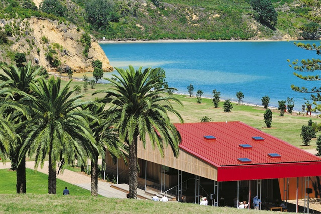
Architecture at its most fundamental is shelter. This visitor centre on Rotoroa Island in the Hauraki Gulf, then, is gratifying in the way that clearly it fulfils that role. Designed by Pearson and Associates Architects, the notion of shelter goes beyond protection from the elements. Here, the building – both a resting point for visitors to the island and the setting for an exhibition of the island’s history as a Salvation Army drug and alcohol rehabilitation centre – takes the notion of shelter and examines it from physical, spiritual, emotional and spatial angles.
Some background on the island: since 1908 when William Booth, the founder of the Salvation Army, bought the island, Rotoroa has been an alcohol rehabilitation centre. In its early days, a two-year “sentence” allowed drunks to dry out while, in more recent years, as psychology started to see addiction as an illness, the Salvation Army post provided counselling and therapy as well as physical separation from temptation. This concept of bundling addicts up and shipping them off – out of sight, out of mind – was eventually abandoned by the Salvation Army (perhaps also encouraged by the high rate of return visitors) in favour of the more modern policy of dealing with addictions on the mainland with the support of family and other government services. As a result, from 2008, the island was decommissioned. Around the same time, philanthropists Neil and Annette Plowman were looking for a project and saw the potential for this island as an ecological refuge for birds and native species, as modelled by Tiritiri Matangi. The Salvation Army leased the island to what is now known as the Rotoroa Island Trust for one hundred years. In the past three years the pine trees on the island have been felled, along with some of the buildings; 350,000 native trees have been planted; a new visitor centre has been designed and built; and some significant artworks have been erected. Already, native birds are becoming the noisiest and most prolific inhabitants. Since February this year the island has been open to the public, with a ferry service taking visitors to see this long-inaccessible paradise – hence the need for both a resting shelter and an exhibition centre.

One hundred years of shelter, protection, salvation and, looking forward, a new life of refuge and sanctuary; the site was rich with metaphorical potential. The architects have obliged, in a way that is both obvious and subtle – neither a bell around a neck, nor an ignored elephant. What is unusual – and exemplary – in this project is that the architects for the building were also the exhibition designers, or perhaps you could reverse that: the designers of the exhibition went so far as to design the building the exhibition was housed in.
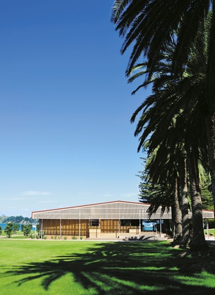
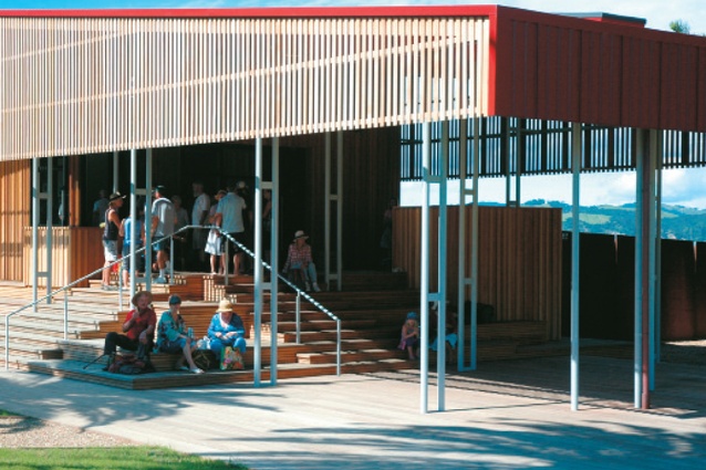
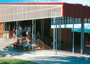
Initially, the exhibition centre and the shelter were conceived as two separate buildings, but throughout the process, as the architects dwelt on that metaphorical transformation – what Pearson describes as “doing to the land what the Salvation Army did to body and soul” – the shelter concept grew until the awning encompassed both programs. The large, gestural roof is the dominant form, its low-slung, rural shed-like shape immediately implying shelter.
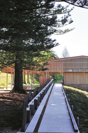
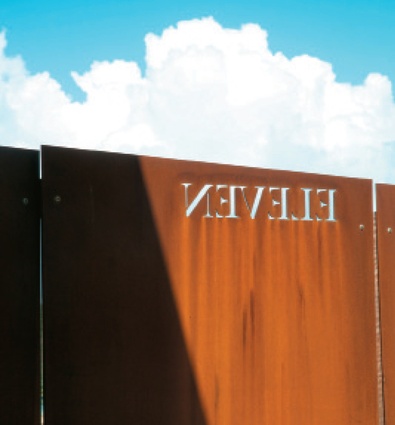
Rick Pearson and project architect Justin Marler also had an early concept of a podium and wanted to create the gesture of earth gathered up. With the building located in a low area of the island, the strongest remnant of this idea of lifting up the earth is in the entry ramp. Designed to be a natural, unselfconscious entry to the building – a gradual rise rather than an affront of stairs – the ramp is unusually long, but it is key to setting the tone of a slow and steady sense of discovery. With off-kilter Coreten steel panels cut in with twelve numbers (spelt out), the ramp also plays with the idea of the twelve-step program (though there may be some existential confusion, being on a ramp). A red Coreten line in the concrete surface also begins a rubric – a semi-religious idea drawn from old manuscripts – creating a pathway through the text/building.
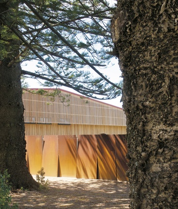
Despite these layered meanings and concepts, the building excels through its simplicity, as well as its mature understanding of human nature. The covered outdoor resting area is beautifully planned: it is a lofty space full of dappled light (small skylights in the roof mimic light through trees) and filled with steps-cum-bleacher seating. The decking, as well as the cladding and the roof-edge screen, are all of totora, chosen because of its natural rot-resistance. Its fine grained, peachy tones don’t hurt either and, while there is a unity in materials, different areas are articulated in different ways – wide vertical boards as siding, thin battens on the roof-edge screen, thinner boards for the decking.
Inside, this straightforward but insightful response to how people will use the space is seen in the small pods that pop out of each corner of the exhibition space. Places to rest but also to listen to the audio interviews that make up part of the exhibition, these pods allow for private moments within the open exhibition room and have carefully angled views to distinctly different parts of the island.
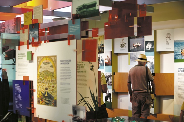
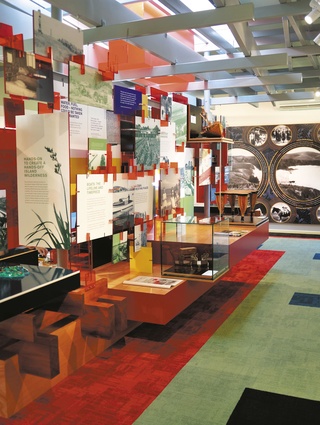
The rubric line that started at the ramp leads through the building, circling the exhibition to arrive at the centre display. For such a strongly articulated idea, I’m not entirely convinced that the central display is so significant that it warrants this treatment. The display – an interconnected series of panels that tell the complex and long history of the island – was imagined at the beginning of the project like a tree. It draws on fractal theory, with the panels repeating at different scales and interlocking in a way that mimics a concept of the elements in addiction recovery – work, family, self-control. These all work together to create a strong whole. The exhibition is interesting, and interactive, though perhaps a bit busy with the red, the panels, the objects, et al., but it does also make sure that as a visitor, one is pulled into the display.
This is a self-confident, mature project. Pearson and Associates Architects has intellectually and emotionally drawn from the site’s rich cultural heritage, while still managing to create a building that is almost defiantly simple, a result only possible when the designers implicitly understand the brief, the site and the program. From materiality to form, metaphor and concept, this building is a shelter, in the most elegant way.

