Royal Society of New Zealand
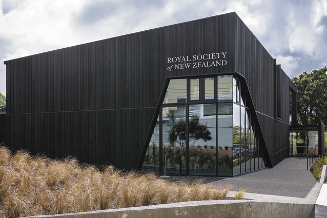
It is a fact worth considering that the Royal Society was formed in 1660. That year a group of notable physicians and natural philosophers at Oxford began meeting weekly to discuss science and conduct experiments (or at least that’s what they told their wives). 1660: fully a century before Cook claimed Aotearoa as British, almost two centuries before the Treaty of Waitangi was signed and, coincidentally, almost three centuries before we celebrated the centenary of the signing of the Treaty of Waitangi. Joseph Banks was already a member of the Royal Society when he arrived on these shores as the official botanist of Cook’s First Voyage, and it is after him that such local features as River Banks, Aussie Banks and John Banks are named. Of those buildings he encountered here, Sir Joseph was less than scientific in description, writing in his journal that the houses he saw were barely the equal of an English dog kennel, so he made pictures of plants instead. Am I reaching too far to suggest that Studio Pacific Architecture’s design for the New Zealand branch of the Royal Society looks very much like the kennel in which one might find a large, black, post-colonial watchdog? Well, yes, probably.
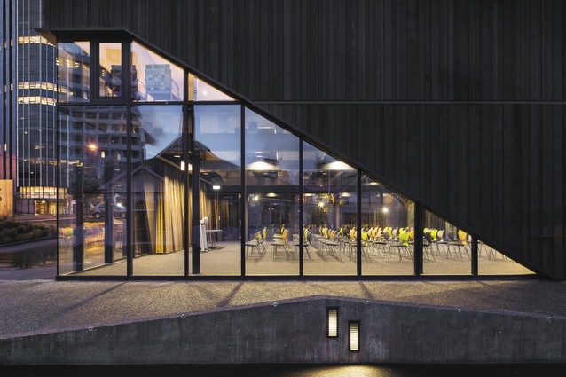
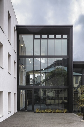
Studio Pacific secured this commission after winning an open competition in 2007. Originally envisaged as a significantly larger campus development involving commercial partners and heritage buildings, the global financial crickey dick downsized both ambitions and budget, stripping the brief so bare that the outcome, as architects Stephen McDougall and Simon Hardy confess, is very much a “working aesthetic”. Located on one of Wellington’s busiest commuter streets, it would have disappeared into the moribund fug that defines so much of this area’s ‘architecture’ if it had been anything less than staunch. It is a building that even the most jaundiced driver cannot ignore. Or, more accurately, it is two buildings, linked. To the fore is a dominant Black Box that holds conference facilities and at the rear it’s contrary, a White Box housing the Society’s administrative services. Between the two is what might best be described as a glazed linking foyer.

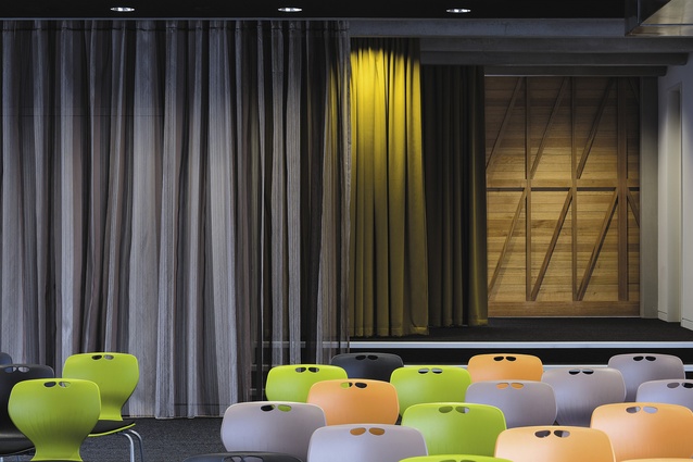
The Black Box is very much the front face to the White Box’s back of house. Dark and brooding, it demands attention in a manner that scientists are seldom known to do. The initial concept idea was taken from a Polynesian stick navigation chart – which, roughly speaking, looks a bit like a torn screen door – in order to reflect alternative expressions of knowledge. You probably won’t guess that to look at the result, which only goes to illustrate how meaning can shift between intention and interpretation. I found it impossible not to think of the Black Box as being, you know, a ‘black box’. Metaphors of the unknown seem inevitable, given the client, and apt too. Apertures and lines of sight carry this imagery further with hints of vision, insight, illumination and clarity being equally inevitable. However, the ‘what you see is what you get’ ethos is let down by details, or lack thereof. For instance, in keeping with multi-purpose requirements, the main conference room is non-specific about where animated discussion might suddenly spring. The risk of it becoming a dreary, arbitrary shell is alleviated by opening up the walls to a small courtyard and curtains allow the space to be easily modified. Unfortunately, the exposed precast ‘T’ beams provide little fat to hide servicing. Cabling is disguised behind flush boxes carefully recessed between the beams but the ducting dangles into the space like brass you-know-whats on a warm monkey.
The same inside/outside disappointment is evident with the White Box. Originally a drab, concrete block of two levels, the architects have perched a third floor on top. The window reveals have been increased and a white render over additional insulation has produced a well-proportioned and modulated façade of which Adolf Loos would have approved. Inside, it still looks like what it is: a highly bureaucratic office saved from Dilbertian destiny by the architect’s insistence on a ring-road between desks and walls.
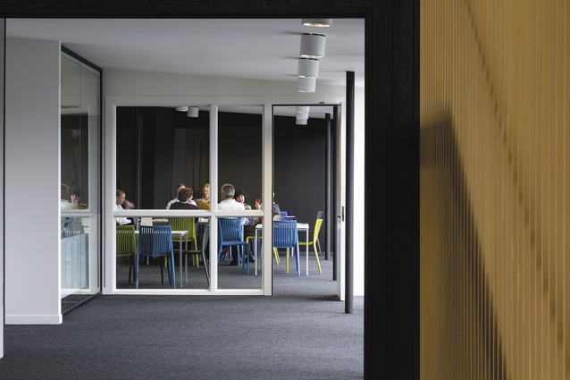
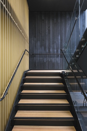
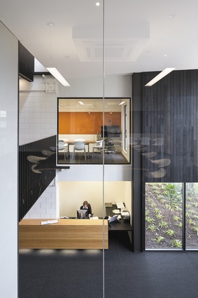
The best spatial experience is found in the between space of the foyer. The site has been shaped to bring arrivals off the public thoroughfare, through a transition entry and into a dramatic volume visually linked to both boxes. Double heights, vertical egress (stairs, to those of you who are not modernists), formal transitions and material changes: old tricks but not cheap tricks and done well (as they are here) they are still the best we have to offer. An example of what is sure to be a popular architectural feature in the next few decades is the visible articulation of the earthquake structure: in this case, the horizontal steel strip that acts as a bandaid to the White Wing and the over-scaled pin-jointed beam that redirects forces to the Black Wing, quite literally laying out the ‘science dimension’ of the building for psychological comfort. Still to come is a huge cubic chandelier (echoes of the colonial grid there, I fear) and, already, a popular part of the furnishing is the Nick Radford felted pelt that coats the lift. If it had been up to the architects, more gestures of that kind would be on display. But it isn’t usually up to the architects to know when to stop. Usually it’s the budget and so architects innovate. Case in point, from the Black Box staffroom, Studio Pacific has widened the fire-exit pathway to become a quasi-terrace stair leading down to an informal garden courtyard. It is a perfectly legal and inspired interpretation of fire regulations, let down in the detail by the poor finishing of banal materials. A petty point, I’ll admit, but one which highlights the risks of building in a country still fresh enough that it needs to battle for small architectural victories. But then, how often does an architect in Aotearoa have a client which is older than New Zealand?

