Ruffle your tail feathers
An historic hotel in Auckland has its nest re-feathered in a uniquely New Zealand way.
‘Absolutely no white’ was a key directive from the client to Material Creative and Ellery Muir & Associates when they took on the refurbishment of Naumi Hotel. Not a small ask when you consider the vast, iconic hotel (originally the Grand Chancellor Hotel Auckland Airport) has over 200 suites, four conference rooms, lounge, bar, restaurant and a plethora of circulation spaces.
But the unique directive is indicative of the client’s propensity to push the envelope – and perhaps of his wicked sense of humour – also charmingly evident in the redesign of the space. The Singapore-based operator also wanted the hotel to have a boutique feel in contrast to its grand proportions, have a uniquely Kiwi sensibility and, last but not least, to operate for the duration of the refurbishment.
Material Creative’s Liv Harper found the client’s dictums, while challenging, gave the freedom to make a unique aesthetic statement, one that avoided clichés and catered to a new niche market. “He really wanted everything to be fun and unexpected and not something you would find in a normal hotel. They are looking at a younger clientele than they currently have – they want to appeal to young travellers and business people.”
The conceptual inspiration for the new space was chanced upon – the tui – for its somewhat unremarkable first impression that belies the symphony of layered jewel tones of the feathers beneath. “They form a gradient from the top of the bird to the bottom; we used this as a progressive gradient of colour from the entry through to each room.”
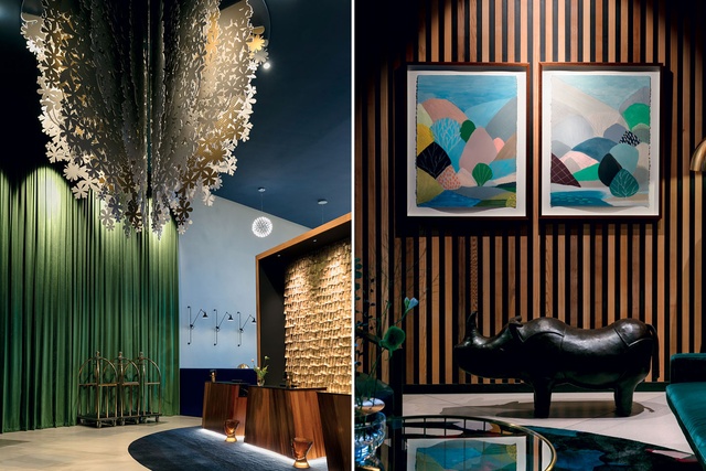
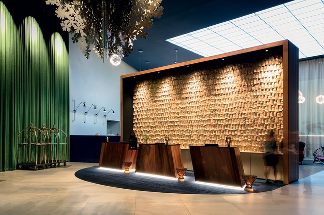
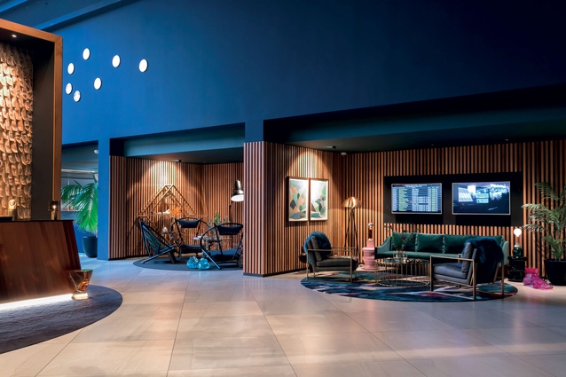
In the entry and reception space, a hint of the rich layering of emerald greens, jewel blues and magenta splashes are first encountered. The backdrop is an impressive welcoming salute – a double height wall with layers of fire-rated canvas strips painted with 24-carat gold leaf, representing the feathers of the tui.
Fire-rating issues, as well as bringing the services up to code, were key challenges of the project. Ellery Muir Associates was tasked with re-planning the common areas and took on the structural and layout aspects of the refurbishment. As the old building had evolved over time with different blocks built in the 1950s, 1980s and 1990s there was a vast amount of upgrading required.
It was, however, an essential evil in order to reconfigure and maximise the potential of the space, and Muir says the client (who operates a number of boutique hotels in Singapore) was “very ambitious with their design – they’re not your normal beige hotel operator.”
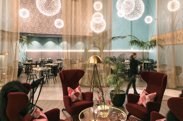
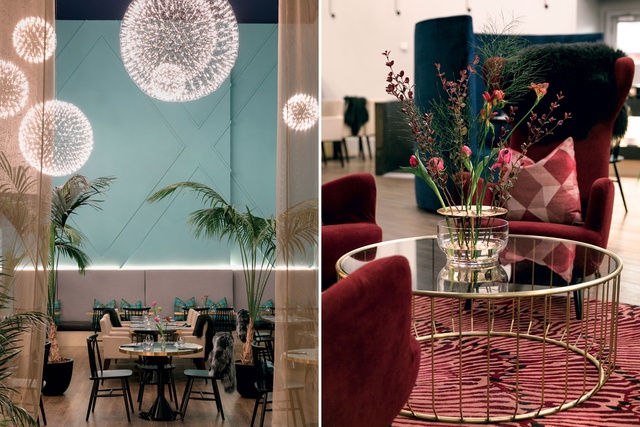
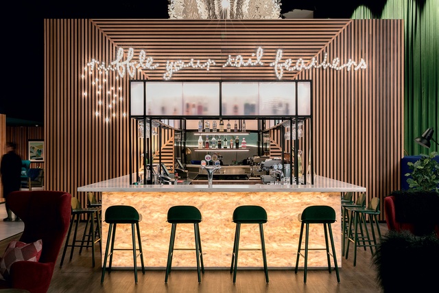
Beyond the reception area, the bar and restaurant are at the heart of the hotel and make an equally bold impact. The light feature singing ‘ruffle your tail feather’ above the bar is an invitation to guests to come and socialise, rather than stay hidden in their rooms.
Lush, oversized armchairs and bespoke floor rugs in circular patterns soften any hard edges, and firework chandeliers imbue a sense of excitement and occasion. Oversized lamps and sculptures create a sense of the absurd, while soft, textured furnishings envelope the guest.
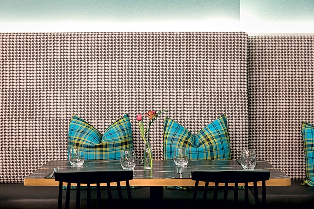
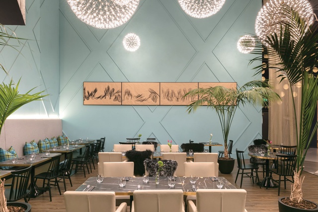
The restaurant appeals in the same way. The application of layers and textures both imitate the tui’s splendid plumage and creates an ambience of elegance, conviviality and fun. An ink artwork depicting the tui’s song by New Zealand artist Judi Bagust elegantly punctuates the space.

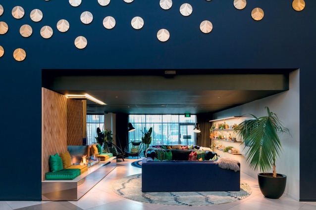
In the lounge room, the boundaries of colour and pattern have been explored. The shelves are filled with sculptural pieces and books; the impressive gold mirrored fireplace, the large jewel-toned sofas and the unique luxury fabrics all “fit within our story,” says Harper. “Everything’s a bit oversized in the hotel – we want people to feel enveloped.”
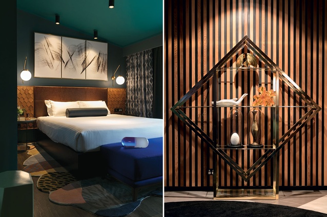
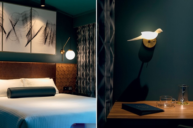
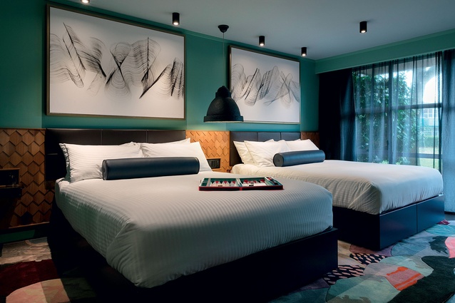
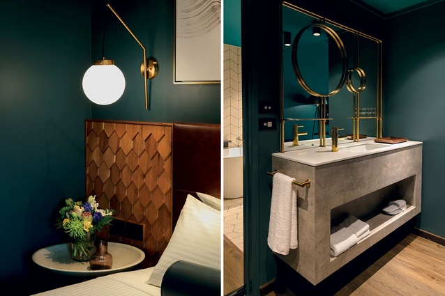
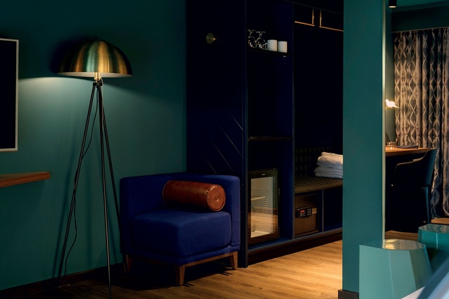
The suites take the embrace of the hotel’s social spaces but pare it back several notches, to avoid over-stimulation. In four colour-ways, the key here was to create a sense of uniqueness in each one, so that the guests feel as if they are in a boutique, personal space.

To achieve the personal tone, bespoke elements were important and numerous. Australian landscape artist Belynda Henry was commissioned to create four artworks that represent New Zealand landscapes – these images were then scanned and clear-cut and made into rugs for the suites. Judi Bagust’s birdsong artworks sit nicely alongside the landscape imagery.
The bespoke bedheads employ a layered timber shingle effect that imitates the layered feathers of the tui, and this motif is extended through to the tiling in the ensuites – a cream bespoke tile that is the closest the designers ever came to using white in the hotel. Naturally, the grouting wasn’t going to be neutral either; it comes in four jewel-tones across the four room types – a chance to give a nod to the owner’s quirky sense of fun.

