Sandringham upgrades
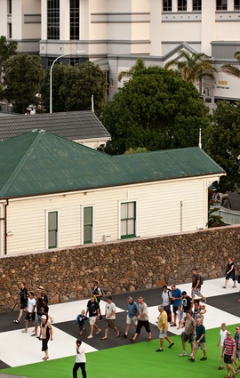
The vivid green of Billy Apple's golden ratio-derived streetscape artworks may not be to everyone's taste but its unarguably daring, eye catching and fun. Apple collaborated with Opus Consultants on these recent upgrades to the Sandringham streetscape.
Art is polarising – sometimes; you either love it or hate it. And I think it’s meant to be that way. It isn’t necessarily about creating something ‘nice’ to look at it, sometimes it’s about creating something thought provoking, something to talk about, and something, for better or worse, that’s memorable. For the Auckland Panel for Public Art (APPA, an external group that works with the public art manager on all the city’s public art projects) it’s also about finding the right public art to go in the right place. Hence Terry Stringer’s Mountain Fountain has vacated Aotea Square for a more suitable home at the Holy Trinity, Parnell and, in Kingsland, there are now two new Billy Apple artworks that are really well integrated with the landscape – mostly because they are, literally, the landscape.
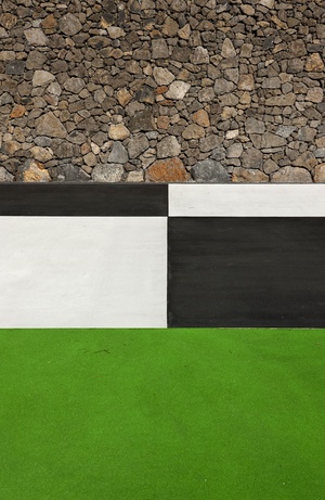
Three artistic concepts were submitted to APPA for this Sandringham upgrade project but Apple’s was the only one that used a landscape material – colored concrete paving – as an expression of his art.
The flurry of activity in this suburb, and other’s around the country, is of course rugby related. Opus International was the lead consultant on a number of upgrades to the area, although not to the stadium environs. Architect Stefan Geelan led the charge on Kingsland station, opened mid-2010, widening and lengthening both platforms, and designing a new pedestrian underpass that now links the northern platform to Sandringham Road.
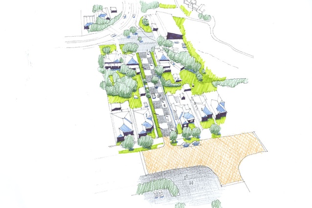
Landscape architect Terry Palethorpe led the process on the improvements to Sandringham Road and Walters Road, working with Apple on the endearingly named linking lane Wairepo Swamp Walk (that’ll get the visitors excited…) and The Corner Post, a pocket park slash artwork replete with, literally, a corner post. The overarching idea behind the improvements was not just to provide memorable artworks, but to improve access to the stadium for train commuters and the many thousands predicted to make the 4.2km trek from the CBD to Eden Park by foot.
Palethorpe says that a precursor to Opus’s original assessment, presented twice in 2009 was a “walking study” that identified the best route for foot traffic from Queen St to the park. He says that this identified that public transport would be able to cater for many visitors, but not all. Eventually, the route was defined – Queen St, Great North Road, Bond St – and then “…a link lane then became a very obvious shortcut to Eden Park.”
So far, simple enough, however, creating the lane required the removal of two council-owned houses to create room for the lane. Other houses on Sandringham Road also required moving, some 7-8m back on their sections, to create additional room for the improvements to the streetscape. Those houses were realigned to better connect with the street, but also completely renovated inside and out, and given with new stone fences and plantings.
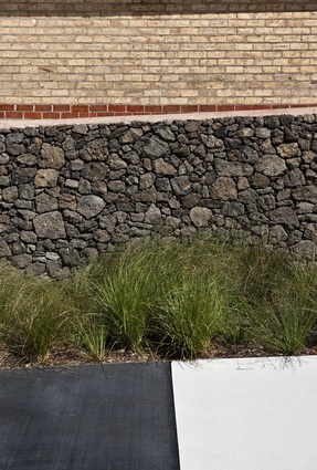
Another Opus landscape architect, Carol-Lynn Kerrigan, also undertook a heritage study in the area, looking at the pre-existing materiality, including facades and street frontages. From that study, basalt was identified as the best boundary material for street frontages, and Apple was in agreement that it was also the best backdrop to the artworks.
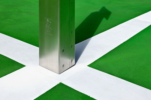
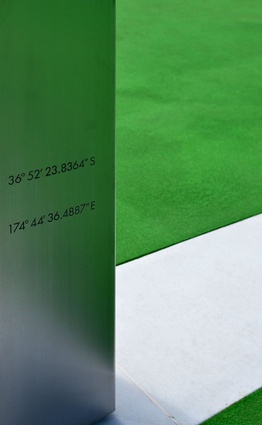
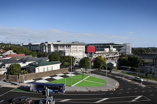
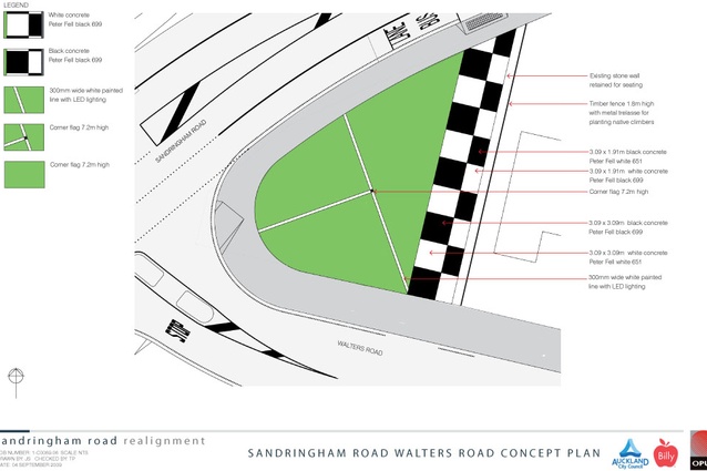
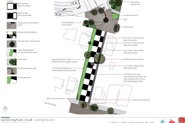
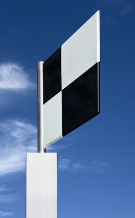
Let’s split the project in two. The Corner Post, on the corner of Walters and Sandringham Roads, is a fresh green and chequered (black for rugby; white for cricket) space devised around the Golden Ratio. With its 4m flagpole it’s an unmissable navigation device for commuters and pedestrians. Aside from the art, this was, says Palethorpe, an opportunity to create a small people gathering space: “The design of the space was integral to how people flowed from the platforms through to through to Eden Park; The Corner Post lines up with one of the Eden Park gateways in almost a direct line from the end of the platform through the space to Eden Park.”
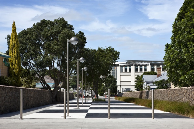
Wairepo Swamp Walk is one of Auckland’s first “shared spaces”, and it’s also distinctive for its chequered colored-concrete surface (it’s concrete covered with Synthite – a recycled pigmented glass surface that is skid-resistant and treated to be stain-resistant as well). Technical site challenges included a fairly steep grade of about a metre and remedying the flooding that used to occur. Two-thirds of the catchments were taken away and put back to ground water. Rain gardens and swales are low-impact design features included in the design; water is collected at the top, directed through the swales and picked up at the bottom. Despite the houses being moved off the Swamp Walk site, the landscape architects looked to retain any mature trees, managing to keep all the trees on the plan. “When we first looked at the site there were houses on there but we identified a pohutukawa on the side and there’s a titoki right in the middle that was pretty much on the border between the two sections. We felt that if we could keep those trees that would have a big impact in terms of keeping the character of the area, of reducing the scale of the space, and also as a traffic-calming device. Early on it was picked up that this could be a shared space, which meant getting rid of kerbs and signs and normal indicators, but you still want vehicles to slow down and retaining a tree right in the middle of the space is a pretty clear signal,” says Palethorpe.
One of the other technical challenges included getting everything on one plane for the artist, which meant dealing with the roots of a tree that were about 500mm in the air (“the arborist wouldn’t let us touch them”). The roots were eventually trimmed to 200mm. That tree was protected and looked after throughout the summer with extra water. “It’s a survivor,” says Palethorpe. A strata soil cell system was also trialled on the walk.
So, does the artwork fit with the idea of shared space? Palethorpe thinks it’s compatible with shared space, in that it makes the driver see that this is not a normal road. It’s something entirely different.
These two new pieces join another Apple artwork in the vicinity: the stairs joining Onslow Road to George Street (see John Hurrell’s report, following page) – another project that come the Rugby World Cup, will help direct the flow of foot traffic in the right direction.

