Sense of place: Ōtāhuhu Train Station
Designed by Jasmax, Ōtāhuhu’s new train station delivers a rich, multi-layered experience, as well as a sense of our place in the South Pacific.
There are a few explanations for the name Ōtāhuhu – the one I like is ‘the place of the ridgepole’. This is the narrowest part of the country and, consequently, was a crucial portage for Māori moving between Waitematā and Manukau harbours.
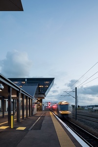
The name Ōtāhuhu seems to me a pun on the appearance of a portaged waka being carried by a group of Māori, resembling a ridgepole being held up by a row of posts. This skinniest part of New Zealand, a narrow neck below Auckland’s biggest and busiest city, remains a bit of a traffic nightmare and is a key to solving our difficulties as we move into a more public transport-oriented future.
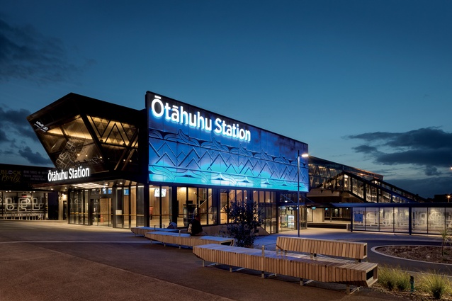
The new interchange, designed by Jasmax, is more than a piece of infrastructure: it is a public sculpture, not least because it incorporates artworks and landscape into the overall design. It aims to give a sense of context and place, history and culture, in addition to its primary concern with helping you take the train or bus.
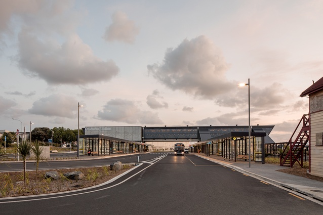
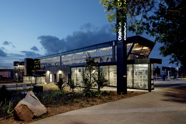
From a distance the structure is long and grey, bridge-like and pointed at each end, conceptually evoking a waka, aligned east-west along the portage route. As you move closer, you will see a number of boulders with trails scored across the footpath as if flung there by volcanic eruption.
However, these are carefully placed and incised with names, pointing to several maunga (mountains) in the area. This is a way of both recovering knowledge of a cultural landscape as well as of orientating yourself environmentally in a brownfield site of roaring trucks, stacked containers and factories.
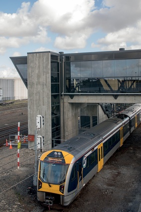
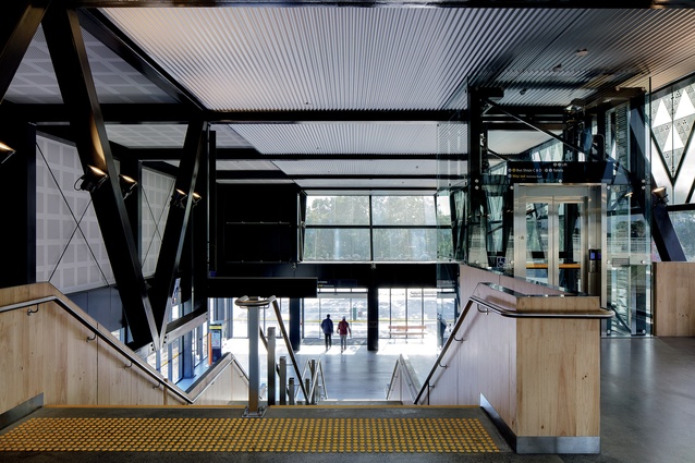
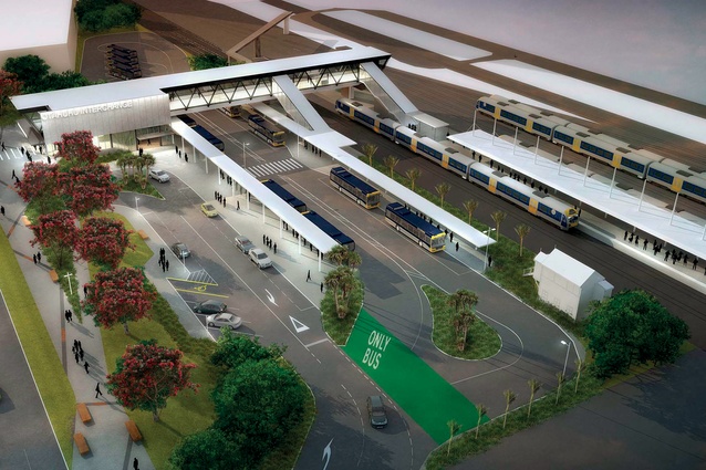
The building itself has a ground-level entrance and lobby before rising to create an elevated concourse linking platforms together with an existing pedestrian overbridge to the Mãngere side of the tracks. It is wonderfully simple in its layout to allow easy and efficient use for first-time users or crowds at peak times. Staff facilities and other ancillary spaces are unobtrusively tucked into a low concrete structure to one side and this could be further developed as a customer service space in the future.
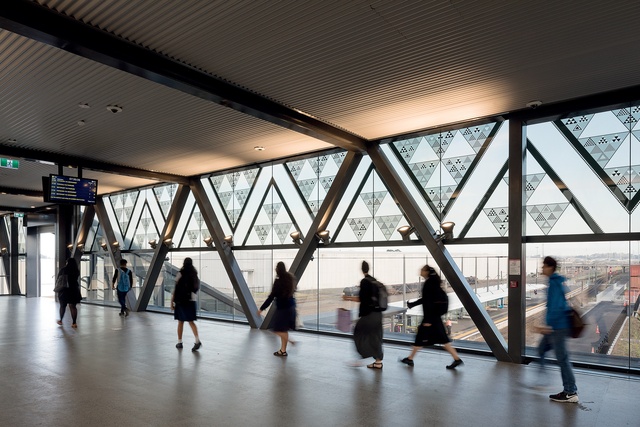
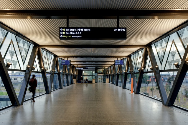
The new building’s bridge form allows clear separation of people and vehicles, and links the railway platforms with new bus platforms, all under cover. This also enables a welcome peek of distant harbour and a few of those maunga. This bridge involves a bit of going-up-to-go-down but this is something we are used to at railway stations. There is also cycle parking and there is a drop-off area for vehicles, although there is no park-and-ride facility because cars are evil, except those driven by staff – they get car parks, the hoi polloi don’t.
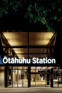
The buses have been moved here from the town centre and that is a bit contentious too, but the aim is to get people used to taking the train rather than bussing into town. Another project plans to improve bike and pedestrian links from the station to the town centre.
A number of commissioned artworks are woven into the structure of the building and a video screen in the lobby runs you through a short presentation on the concept of the building and the meaning of each work. But they are so well integrated that – like a wharenui (communal house) – the art and the building become as one. This is much better than the ‘pin the koru on the tail’ approach that you see in many other public buildings.
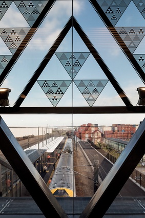
Some of these artworks also emphasise significant moments in a building to Māori, such as a waharoa (welcoming gateway) or the paepae (threshold). The bridge part of the building is a pair of great trusses, triangulated like a Bailey bridge, and one of the most effective artworks utilises this architectonic element in a rhythmic pattern that both evokes the rolling waves of oceanic pathways and flowing tides and also represents the interlinking nature of whānau, hapū, and iwi. Handily it has a solar shading function as well.

Many of the artworks have this sense of navigation, movement and orientation running through them, combined with references to the iwi who call this area home and contributed to the project. A couple of the works also extend the metaphor of the building as waka: white rango (cylindrical) paving inlays refer to rollers that slid portaging canoes across the ground, and pūhoro (tattoo) on the pre-cast concrete relate to carvings on the underside of waka to make them move faster.
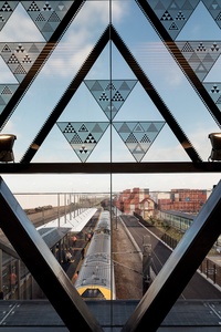
This latter is an element that Auckland’s trains could probably benefit from as well. And, in a nod to more recent history, the old station’s signal box has been retained, moved from the centre of the tracks to one side.
Ōtāhuhu Station is a rich and multi-layered experience that delivers a sense of our place in the South Pacific. It is one of the best of the infrastructural buildings that we have been blessed with over the past few years which have seen public transport taken seriously and not remain the poor cousin of the car. There are lots of good reasons to visit this place, not least to take the train.
(Disclaimer: Bill McKay with Warren Viscoe designed a public sculpture on another portage site in New Lynn, a few years ago. It is also long, grey, pointy and waka-like, not that this has influenced his positive review in any way.)

