Sensory sanctum: Garden Pavilion
This new extension by BLOXAS is a private garden sanctuary in more ways than one, as an escape from modern city life and as a place of retreat for a client who suffers from a chronic sleep disorder.
Updating Australia’s housing stock from anachronistic, compartmentalized boxes to shapes and models more suited to our climate and lifestyle is a major, if incremental, infrastructure project. Street by street, house by house, we’re creating stronger connections between indoor and outdoor areas, knocking down walls and blurring the boundaries between different rooms and spaces.
All it takes is a quick review of any edition of Houses to see that we’re getting pretty good at it. But every now and then, someone who wants something different comes along, or in the case of this house renovation in Melbourne’s inner north, someone who needs something different. The owners, a couple, did want an open living area connected to their garden, but they also required a separate place of sanctuary for one of them, who suffers from a chronic sleep disorder – a place away from noise, light and distraction.
For architect Anthony Clarke, director of Melbourne practice BLOXAS, the challenge at least initially was as much about research as about design, to understand the nature of the condition and, through conversation with his clients, to understand their specific lived experience.
Layered on top of this, of course, was the nature of the existing house (a classic Brunswick bungalow in brick, with a western orientation) and rear garden (a classic Brunswick hobby garden complete with a monumental olive tree and ancient but still very productive lemon tree), and a broader brief focused on improved amenity and, yes, greater connection between indoors and out.
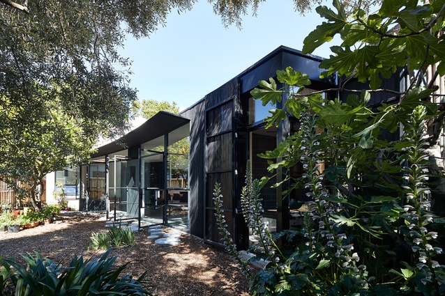
Anthony’s design response addressed this varied brief with sophisticated thinking yet simple, at times even deliberately low-tech, processes and solutions. A new structure has been appended to the rear of the house, running along the southern boundary to create a northern orientation for the new living/dining/kitchen space. The extension tapers to create a curved footprint that wraps around the edge of the garden, placing the olive tree and shady, bark-strewn ground beneath it at the heart of the home.
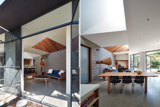
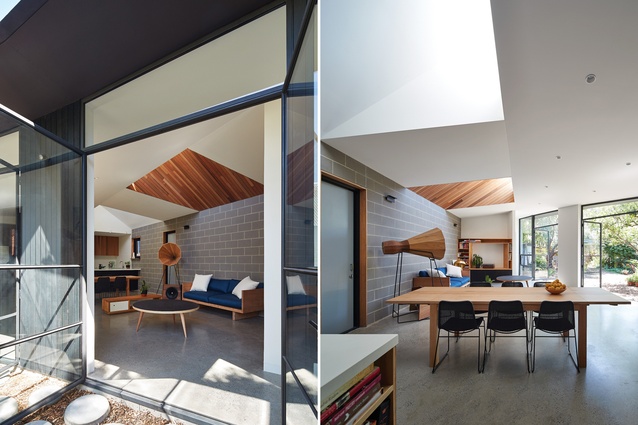
The interior materials palette is pared back and honest, with soft grey blockwork walls, polished concrete floors and white walls, so that the eye is drawn out to the garden. Roof pop-ups bring northern light deep inside the space, but also serve to delineate zones within the open-plan volume – one pop-up, painted white, over the dining table; the other, partially clad in timber, over the lounge area. The undulating ceiling height also creates a sense of airiness befitting the garden outlook.
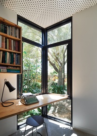
Make no mistake, this part of the house provides real sanctuary from modern city life, and is every bit as idyllic as the above description and photography make it out to be. It’s beautiful and tranquil. But the other part of the client brief required a wholly different kind of sanctuary. It is to be found at the far end of the extension, through a double set of doors with custom-designed seals that act as a kind of airlock between the two distinct realms of the house.
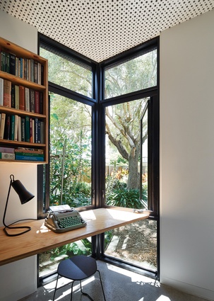
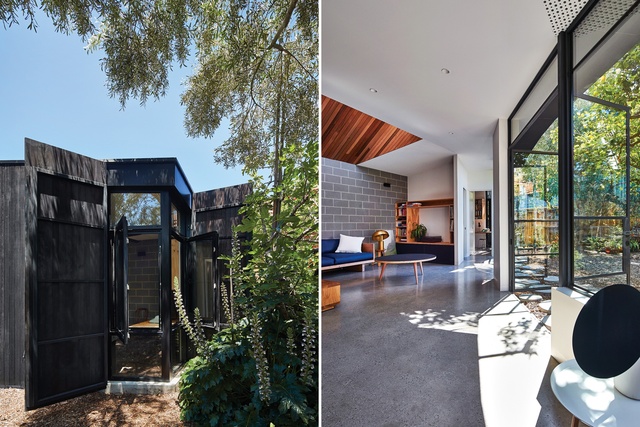
The room is a combined home office and bedroom, with integrated desks and a sleeping platform and, like the living space, a beautiful garden outlook. However, unlike the living space, this room can be shut down completely. With shutters pulled tight over the windows and manually clipped in place with tarp straps and carabiner hooks, and the two internal doors closed, sensory distraction is almost completely nullified. Thanks to acoustic panelling on the ceiling, even noises generated within the small room are suppressed.
There’s something quiet about the exterior of the new extension too – the way it seems to sit in the backyard, not as a hard structure in opposition to the natural surroundings, but as an element of the garden. This is largely due to the organic curve of its facade, but also to its timber cladding, which has been charred following the traditional Japanese wood-preserving technique of shou sugi ban. The blackened timber recedes into the shade of the olive tree, its unrefined texture appearing, if not quite like the bark of a tree, then the walls of a treehouse (an impression supported by the design of the window shutters to the sanctuary room).
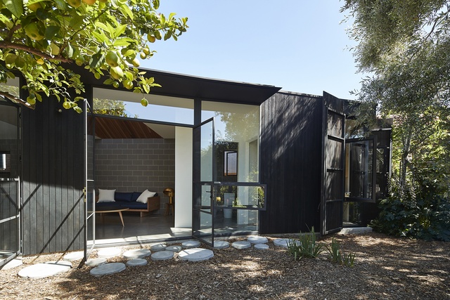
Despite handing the house over to the clients some months ago, Anthony still considers this to be a live project. He’s still collaborating with the owners, gathering feedback on the building’s performance and making tweaks to optimize the lived experience, both within the sanctuary room and throughout the house.
This ongoing process dovetails nicely with the clients’ approach to their garden, which will always be a work in progress, with new plants being brought in, pots moved into new positions, and olives and lemons harvested. But it’s also exposed a new and intriguing area of interest for the architect – designing projects for clients with specific and unique personal requirements. Seeing the impact of this house on its owners, the appeal is obvious. For those who wonder if architecture can really change people’s lives, the answer is “yes.”
This article was first published in ArchitectureAU.com.

