Shack in a tent: Apollo Bay House
This addition to a Bruny Island bush shack by Dock4 cleverly exaggerates the existing roof form to create volume, drama and a dialogue with the surrounding landscape.
The client for this holiday house in Apollo Bay, on Bruny Island, handed Dock4 Architects an interesting challenge. Having bought a sloping, north-facing property overlooking the bay, the client insisted on re-using and extending a small existing two-bedroom shack. Apart from this, the brief was simple. Pragmatically, the client wanted a four-bedroom house. Aesthetically, he wanted to ensure that views from the dwelling focused on Mount Wellington and the bays and bushy headlands along the edge of the Derwent River.
With Richard Loney as the lead architect, Dock4 took a relatively unusual approach to the existing building, seeing it as the warm, enclosed service core at the centre of a built “tent.” Richard also felt that the way this holiday house connects with its surrounds could be a refreshing contrast to the family’s inner-city Melbourne life.
Apollo Bay is on the west side of Bruny Island, located a short drive from the ferry dock. This site sits on the north face of the headland, which forms the edge of Apollo Bay, and is miraculously sheltered from the fierce south-west and west winds, making it perfect for opening out to the coastal bushland surrounding the house.

The existing shack was basic but structurally sound, with a gable roof running perpendicular to the coastal edge of the site and a deck to the north, overlooking the bay. Typical of a simple kit build, it had a quality of hovering on the site, with minimal excavation done to bed the building into the site.
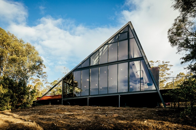
Dock4’s approach to this house can be characterized by three design moves. The first stretches the existing line of the roof upward to form a second storey. The second wraps a layered skin over the new A-line shape of the build and the third move draws living spaces down closer to the ground, allowing greater connection with adjacent bushland.

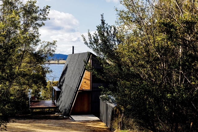
The irregular A-line of the new home continues the existing angle of the gable on the east, letting it rise up to second-storey level, then drop steeply down to the ground on the west. Choosing to clad much of the steep western side in triple-wall polycarbonate, Richard saw the new roof as a tent-like skin over the original building.
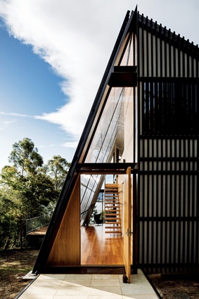
Layered over the translucent wall and also completing the A-line of the build around the home is a screen of solid timber battens. This more porous skin offers shade, privacy and enclosure, setting up a series of small, sheltered spaces that will eventually be planted out with shade-loving gardens.
All existing and new work on the external surfaces of the building is painted or finished in black, a colour that tends to sit well within the surrounding bush and reduce visibility of the building from a distance. This dark palette is complemented by low-reflectivity glass, which minimizes birdstrike and contributes to low visual impact for the remaining area.
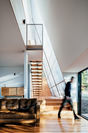
While the existing building still provides a semi-enclosed lounge, bathroom and guest bedroom, with standard ceiling heights, the A-line shape of the extended house forms a series of new, more dramatic spaces. When you open the large pivot entry door, your eye is drawn straight through the house to the view of Mount Wellington in the distance, the vista framed by the angled west wall.
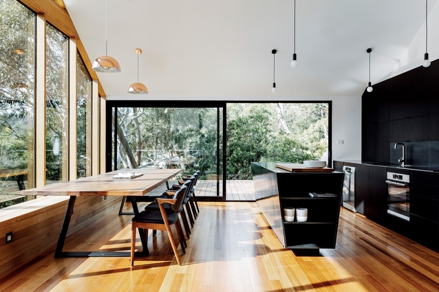
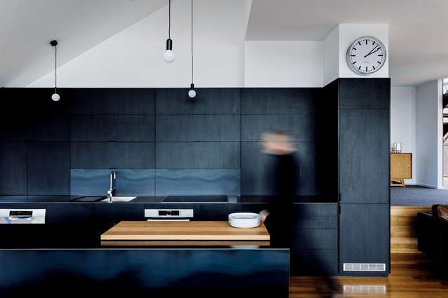
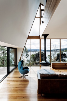
This light-filled, double-height space is a connective device for the whole home, providing direct access to each of the ground-level spaces and also to the upper level via an open timber stair. Dropping down several steps below the existing floor level, the new open-plan living, dining and kitchen space, at the northernmost end of the building, enjoys the full double-height ceiling and a closer relationship to the external landscape, with sliding doors opening to west and east decks.

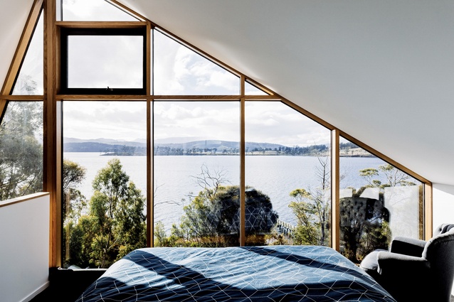
Occupants of the main bedroom, which sits above the open-plan living spaces, can also enjoy the framing of the building’s new angles against that sublime view of the river and mountain beyond.
While I’m still curious about what the architects might have done with a free rein on this wonderful site – perhaps a building nestled more into the slope? – the design that Dock4 developed within the constraints of the brief is interesting and unique.
The steep sides of the extended home frame the view both from within and from outside the home and bounce light throughout the whole volume. The integrated components of the existing house do their job as places to retreat when night falls or the weather closes in and the new sections of the home allow for direct visual or physical connections to the surrounding landscape, particularly the open-plan living space, where large sliding doors allow the indoors to merge a little with the spectacular outdoors.
This article first appeared on architectureau.com.

