Shadows of heritage: Elgin Street Residence
Bespoke detailing, clever manipulation of a small space and a good choice of materials make this terrace house renovation by Sonelo Design Studio feel luxurious rather than budget-constrained.
You could say that Elgin Street Residence is Sonelo Design Studio’s first architecture project, but co-founder Wilson Tang spent nine years at Inarc Architects honing his residential design skills, so really it’s his latest house design, the first under his own brand. This project had some significant differences from the high-end residential work that Wilson was used to at Inarc Architects, not least being the relatively constrained budget.
On launching Sonelo with architect and life partner Elodie Lim, Wilson says, “One of the biggest challenges was starting from scratch,” explaining that they had to “reinvent and relearn details” to fit smaller budgets (the duo completed two interiors before this project).
The small floor area of the Elgin Street Residence was another novel challenge – the existing block measures just 104 square metres. In small spaces everything has to work harder, perform multiple purposes. Fine details loom larger.
The cultural heritage of the clients subtly influences this reworking of a nineteenth-century row house in Melbourne’s Carlton. The fulltime occupant of the house is the young adult son of an Indonesian couple, and for a few weeks each year the extended family comes from Indonesia to stay.
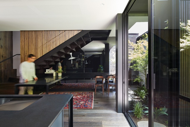
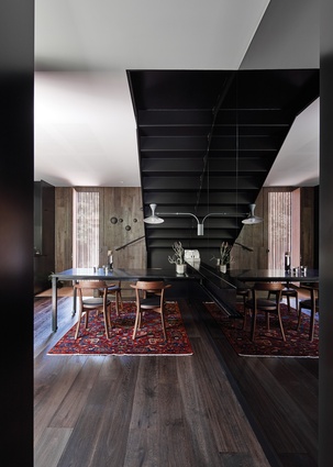
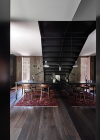
Indonesians have a social custom of leaving shoes at the door and sitting on the floor, “the coolest part of the house,” explains Wilson. The client’s after-dinner ritual of lounging with his guests on the floor is facilitated by a built-in dining table on a sliding track that can be effortlessly pushed out of the way to create more floor space.
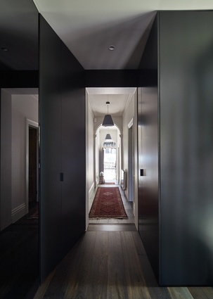
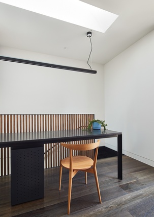
Renovations to the existing house include a new timber floor and spaces finished in white. Internal walls are thickened with the insertion of floor-to-ceiling storage, making the door thresholds wide. Sonelo fitted out the existing front two rooms identically, as bedrooms, but in the end the family chose to use the one facing the courtyard as a lounge room instead. The son benefits from this arrangement – his bedroom takes over what was intended as the upstairs lounge, complete with a north-facing window, a study desk and a generous bathroom.
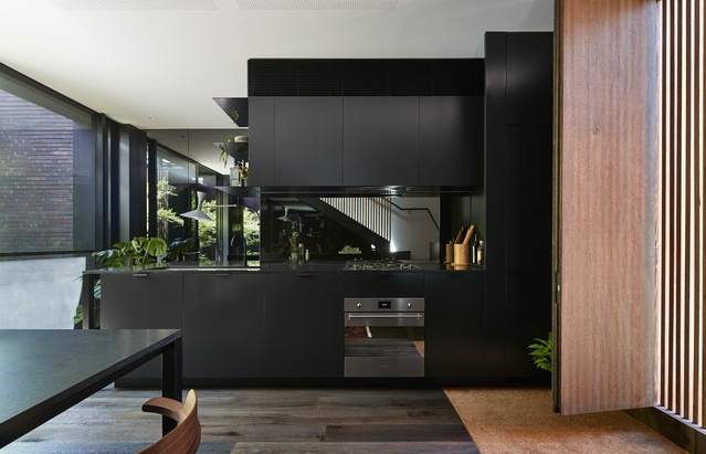
The transition to the addition is marked by a change in wall colour, from light to dark. A black-painted, thickened door surround is an element that navigates the addition’s lower ceiling height (heritage controls required that the new parts not be too visible from the street – Sonelo accordingly compressed the ceilings to 2.7 metres).

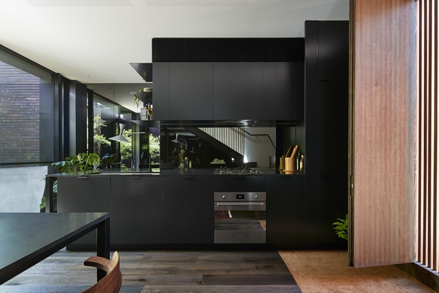
Black may seem an odd choice for a small space, but shadowy tones are a familiar theme in Indonesia. It makes sense in hot climates – it is the shade that is sought after, not the sunshine. Steel joinery is painted black, table and bench surfaces made from slabs of black granite. Mirror-lined walls and kitchen splashback extend the visual depth of the space, the “infinite reflection” effect made subtle by dark tinted glass.
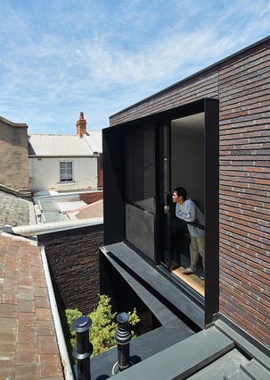
In a built-up area like Carlton, privacy and overlooking issues can easily become constraints. In this house, apart from the front bedroom, there are no views to the street. External black steel window surrounds are tapered at odd angles, an elegant way to block overlooking of and from neighbours.
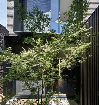
Very little winter sunlight penetrates the ground-level kitchen/dining space, due to a tall building across the street. The downstairs bathroom has no windows at all. An external door in the kitchen/dining space faces the laneway at the rear boundary, and is detailed with timber battens and a separate inner leaf that allows the breeze in but filters out views. There is a celebration of light and life in the courtyard, which has been planted to become a lush green space with views of the sky.
Other than the small courtyard, the whole site has been built on. “It was designed from the inside out,” says Wilson. In a dense and confined project like this one, the fine details become so important – they are what surround you, what you’re looking at. And it is in the fine grain, how one material meets another, that Sonelo really excels.
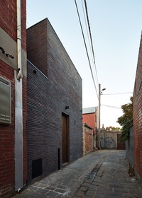
Even the choice of brick was carefully considered. External brick walls are visible from the external laneway facade, but also internally from the windows facing the courtyard. Broader and thinner than usual, Sonelo’s bricks are laid in a random pattern to mimic stacked stone, the horizontal grout recessed, exaggerating this dimension and de-emphasizing the vertical.
Such care was taken with the details that the spaces feel luxurious rather than budget-constrained. In the bespoke joinery and furniture, thin shadow line gaps separate steel from stone. A shelf in the kitchen is fabricated from near-impossibly thin steel, folded at the bottom shelf, and the other shelves invisibly welded. Is this the work of an architecture practice just starting out? It seems implausible. Not judging by these confident hands.
This article was first published in ArchitectureAU.com.

