Shapeshifter: Bronte House
Archer Office has used a series of interlinking indoor and outdoor spaces, adapting an existing terrace to feel “generous, considerate and creative.”

It’s part of the conundrum of designing housing in an existing urban context. Our protected building stock is charming, but tight. We want to expand the spatial capabilities of these early-twentieth-century terraces, semis and bungalows, and often the only way is up or down. We want to capture the breeze, squeeze in a rumpus room or maybe sneak a peek at a view. Regardless of the goal, the frame is set fast at the sides, and so almost inevitably the inner-city suburban alteration is seen as a portrait-format exercise – but not always.
The human field of vision is naturally set for wide-screen format, so rather than work against this, why not work towards it? When Liv Sutton and Heath Rolls engaged Archer Office to look at reconfiguring their semi in Bronte, a beachside suburb of Sydney, a sense of open space and connections to the rear garden were critical to the success of the venture.
Opening up the rear of the house as much as possible would be the typical response, but not necessarily the most successful one. Archer Office recognized this and sought to create a series of interlinked spaces from interior to exterior, eschewing a simplistic maximizing of big glass door area.
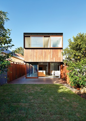
The way this was done was elegantly simple. Firstly, the front three rooms were kept and refurbished. Beyond that, the new work housing three new bedrooms upstairs is, in the architect’s words, “an elevated timber box.” Below the box, living spaces were allowed to stretch across the entire width of the site.
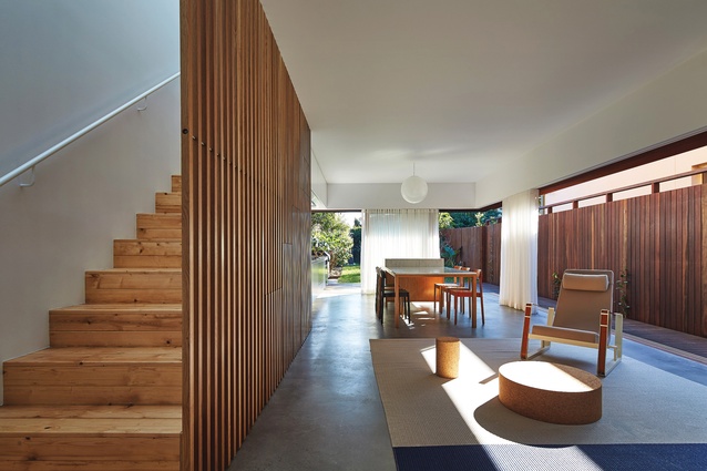
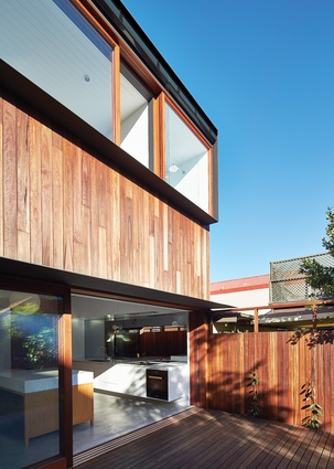
This allowed an “intimate datum” to be established across the ground floor, a set head height for all the new doors and windows that matches the height of the boundary fence and acts as a kind of picture rail around the new rooms. What this does is subtly shift everything into landscape format, although the height of the spaces is actually much higher than the datum. This frames views out the back and along the side of the living spaces in a slightly different way from what you would normally expect, seeming to draw the rear garden back towards the house.
The ground-floor spaces are fitted out with an elegant palette of concrete, marble and timber, with white-painted walls and ceilings, while four different timbers are used throughout the house. The original pine flooring works well with new oak joinery pieces and new pine flooring to the new staircase as well as on the upper floor. Spotted gum is used externally along the new fence screens and on the decking and building cladding, each surface ageing differently to create a gentle depth in the external envelope.
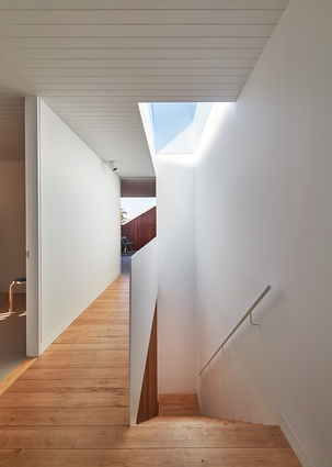
A white-lined staircase brings a soft light into the centre of the house, its timber balustrade screen providing a vertical tracery that edges the living room. Walking up the stairs, you notice that the entire stairwell is capped with glass, filtering daylight into these central spaces. The streak of blue sky combines with the white walls, ceiling boards and thin metal balustrade to give the upstairs areas a lightness that belies their modest dimensions.

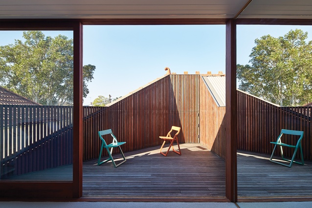
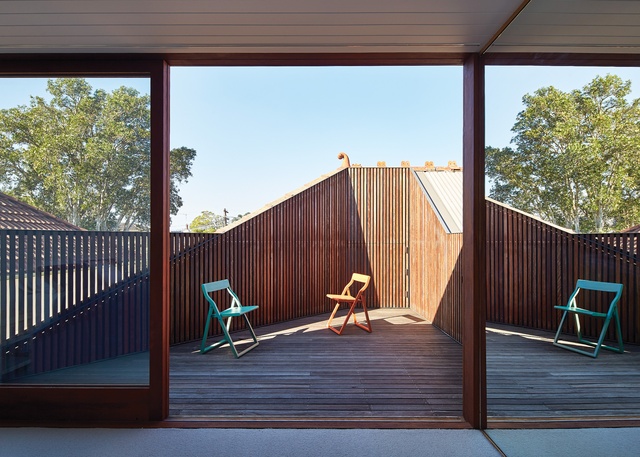
Recessive detailing accentuates the light in the house, so when you arrive at the top of the stairs in the gallery/hall space, what catches your eye is the gradations of light and shade across surfaces and edges. The diagonal line of the timber-lined deck carved into the back of the original terracotta roof form instantly stands out against the rectilinear forms used elsewhere, and lightens the edge of the house towards the front. It also creates a private outdoor space for the main bedroom, maximizing light and ventilation.
As with the downstairs space, the stretching out of the three new bedrooms along a gallery/stairwell makes these spaces feel more horizontally than vertically proportioned. They aren’t, but they seem to be, which does affect the way you feel both about and in this house. With the edges modified, whether by skylight, horizontal datum, deck space or garden, the house shapeshifts just a little.
These decisions about the way the edges are treated are what makes this house better than most. Rigorously considering each room – the surfaces, colours, textures and volumes – and then assembling them into a cohesive whole, Archer Office has put together a house that feels generous, considerate and creative.

