Shine a light
When life hands you a renovation, what do you do? If you’re Sarah Loutit, you go for broke. “I’m the kind of person who believes that if you’re going to make a change, you may as well make it the biggest change possible,” says the interior decorator of the Remuera home she shares with husband Bill and children Jack (9), Annabelle (6) and four-year-old Lily.
The couple bought the 1930s’ bungalow in October 2011, having admired its single-storey living, simple flow and 900m² section. A draughtsman was called in to translate the simple, ‘back of the envelope’ renovation they planned. But it soon became apparent that, while the plans captured the spaces and layout Loutit wanted, they didn’t make the architectural statement she was after.
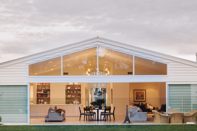
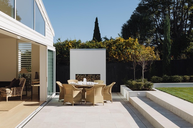
Enter David Ponting, design director of Ponting Fitzgerald, with whose work Loutit was familiar. Ponting suggested pushing out both the back and the front and adding a gabled roof that elevated the stud to 4.5m. “We wanted to reflect and expand upon the classicism of the established Remuera context,” says Ponting. “By creating a strong axial line, we were able to create a symmetry that everything else in the house hangs off.”
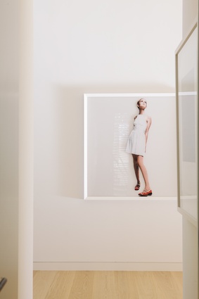
Key internal walls were moved to achieve a central axis, allowing for a 2.5m-wide hallway that provides gallery space for the couple’s extensive art collection, which includes works by Dick Frizzell, Michael Parekowhai and Karl Maughan. Ponting’s design also allows for a clear line of vision from the front door to the back garden.
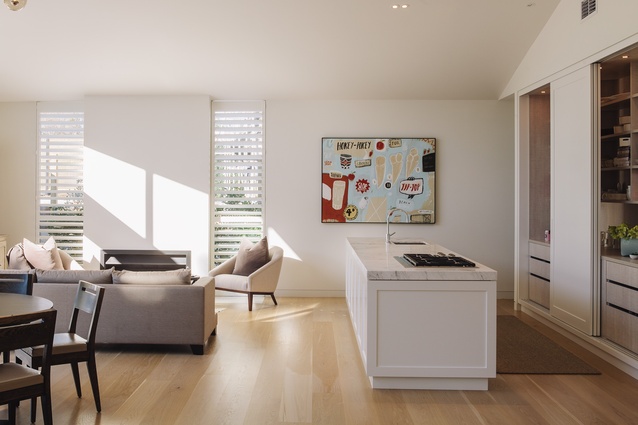
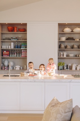
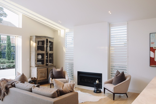
At the street level, the former laundry at the back was demolished and replaced with a generous open-plan kitchen, dining and living space (the site of the original kitchen was turned into a den). It was critical to Loutit that she created the perfect kitchen – or two kitchens, as it turned out. The first is what she jokingly calls the “show kitchen” and features a generous island and an extensive pantry concealed behind floor-to-ceiling sliding doors. The second is the beating heart of the home, a large, functional scullery that’s tucked behind the pantry. “I hate clutter so having the real working parts in the scullery – the appliances, fridge and so on – means the mess can be hidden away,” says Loutit, 42. Ponting agrees: “The scullery is an excellent solution for hiding the secret workings of an entertainer’s kitchen so the main space is kept as simple and elegant as is the adjacent living area. I’ve always pushed for these working zones when resolving open-plan environments because I like to see streamlined kitchens that integrate with architecture.”
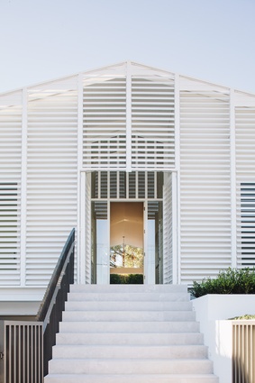
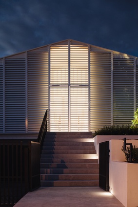
However, the change that literally stops traffic is the front gable of the house covered in fine-blade aluminium louvres custom-made by Locarno. “I wanted the front of the house to create a distinct statement by layering textures so that they allow light to play through and regenerate the true character of the previous form,” explains Ponting. “By using the wall of blades to softly manipulate light, the home reveals a sensitivity belying its bold contemporary form. In many respects, it extends the timeless, functional qualities of a ‘plantation’ aesthetic to better suit the urban context.” The imposing front grill is designed to completely close off, which Loutit likens to “shutting out the world. People call this the ‘louvre house’ and it’s definitely well known around here,” she laughs. “People often knock on the door to ask about it.”
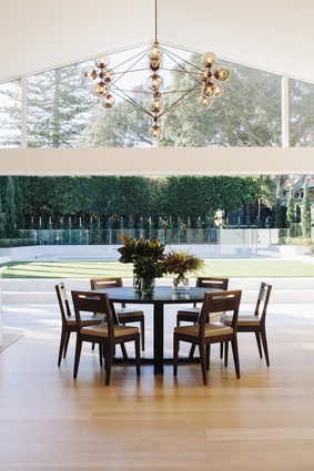
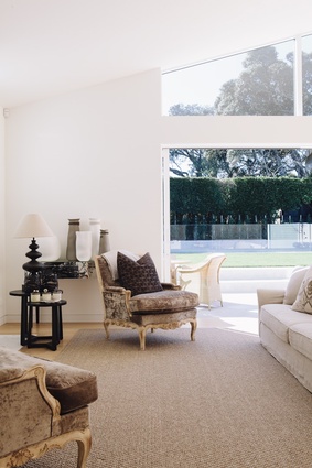
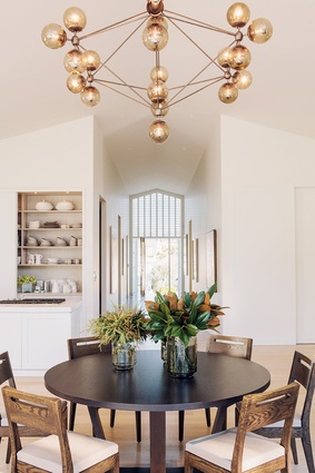
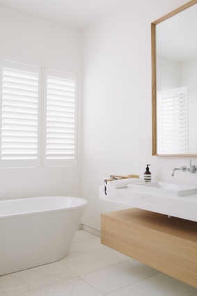
Surprisingly for a renovation of this scale, the project took only eight months to complete. Being in the industry helped, admits Loutit, as she was able to call upon contractors with whom she had worked previously, including builder Adrian Rowan of 505 Construction. And, unlike when working for interior-design clients, Loutit was able to decorate without any constraints. “When it’s your own home, you can do whatever you like,” she says. Hence the natural oak floors and liberal hand with white paint – and the striking Roll & Hill modern-vintage light designed by US designer Jason Miller that hangs above the dining-room table. Loutit found it online and had it sent to New Zealand from New York. “It took five months to arrive and a few weeks later I saw the same thing in the ECC Lighting catalogue!” she explains.
The house was completed at the end of 2012 and the family moved in as soon as the last nail had been hammered. “I underestimated how functional it would be; it literally blows me away,” says Loutit of Ponting’s design. “It works so well; it’s straightforward, uncomplicated and not trying to be too clever. It has simplified life for us in a way I didn’t anticipate. We’re very happy here – I think we’d find it hard to find anything else that suited us so well.”

