Simple strokes: Bethells Bach
Nestled into the sand dunes, this bach provides close communion with Auckland’s west coast and acts as a simplified expression of a strong architectural voice.
Located 30km north-west of Auckland, Bethells Beach is a small settlement on the city’s west coast. Black sand, implacable surf and native bush comprise the material palette of the area, which boasts the iconic settlements of Muriwai to the north and Piha and Karekare to the south.
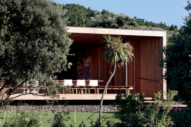
Inserted into this backdrop is a modest 150m2 bach – which includes two covered decks – designed by architects Lance and Nicky Herbst, the husband and wife team with an international reputation for blurring the line between the built and natural environments.

“We’ve been looking at ways in which we can produce a ‘Herbst’ bach but at a budget-friendly price point,” says Lance. “Usually, our baches are very focused on the detailing, with the structure very much exposed – such as you would see in Under Pohutukawa, GoGo Bach or Kaipara Pavilion as an example. To carry that off, the finish needs to be impeccable and the materials of a very high grade, which gets expensive.
“This project has been an exercise in simplification. The detailing is still evocative of our bach architecture in the sense that we have tried to do something relatively simple, yet formally beautiful. In that way, it is very much in keeping with our oeuvre – however, much of the structural detailing has been covered up.”
Obviously material choice will impact on building costs, as will the complexity of the design. With that in mind, Bethells Bach features a much-pared-back form.
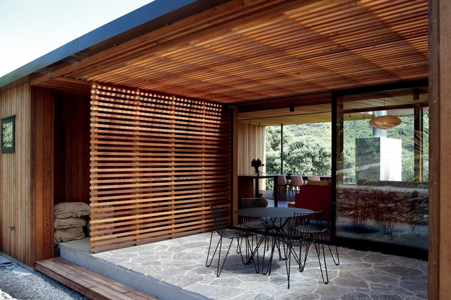
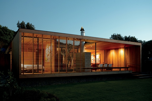
“At first glance the bach simply reads as four walls and a roof,” says project architect Andre Fourie. “On closer inspection you begin to notice the subtleties – what appears to be an outside space is actually contained within the structure’s envelope while an internally accessible space is, in fact, exposed to the elements. It is touches like these that lend the building its own architectural credence.”
Nicky Herbst agrees: “With this project we’ve started with a traditional, static form and have ended up breaking the cube; there’s a surprising amount of movement – from the high-stud ceiling at the front of the bach which slopes down towards the back, to the angled wall which echoes the angle of the ceiling pitch and draws people up the stairs and into the interior of the bach.
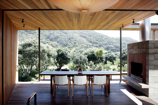
“There is no wasted space – corridors have been eliminated and there is no internal dining space. The layout encourages you to do things outside. The various types of decks create indoor spaces outside and vice versa, which has then been visually reinforced through the repeated use of materials.”
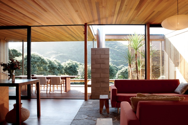
“The mono-pitched roof was one of those cost-effective considerations and yet the finished result has worked out better than we envisioned initially,” adds Lance. “At first it was seen as a compromise but it has actually really opened up the interior to the natural environment so that you end up with one entire wall of glazing providing an unobstructed view outside.”
It also meant that the architects were able to do away with cumbersome elements such as a front door, instead using visual cues – the angled wall – as wayfinding devices, which, together with the indoor-outdoor/outdoor-indoor aspect, imbues the bach with a relaxed feel.

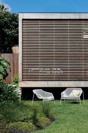
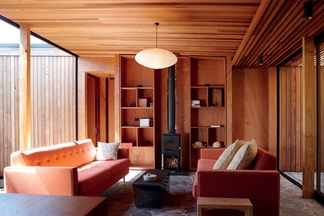
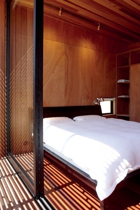
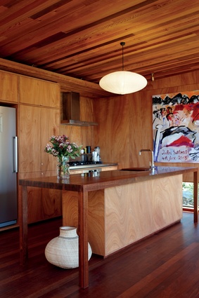
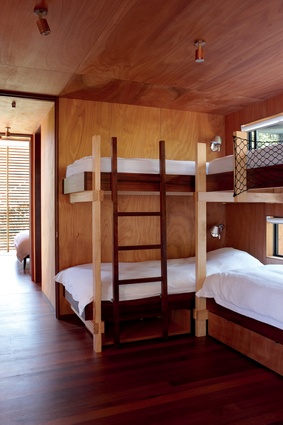
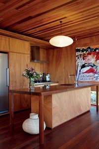
The material palette, too, continues the blurring of interior and exterior spaces, for example, cedar battens have been used to clad the exterior and make their way into the interior before giving way to gaboon ply. Similarly, the rear courtyard features a surface of crazy paving, which has been extended to cover the floor of the lounge, linking the two spaces and visually making them one.
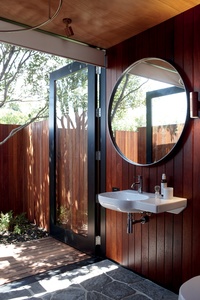
“Crazy paving acts as a heat sink, storing heat throughout the day to retain interior warmth overnight,” says Fourie. “We were conscious of taking the limited material palette and using it in unexpected ways; so we’ve echoed the horizontal paving vertically by using gabions to create a retaining wall around the rear courtyard.
“Gabions are a recurring motif of ours, having first used them in 2002 on the Barrier Bach project. When featuring them, we like to either integrate them with the building, as we’ve done at the front of the bach – where they slip under the deck imparting a sense of the structure floating above – or as a free-standing element, such as the retaining wall, or both.”
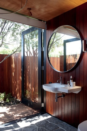
In the bathroom, a similar pattern emerges only this time it’s kwila – the same material used as decking – that lines the walls. The mix of timbers – kwila, cedar and gaboon ply – while tonally similar, sets up a visual dichotomy adding further interest to the design scheme, marking this as a Herbst bach.
Is the couple happy with the end result? “I think it’s turned out pretty close to perfect,” says Lance. “There were, in the end, very few compromises.”

