Slender splendour: Upsilon House
A dilapidated cottage on a narrow block in Sydney has been replaced by a beautiful home designed by MCK Architecture and Interiors for “simple, rugged, no-fuss living.”
When I visit houses and apartments for review, I usually ask myself, the designers and the clients, “What was the key factor in the success of the project?” You might assume that the first response would be “a large budget,” or that the success would be attributed to the experience and skill of the designer, or even to the drive and passion of the client.
Despite these important contributors, the most frequent answer is something that requires little money but a lot of commitment – dialogue. The Upsilon House by MCK Architecture and Interiors is a clear example of a home created out of conversation and collaboration between architect and client.

The clients – who run a successful fashion business – wanted “out of strata” and were keen to find a house near the beach where the “water baby” of the duo could indulge her aquatic side. In addition to moving out of an apartment to somewhere nearer the ocean, the couple also wanted to “do something special” with the opportunity.
They managed to secure a dilapidated weatherboard cottage on a narrow block in Sydney’s beachside suburb of Bronte and began seeking out an appropriate architect for the job. Of the variety of architects they contacted, it was Steve Koolloos – principal of MCK – who said he could take a look at the site that very same day.
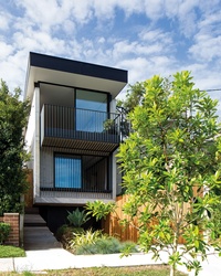
The project architect on the house, Jarad Grice, says of Steve: “He has a knack for knowing when to explore an opportunity for a relationship. He is always ready to have a conversation.” The clients say that from this initial conversation, the architects “melded into our lives naturally during the process … we understood each other well.”
While the open lines of communication between architect and client allowed the brief to evolve fluidly, the limits of this conversation were dictated by the tight restrictions imposed by the site and the local council. The design needed to address the slope of the land and the always-sensitive issue of not compromising the neighbours’ privacy or amenity.
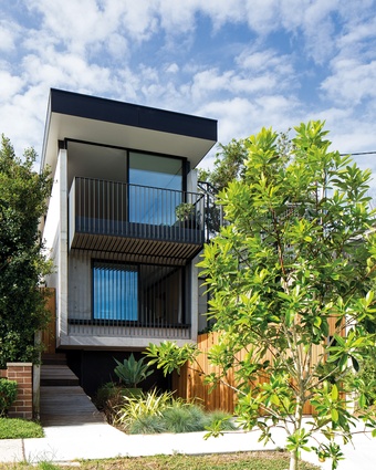
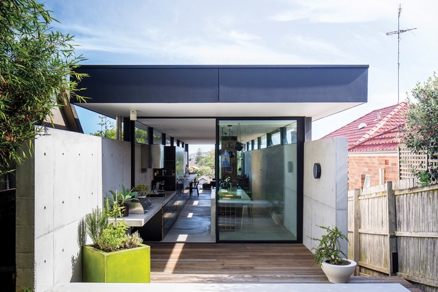
In response to these two very crucial issues, MCK opted for a straightforward yet highly effective solution. In essence the house is a large U-shaped concrete channel buried into the slope, with a floating plane roof for the upper living area. Jarad says, “The site left the design process with little choice but to go up.”
The slender concrete house slots neatly between its considerably larger neighbours. The entry is off the side passage, halfway along the building. This positioning minimizes wasted circulation space within the interior while also allowing the spaces at either end to use the maximum width of the site. Whereas in traditional terrace houses this layout typically leads to narrow rooms at the rear and dark corridors in the middle, MCK has used the benefits afforded by steel and concrete to overcome this.
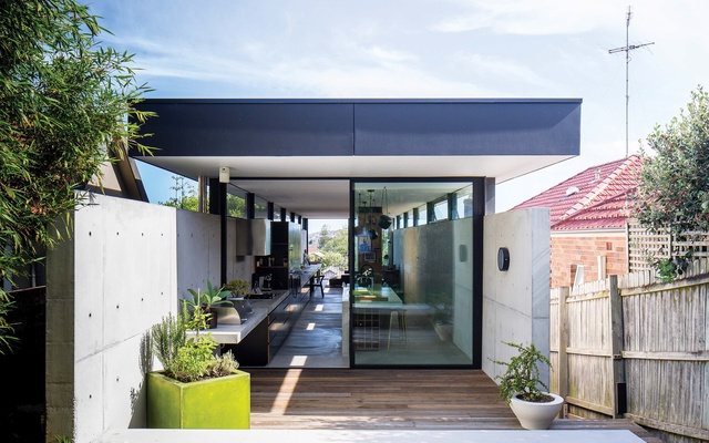
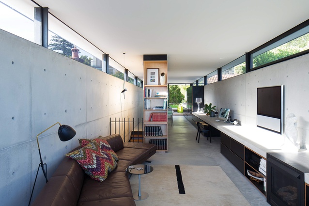
In the living spaces on the upper floor the concrete walls are brought above eye height, maintaining the neighbours’ privacy. Floating above on steel blades is the roof. The resultant ribbon window that runs around the whole of the space creates a light-filled interior. This window frames a picture of the surrounding neighbourhood and greenery, something that couldn’t have been appreciated had a more conventional solution been adopted. Jarad notes that “you don’t have to do timber and weatherboard to be light.” The clients love the night-time ambience in the living spaces – the high-level windows allow them to track the stars during the course of an evening, a very pleasant surprise that they hadn’t counted on.
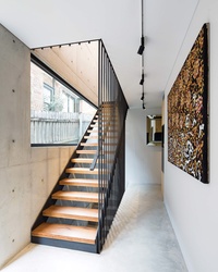
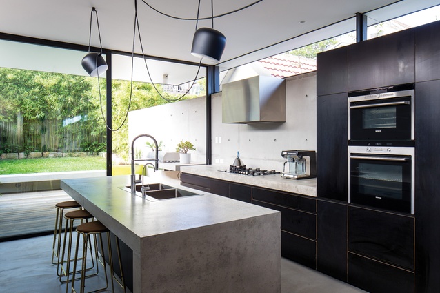
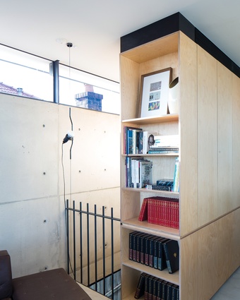
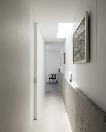
The interior finishes mirror those of the exterior: grey off-form concrete, plywoods and natural coloured fabrics. The clients, who see a lot of colour in their work in the fashion industry, wanted some neutrality in their home. They were after “simple, rugged, no-fuss living.” This approach extends throughout the living spaces, where concrete is used to form the kitchen benches and the long bench that runs the entire length of the home. The grey of the concrete is contrasted with the black of the kitchen’s formply units and the birch ply of the bookcase.
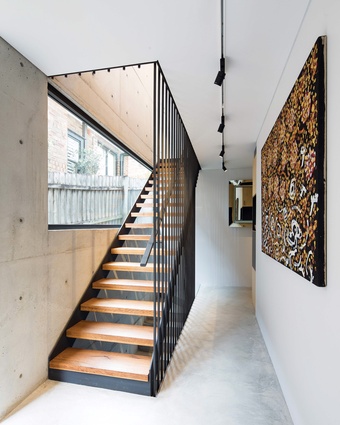
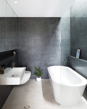
The steel staircase is painted in the same paint that was used on the Sydney Harbour Bridge. It glints and glistens when it catches the light coming through the large picture window that flanks it. The sleeping spaces on the lower floor continue the muted material palette with the addition of a beautifully veined black Brazilian slate. While the main suite is afforded a view toward the street, the other rooms have high-level windows similar to those in the living space.
From the outset, the clients wanted the process to evolve naturally. This, combined with architects who were able to “tune into the aspirations of the client,” put the project on the path to success. Jarad astutely notes that in architecture, “the best relationships are built on trust.”

