Small wonder: Tivoli Terrace
Small but clever alterations have been made to a house on a tiny site, opening the interior to the courtyard and giving a new meaning to the concept of “in.”
Somehow when you’re in here, it doesn’t feel small at all,” says Chris Bosse, co-founder and director of Laboratory for Visionary Architecture (LAVA), about his recently reworked home on a tiny seventy-square-metre site in Paddington, Sydney. When Chris purchased Tivoli Terrace in 2014, his plan was to continue renting another place while completing the house alterations. But when Chris and his partner, Jennifer, inherited a dog, they needed to move out of their old apartment. Tivoli Terrace has a small outdoor space suitable for a dog and they decided they would move into the house as soon as possible.
Chris knew that a fair amount of work was needed before they could move in and they were now under some pressure to do it quickly. “The kitchen was a daggy 1970s design, the bathroom had horrible finishes and all the spaces within the house were dark and separated from each other,” he says. Chris soon discovered that under certain conditions he could obtain a compliance development approval within a week, but it would “only [allow them] to do major works on the ground floor, you could not touch the facade or do any structural changes.”
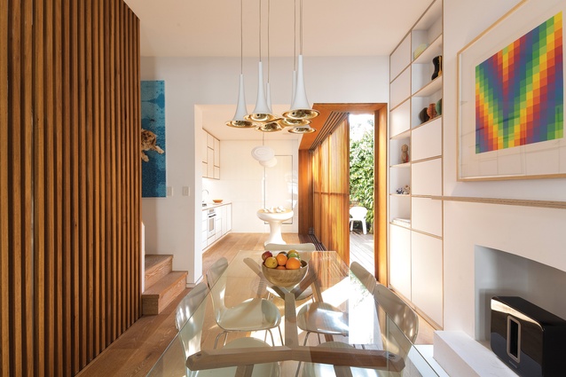
Chris took on the challenge, applying minor yet clever alterations that make a major impact. The work has resulted in beautifully continuous open spaces that feel much bigger than they are, with LAVA-esque elements dotted throughout the interior.

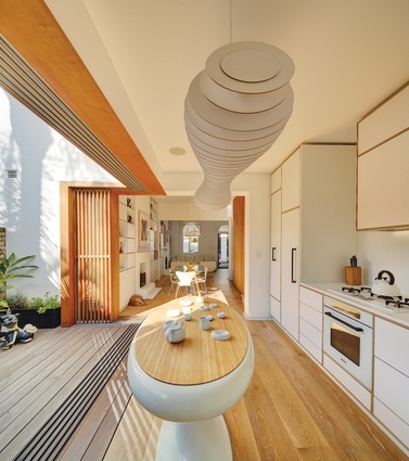
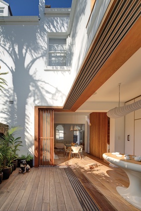
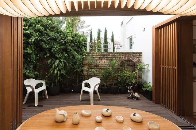
On the ground floor, what used to be the “daggy” kitchen – a dark and enclosed room with one little door to the bathroom and another to the courtyard – is now an extension of the living and dining spaces, showered with daylight and opening out to the courtyard. Chris tore down the wall between the kitchen and the courtyard and replaced it with two layers of sliding screens, one a series of timber-framed glass and the other a set of vertical timber battens. These screens play the biggest role within the space: they blur the boundaries between inside and outside when opened, allowing the courtyard to become part of the internal space, and create different atmospheres through plays with light when they are slid in and out.
A suspended light floats above the island at the centre of the kitchen. “A lot of things in here are off-the-shelf items but then modified, like this light, which is a standard product decorated with a series of elements in different shapes to create a more interesting form,” explains Chris. The kitchen island, unlike any ordinary island, represents LAVA’s distinctive geometries, which not only adds to the character of the house but also offers more space for movement within the small footprint.
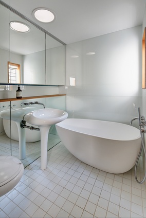
At the end of the kitchen, what was an ordinary door to the bathroom has been transformed into a “secret” entry. The original layout has been retained but all the finishes have been stripped and upgraded. Covered with white tiles and fixtures, the small space has been transformed into what feels like a spacious bathroom, featuring an organic-shaped basin and lavatory.
The material palette also contributes to the sense of spaciousness. With the exception of the oak flooring throughout the house (which, coincidentally, matches the dog’s colour), the rest of the kitchen is clad in white. The white is paired with plywood, which is also visible throughout the house, from the kitchen, living and bedroom joinery to the floor skirting. “It’s a very raw and honest material – you’re not hiding anything because you’re exposing the edges and therefore seeing what it is,” says Chris.
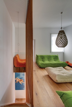
Upstairs, Chris has turned the middle of the three bedrooms into a rumpus area, again opening up the entire floor and bringing more light into the home. The narrative of the ground floor is carried through to the upstairs spaces, seen in the materiality, the abundance of daylight and customized elements. “LAVA green” is seen in accessories, lounge covers and light fittings, contributing to the distinctive character of the house and referencing Chris’s practice. Oak flooring, plywood skirting and white joinery are continued on this level, effortlessly joining all the spaces as one.
While the inheritance of a dog meant that work on Tivoli Terrace had to be completed in a shorter timeframe than Chris initially intended, the architect’s small but clever moves have transformed the house into a light-filled dwelling that feels much larger than it is. The integration of the courtyard with the interior has extended inside to outside, and outside to inside, adding a different meaning to the concept of “in” so that “somehow when you’re in here it doesn’t feel small at all.”

