Soft fantasia
Cross-pollinated compositions and a certain chromatic sweetness multiply in Bondi Junction.
As the principal of Alexander & Co., Jeremy Bull is responsible for some of Sydney’s most stylish residential and hospitality interiors.
And as for every high-profile architect with a distinct design signature, there’s speculation around what his own home looks like. So, the unveiling of his studio’s newest project in Bondi Junction is not only going to win Bull more admirers, it’s also going to satiate widespread curiosity. The recently renovated terrace is indeed the architect’s own abode, which he shares with partner Tess Glasson (who is Alexander & Co.’s marketing director) and their four young sons. Unsurprisingly, it boasts the characteristically expressive materiality for which Bull is renowned, as well as a flair for spatial dynamism and volumetric daring.

When the couple purchased the 1900s’ Victorian semi-detached terrace almost 10 years ago, it was in a dilapidated state, poorly planned and offering only the most basic of amenity. Their first renovation was substantial and involved resolving structural problems that affect most homes of this age, while the second introduced a small loft addition, comprising a fourth bedroom and a rumpus room.
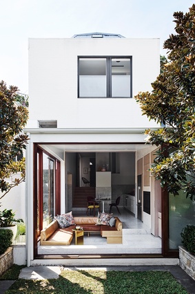
In their most recent alteration, Bull and Glasson have extended the kitchen space to include a new laundry, dining area and sunken lounge. As he explains, “We wanted to make a very small terrace look like a big house so we played with the volume, views and scale in a way that’s considered unorthodox for this type of dwelling. I wanted the interior to feel joyful and unexpected as it unfolds gradually from the front of the house.”
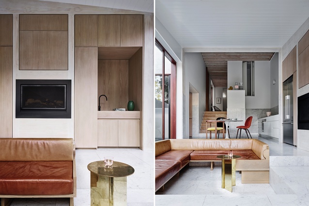
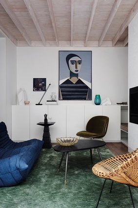
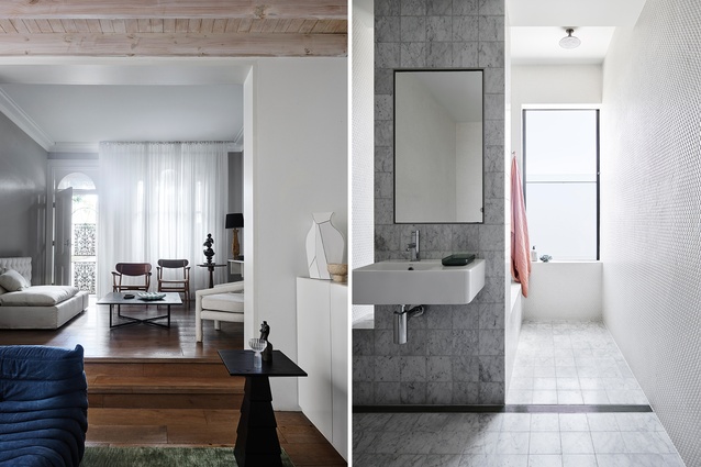
There’s not a moment wasted in this latest renovation and, although spatial economy is key, so too is efficiency. In stepping down from the sitting room, full-height glass doors and windows open up the terrace to the rear garden, ensuring the open-plan living areas receive plenty of natural light via the site’s westerly aspect. It’s a rational outcome that minimises circulation spaces in favour of defined zones, both thoughtfully planned and meticulously detailed. And, while the kitchen remains a tiny nook, Bull has managed its constraints by establishing the informal dining space and sunken lounge as the heart and hub of the home, where the family spends most of its time.
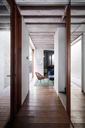
Overall, it all feels much larger than it actually is because of the generous volume, which boasts ceiling heights of more than four metres. The effect is cathedral-like and the steps down to the lounge create further drama, adding to this sense of spatial gymnastics. However, it’s the design’s materiality that sets the interior apart.
“Tess and I agreed from the outset that we wanted something light and Scandinavian,” says Bull. “So we had all these wonderful and imperfect pine elements underpinning our material palette and we decided to carry them through each renovation for consistency.”
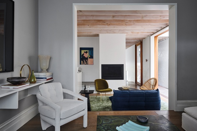
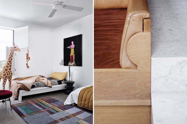
The exposed limewashed pine ceiling beams are particularly striking for their textural, raw appearance and serve to connect the sitting room visually with the extension. They exude a wabi sabi aesthetic and, in the new space, the limewashed pine is deftly used as the door-frames’ finish and as an accent in the custom American oak joinery, which neatly accommodates the fridge and a fireplace.
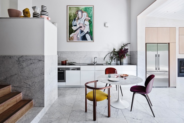
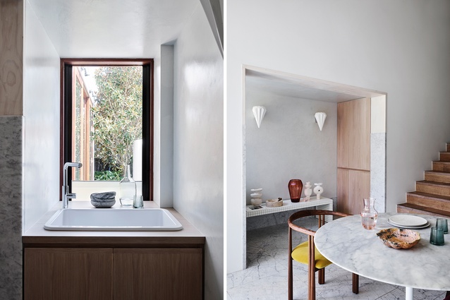
But the undeniable highlight in Bull’s simple-yet-sophisticated material palette is the use of Carrara marble tiles as flooring that wraps the walls, essentially to create a type of exaggerated skirting board. Not only does this patterned feature lend the scheme that unexpected quality Bull so desired, it also makes the experience of being in the space all the more pleasant.
It’s a risky move by the architect, not least of all because the kitchen could have ended up feeling like a bathroom if it had gone wrong. Fortunately, Bull’s lateral thinking paid off. “The design doesn’t conform to any clear genre, so there’s a sense of experimentation to the project,” he says. “Because it was just Tess and I making the decisions, we had all these conversations that I wouldn’t necessarily have with my clients. And, in coming to understand the house itself, we respected its old brick exterior and arrived at this strange, quirky little carpentry offering on the inside.”

Despite its Scandinavian sensibilities, the interior also has a maximalist quality to it – albeit a somewhat restrained one. It’s inherent in the marble application and the way the skirting boards juxtapose the European oak stair from the sitting room, along with the ‘patchwork’ effect of the custom joinery.
In this respect, Bull reveals his admiration for the decorative workings of Axel Vervoordt and the material integrity and honesty of Louis Kahn. This is a home with rigour and character that provides the perfect setting in which Bull and Glasson are raising their children. Ultimately, its interior design is as logical as it is charming, with a robustness that translates as warm and welcoming.
This article first appeared in Urbis magazine.


