Soft focus
When Simone Haag and her husband Rhys Haag started looking to move out of their one-bedroomed city apartment and into a house, a suburban brick-and-tile building wasn’t going to cut it. The pair, who are well entrenched in the design world – Simone as the design and communications manager at Melbourne-based architecture firm Hecker Guthrie and Rhys (36) as a construction manager – wanted something that would make more of a statement.
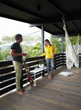
They were looking in the inner city when a rundown, three-bedroomed, 1960s’ cottage in the outer-eastern suburb of Ringwood popped up on the website Modernist Australia (a blog-turned-website which flags modern homes for sale). At first, the couple was hesitant about the location. However, the variety and unpredictability of its outlook over train lines, bridges, bush and houses towards the Dandenong Ranges soon became some of their favourite aspects of the house.
In the 1960s, Ringwood was remote enough that it was a refuge from the city. Nowadays, with the city sprawling ever outwards, the suburbs have caught up to this semi-industrial, hilly enclave. The Haag’s house hadn’t caught up to 2012, however. Amazingly, it had had only one previous owner, who had built the house then divorced soon after and rented out the place from the ‘70s until putting it on the market in 2012.
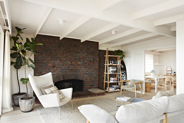
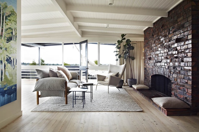
It meant the 160m² house had all of its ‘60s’ charm, including untouched modern planning, panelling, beams and full-length windows. On the flip side, with renters through it for 40 years, its condition was scruffy to say the least.
“Tea stains on the carpet, water dripping through the ceiling, holes punched in the walls… you couldn’t go up the driveway because it was so steep and the garden was overgrown,” explains Simone, 34.
But help was at hand, she says: “We worked quite closely with Paul [Hecker] and Hamish [Guthrie] on the design, but also I wanted the opportunity to showcase my own design sensibility. And I really wanted to surprise them with things I had found. So it is fair to say it was a collaborative approach.”

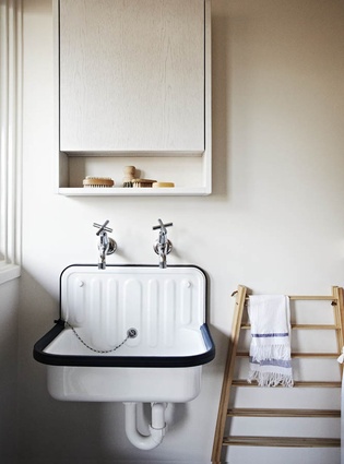
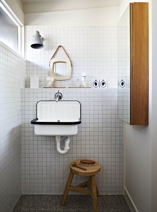
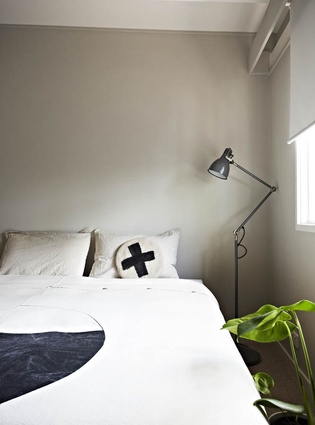
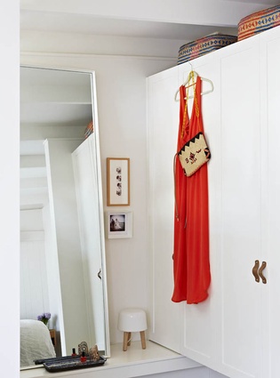
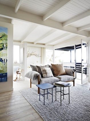
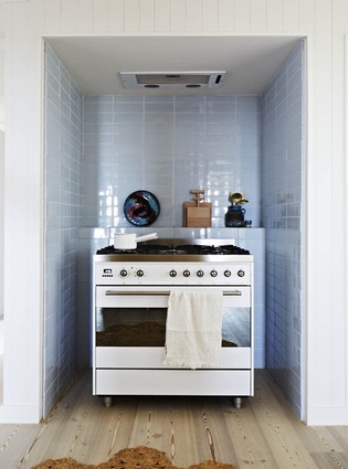
Because the planning and layout were the best things about the property, few structural changes were required but at the back door, where the entry faced directly into the laundry, a mid-height wall was inserted where the appliances could tuck underneath (hiding them from view) and a mud-room-like space was created. Beyond that, the renovation was an interiors project. Simone wanted to create a beautiful house for herself and her husband, with the added motivation of impressing her bosses. She decided on the palette – washed-out, Scandinavian hues – early on; this then guided all of her future interior design decisions.
The renovation took only three months. The Haags ripped out the carpets and old cabinetry themselves and subsequently builders came in to put it all back together.
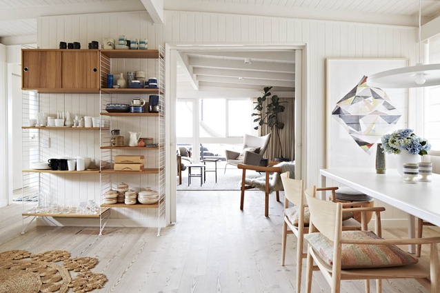
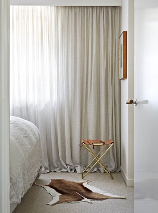
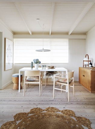
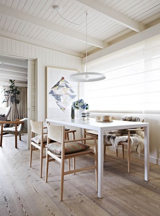
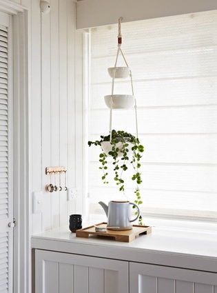
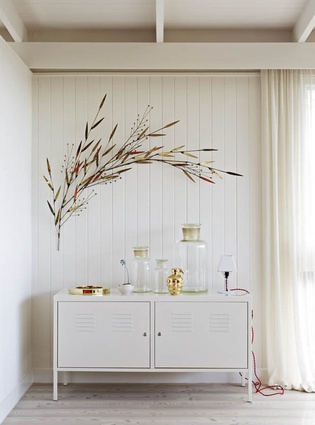
“The biggest alleluia moment was when we painted all the dark-brown panelling white,” Simone says, though it wasn’t easy going – five coats were required to completely cover it. Pale larch floors and a pale woollen carpet were installed and the Scandinavian motif was carried through the furniture, objects and art. Variety is created with muted shades of colour and texture – from the stark white of the Hay dining table to the furry Mongolian goat fur of the Log chair and the soapy ash of the Porro dining chairs. The result is an elegant, calm and focused design. But while there is remarkable consistency here, there’s certainly nothing uniform.
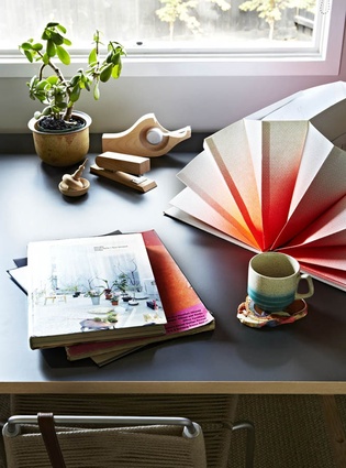
“I didn’t want it to feel too contrived,” Simone says. “So it was about going to op shops, going to Ikea, going to high-end shops, just to show a breadth of different pieces.”

