Fresh breeze: Sorrento House
Retaining the relaxed, breezy feel of the original beach house, this extension and renovation by Figureground Architecture is a clever reorganisation that makes the most of the views and space.
Many of us have stayed in an old beach house like the one that sat at the top of this steep quarter-acre block in Sorrento, at the tip of Victoria’s Mornington Peninsula. Constructed from split-face bricks in the mid-eighties, it seemed to have been plonked onto the site with little consideration for context, apart from using the highest point to gain the best view.
The house was two storeys high, presumably because of “view,” and the eastern and northern sides were wrapped in a shallow balcony, again because of “view.” Little matter that this view included the neighbouring home in the very close foreground. Or that the balcony was too narrow to be of much real use, indiscriminately exposed its occupants to direct sun and strong coastal winds, and cluttered the view for those inside.

“Shouldn’t complain,” you might’ve said. “It’s just a simple beach house for a simple holiday.” Of course, “simple” and “poor design” are two different things, the former too often a euphemism for the latter. But no longer at this beach house, which has been extended, reoriented and reborn by Matt Rawlins of Figureground Architecture.
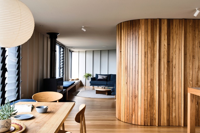
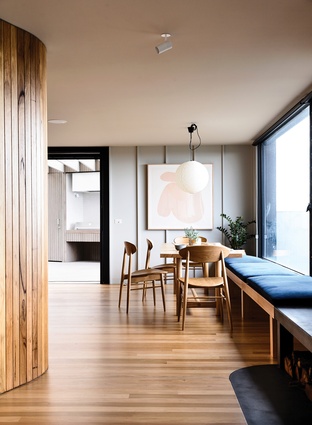
The extension of the house’s footprint, to accommodate a large children’s bedroom and play area on the ground floor, allowed for a strategic expansion and reorganisation of the first-floor living zones and main bedroom. Along the eastern facade the balcony has been reclaimed for interior space and the majestic views toward Mount Martha and Arthur’s Seat curated through the placement of large picture windows, to focus attention on sections of the landscape. A bench runs the full length of this wall, linking the living and dining spaces, providing seating and storage, and halfway along, accommodating a wood heater and hearth.
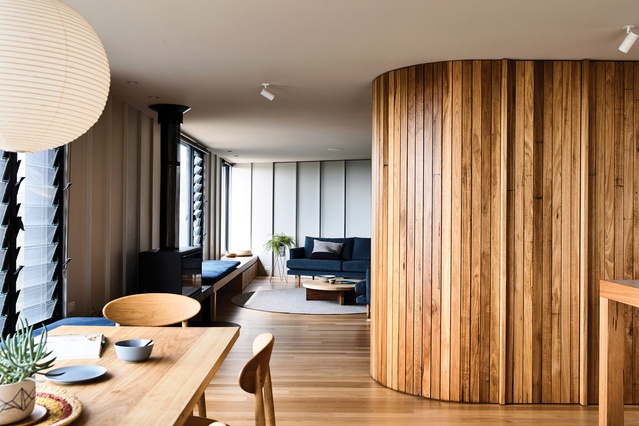
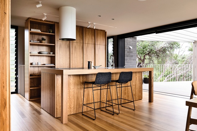
Separation between living zones is created by the insertion of curved timber joinery – on one side it adds a sense of intimacy and warmth to the lounge; on the other, it conceals a pantry and fridge. The kitchen island bench, also constructed from timber and with a neatly recessed terrazzo-tiled benchtop, reads more as furniture than functional cooking platform. It’s simple, yes, but elegant and simple, and lovingly crafted, like much in this house.
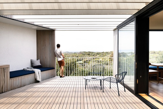
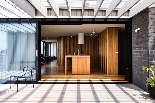
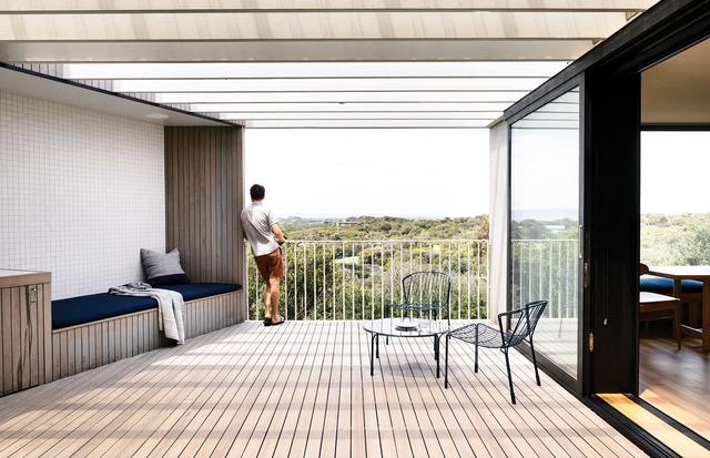
The kitchen flows out to a generous, partially covered outdoor courtyard, which sits on top of the new ground-floor bedroom. A solid wall to the north provides privacy from next door and mitigates the impact of strong winds, while again focusing views in a more considered way – to the east, the coastal Mornington Peninsula panorama; to the west, a more intimate view of bushland in an unoccupied neighbouring block. Because of the topography of the site, flat outdoor space is at a premium, so this highly functional courtyard is all the more valuable.
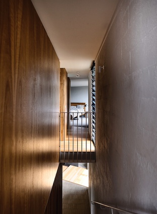
The main bedroom is tucked into the rear corner of the top floor, and like the courtyard, enjoys a view into the neighbouring bush block. Both the main bedroom and the downstairs sleeping quarters have been designed with the simple functionality of beach holidays in mind. The joinery in the guest rooms is limited to an open clothes rail above a simple bench, so new arrivals can quickly dump their bags, hang up any “nice clothes” and get changed into bathers.
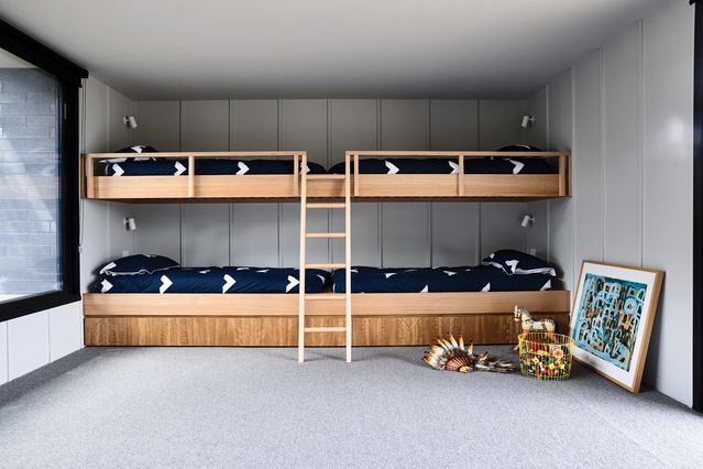
In the kids’ bedroom, top-to-toe bunk beds with integrated storage are pushed to the end wall, so that toys and books can be scattered across the carpeted floor and only scooped up again when it’s time to load the car for the trip home.
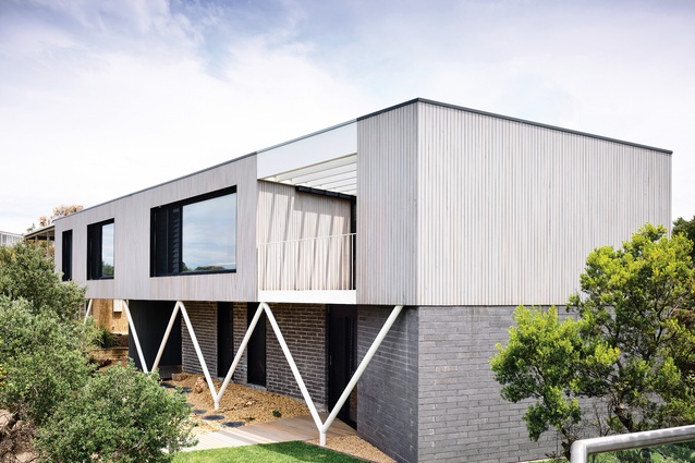
A breezy, uncomplicated feeling permeates every part of the house, even the exterior, where the rough, grey blockwork of the original walls, left untouched in the renovation, evokes memories of utilitarian coastal buildings of decades past. (The new extension was constructed from charcoal concrete block, referencing the old house, but with a smooth finish that adds a wonderful textural contrast to the front facade.)
Apart from the bricks, the most prominent feature of the exterior is a zigzag steel column structure, which brings with it an unmistakable mid-century modernist aesthetic – a nod to a time when beach houses were prized for their clarity of design and modesty of scale (the good kind of simple).

Perhaps unusually, the clients requested that car parking spaces be left at the front of the site, leaving visitors to climb up to the house along a winding track. This enabled the existing garage to be reconfigured for the main entry, as well as storage, services and a bathroom, and it also displays a commitment to the idea of a simple beach house providing escape from the complications of city life. The journey to the front door echoes the walk through sand hills to the beach, the time and physical exertion representing the final separation from the city life escaped. And now, thankfully, the house at the top of the hill is a fitting reward for the effort.
This article was first published in ArchitectureAU.com.

