Sparking a fire
I recently heard the story of a mother telling her young daughter that mobile phones had not been around when she was a child. The daughter replied incredulously: how did you google? Indeed, mobile phones are no longer just for calling people, and telecommunication companies are no longer dealing simply with calling plans and dollar-per-minute deals.
Telecom realised this and saw the need for a change from its more staid, traditional, corporate image to a youthful brand that comprehends the latest technology – hence the launch of Spark. Spaceworks was contracted to bring the new brand’s image into its stores. Christy Ormand, head of retail design at Spaceworks, said the first step was to look at where the company was as Telecom and where it wanted to be as Spark.

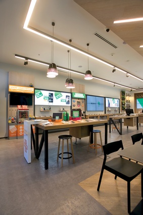
“The Telecom stores were very white, with an injection of blue in the form of signage. The intention was to be neutral and clean but the company realised it was a sterile environment for the residential consumer. Spark is more encompassing of an entire customer base rather than being business focussed. They wanted to create more community and to appeal to the younger target market, especially in Auckland, and to create a telco retail space like no other in New Zealand.”
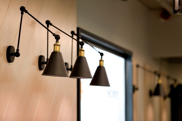
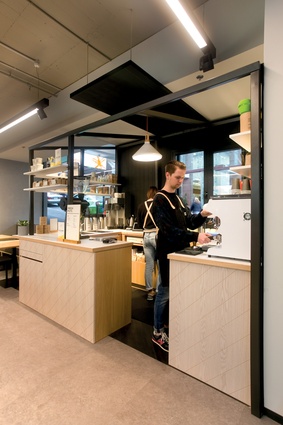
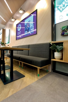
In terms of materials, Spaceworks chose to use whitewashed American oak cabinetry and concrete flooring to give the stores an urban look, although this is not taken to the extreme, as too much of a raw aesthetic may have alienated the business customer. Timber counters and storage cabinets are in the informal yet clean style you might see in a café. Stools, chairs and benches allow plenty of comfortable seating options. Lighting is varied and soft, with pendants hanging over the central counter spaces.
Space planning played a large part in creating a friendlier environment. Spaceworks firstly did away with the traditional point-of-sale counter, replacing it with smaller sales counters throughout the stores in among the merchandising displays. It also removed the customer service counter, traditionally to the rear of the store, and encouraged Spark to make customer service and retail one and the same.
“In our research in the existing stores, we noticed that, already, customers were coming around the side of the counters to look at the monitors with the staff, so we brought the staff out from behind these counters and onto the shop floor. Staff can now make side-by-side transactions with the customers,” says Ormand.
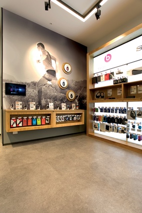
Storage in Telecom stores was out the back, so staff members would need to leave their customers to retrieve products. The new stores feature below-counter storage, so the retail team is able to stay on floor. Also, phones on the display shelves are no longer locked to the displays, but feature alarm chips for security, so the customer can pick them up and play with them.
“The more you can get the customer to engage with the product, the more you can help the sales. Many people want to pick phones up and see how well they fit in their pockets,” says Christy.
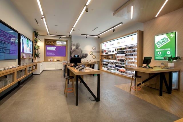
To make each store seem more open and welcoming, Spaceworks widened the entrance by removing the shop window from one side. In the remaining shop window, the visual merchandising is integrated into the design of the store, rather than appearing to be removed.
“This was about creating a much more interesting, fashion-focussed shop front than what was just a poster and a mobile phone on display. There was a second layer of visual merchandising to try to bring these intangible stories to life,” says Ormand.

These stories are told in creative ways, using visual props, such as the pile of office equipment in the business section of the store, letting the customer know all these appliances can be replaced by their mobile phone. In the entertainment area, a popcorn machine is a visual prompt about the movie ticket programme offered by the company.
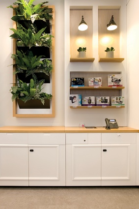
“Often, in other telco stores, there is a couch set-up with a TV to allude to a lounge, but Spark wasn’t creating large flagship stores and this would have been just a waste of space. Instead, we have the kitchen shelf set-up at the rear of the stores with mouldings and a green wall, creating a welcoming environment to showcase the home products and services,” says Ormand.
Spaceworks also designed lockable cabinets in each store to allow customers with low juice to charge their phones while they shop. Branded Spark water bottles are free for the taking from the bar fridges next to the soft bench seating.
The new store in Queen Street, while not an official flagship, is a larger store than most with a café integrated into the retail space. Further stores will be rolled out over the next three to four years.

