New public face for St Peter’s College
Clear thinking backs a resolved gymnasium designed by Architectus.
Writing about architecture in New Zealand sometimes seems like speaking into a void. Response is zero, and nobody ever acknowledges having read the words that one has laboured to string together. This lack of a dialogue in the journal best suited to support it contributes to the fact that too much building produced in this country, by architects and others, is really not good enough. Surely some energetic debate would be useful in calling us all to account? But there is one advantage for the writer in feeling that there’s no audience: one can write for oneself. And that is perhaps how it should be, for a piece of writing, like the designing of a work of architecture, is, as Wittgenstein remarked somewhere, essentially work on oneself.
So to speak about Architectus’s new sports centre at St Peter’s College on Auckland’s Khyber Pass Road one may choose one’s own terms of reference, and if readers don’t derive useful information from what one has to say, then the remedy is for them to go and look at the building for themselves and form (and, who knows, perhaps even write) an alternative piece.
Someone described the gym Architectus designed at St Kent’s as the best of the current gym crop in Auckland (see Architecture NZ 4.2010). Such a pronouncement suggests a starting point for writing about St Peter’s. But that’s another article, for what’s more important than the generation of a ratings game is to go straight to what’s essential. In this case the theme of choice is to ask what characterises the work of this practice in general and how it is illustrated in this particular building.
Architectus has developed a sound reputation for the production of rigorous and well-resolved buildings.What do they do to achieve this? Well, as far as this writer can judge, the core of what is now a pretty long period of success lies in the firm’s ability to start from early on in each project with a series of diagrams that define with great clarity the factors that impact on the design. They’re a bit like the things you used to find in early Richard Meier books. Having established an appropriate visual representation of the big issues, the design then seems to evolve in ways that become richer and denser while continuing to reveal the underlying simplicity of the early diagrams. (At this point, one should note Mies’s dictum that just because you like simple things it doesn’t mean that you’re a simple person …) For sure, everyone diagrams their projects – but more than most others Architectus manages to retain the essence of its initial graphic analysis and to hold it through the design-resolution phases so that it remains visible in the finished product.
These diagrams commonly form a part of Architectus’s presentations to clients, and they are not only very accessible to the laypeople who are trying to understand what’s going on and why the architect did it that way; they also retain considerable value for other architects. The very clear sense of total context which these diagrams reveal, with all the big issues reduced to a few lines, remains a characteristic of Architectus’s thinking and therefore to this project. It now distinguishes the whole body of work which the firm continues to produce.
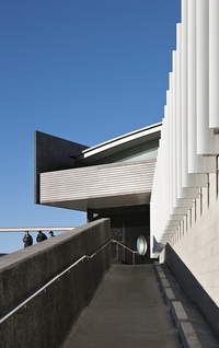
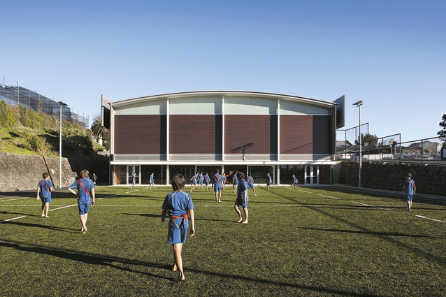
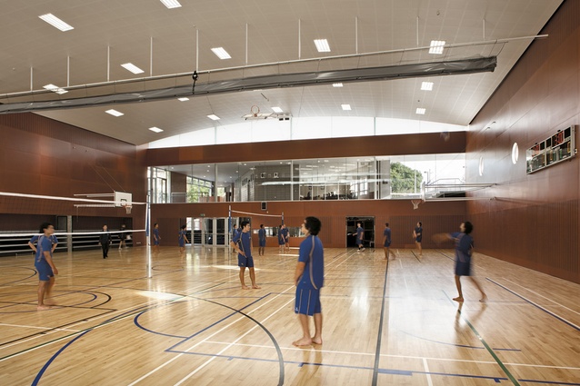
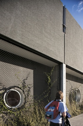
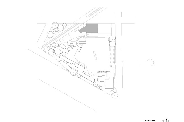
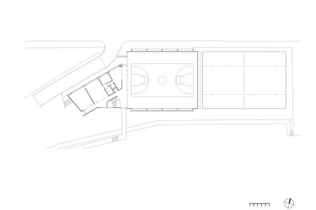
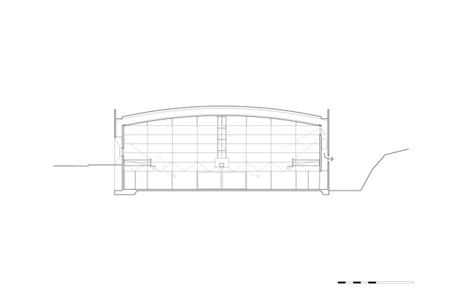
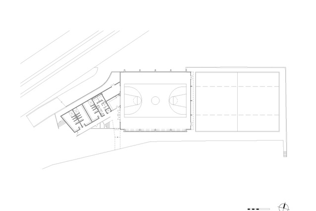
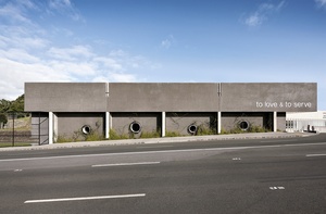
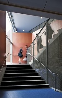
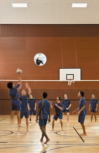
The gymnasium at St Peter’s works well with a series of transparent and well-connected spaces suited to their functions and devoid of unnecessary detail or excess. The building as a whole sits happily to the busy commercial street which it fronts, rather like one of the many other billboards nearby, and resolves some potentially awkward relationships between the adjacent railway line – a source of considerable noise – and the abrupt change in level between it and the rest of the school. This ability to use a building as an organising device to connect adjacent activities requires an ability to analyse relationships in a wider context – and this is something Architectus does well. The building also reveals some nice approaches to the use of materials – oiled cedar weatherboards, honed concrete blockwork, stainless mesh screens and wall plantings all provide a quality to the touchable surfaces which might engage the students who use it in one of the most important aspects of architecture: that its primary function is to work on the senses. The builder, Aspec Construction, has done its part in making these matters of finish successful.
This article started with the observation that there are many different ways to write about a building. An alternative which almost got written here was to have been about the architecture of the senses and how this gymnasium dealt with them: how, in effect, the architect’s skills were used to create an atmosphere, that elusive but immediate characteristic which Peter Zumthor describes as the essence of architectural quality. But that’s for another time.

