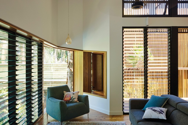
Subtropical modernism: Chapel Hill House
Reddog Architects has peeled back a 1980s home and reprogrammed it into an interconnected “collection of pods” that respond to the subtropical climate.
The strong geometry of an existing 1980s house in suburban Brisbane provided a rigorous platform for a series of subtly nuanced interventions by Reddog Architects.
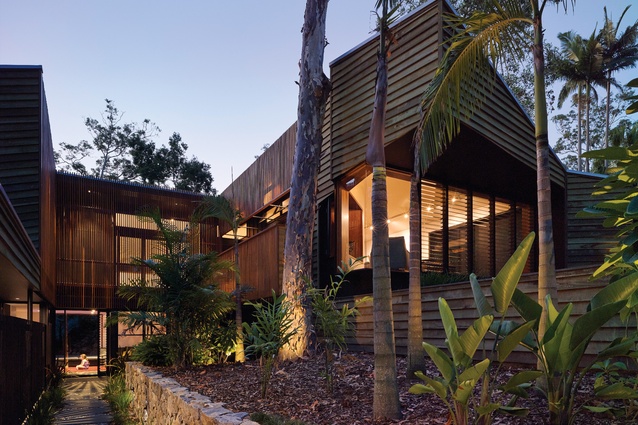
The original house is representative of a brand of modernism that burgeoned in the suburb from the early 1970s, as it converted from mountainside bushland to family-topia. Homes here run the gamut from ranch-style replicas on acreage to the architecturally daring and more humble project homes. Many respond to the semirural setting with natural materials (in this case copper-treated weatherboards) and soaring roof lines that lift to frame views of the surrounding trees.
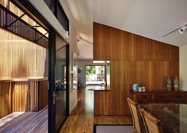
The owners of Chapel Hill House were keen to pursue the subtropical modernism they inherited with the home. They had purchased the property sight unseen from their expatriate home in Singapore, then lived in it for a time before deciding to renovate. Their brief was to retain the legibility of the home’s original form while decreasing light levels. Moreover, the arrival sequence, devoid of both ceremony and convenience, demanded adjustment.
Director Paul Worroll and associate architect Graham Tippins sought to reprogram the house with clear delineations between public and private realms. One owner is a golf course designer and keen gardener, so creating a connection to the landscape was a given. The home’s siting at the base of a long easement surrounded by five houses lent itself to an oasis motif and multiple vistas.
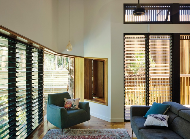
With so much on the table and a limited budget, the project required a careful and restrained approach, using existing elements judiciously while providing elegance and a sense of wonder within a pragmatic plan for the family of five. “It was a bit like peeling an onion,” says Paul. “The changes were devised to accentuate the form rather than to hide it.”
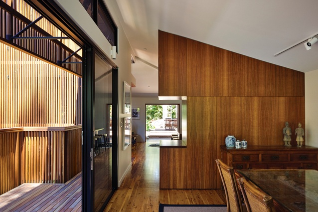
While he and Graham describe the new insertions as a “collection of pods” akin to a village, the design is vastly more interconnected than this metaphor allows. There is a neat and thoughtful precision to the compaction and jigsaw-like fit of the spaces, all housed under the original cathedral ceilings and all relating to one another and to the outdoors.

The arrival sequence incorporates a sinuous, jungle-like driveway, plunging downhill past several neighbouring houses until reaching the arrival point of a carved-out plain nestled into the forested hillside. The sense of retreat is strong and has been nicely elaborated on in the redesign of the home. The home’s U-shaped plan allowed for an entry path navigating a courtyard chasm between the protruding wings. A former deck and entry stair were demolished, and arrival is now at the deep centre of the U on ground level, alongside a pebbled creek bed. Inside, a garden room peels away to the landscape beyond and a double-height void allows light to flood in from above.
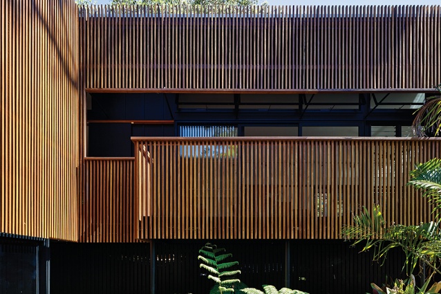
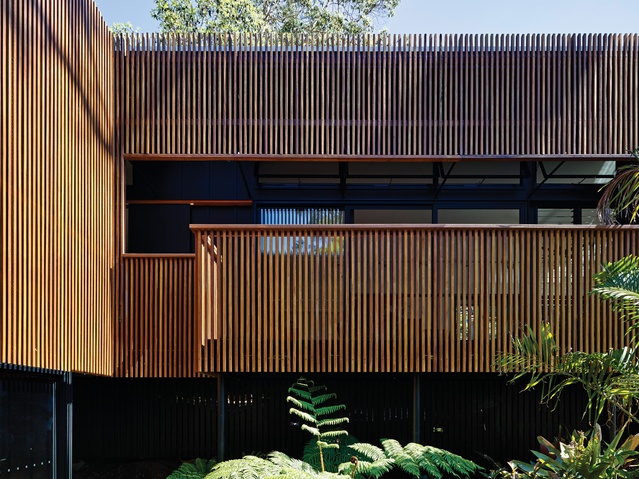
Surrounding the entry chasm is a veil of striated timber cladding that wraps up the decks and provides screening to the rooms and ledges behind. The veil is one of the key interventions and has multiple functions. The spotted gum screen unites the spaces in one gesture, reducing light levels and forming part of a new layer of interstitial spaces for seating and circulation. It forms a secret and secure ledge where it terminates outside a daughter’s bed-room. It also cleans and tidies a complicated array of mullions and details.
“We organized a lot of detail to make the screen appear effortless,” says Graham. “We worked with the grid of fibre cement sheeting, the cover battens, glazing, K-frames and structural posts – everything had to align.”
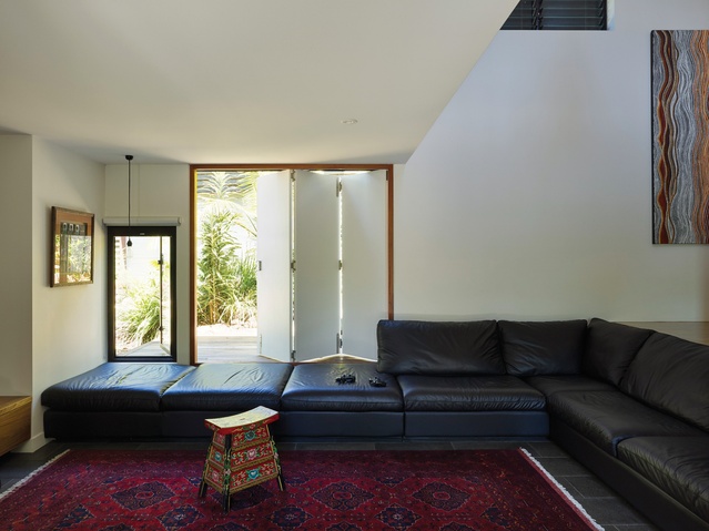
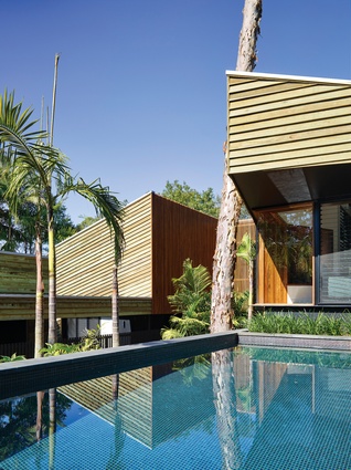
A small extension pushes the kitchen toward the south-western garden, which is visible through a Ned Kelly-like black slot. A similar small push out from the living room roof line to the north affords a picture window looking over a resort-like plunge pool, and a key voyeur’s outlook through a glazed corner to the entry chasm below.
A new main suite is carefully inserted on the home’s north-eastern side. A luxe dressing room and bathroom are the first points of call. A few steps below, tucked under the steep roof, is the private anteroom of a library/study. A discrete, modestly scaled sleeping chamber adjacent marks the journey’s end.
“We took the opportunity to elaborate on and honour the rituals of dressing, bathing and sleeping in the organization of the spaces,” says Graham. There is ample thought put into circulation paths, with plenty of sweet moments along the way.
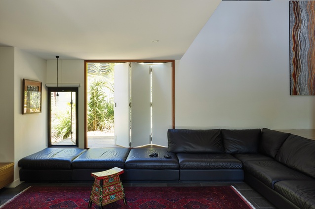
While the exterior geometry was perhaps the hero in the original house, a standout aspect of the new arrangement is the easing up of spaces that flow together and provide serendipitous moments. With so much of the home carefully peeled away, revealed and touched lightly with clever insertions, its function is akin to a series of breathable verandahs or garden rooms.

