Summer in the city
The architectural highlight of summer in London is the temporary pavilion erected in Kensington Gardens, adjacent to the Serpentine Gallery. Since 2000, 16 pavilions have been commissioned from international architects respected for extending the boundaries of architecture practice, who hadn’t yet built structures in England. The result is a consistently inventive series of site-specific architectural responses, within a quintessentially English park.
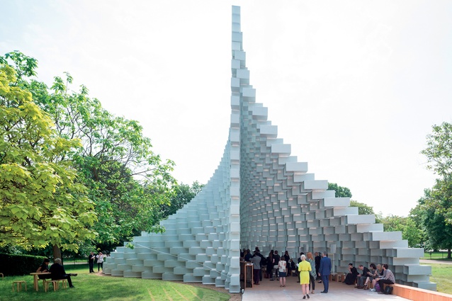
Bjarke Ingels Group (BIG) accepted the gallery’s invitation to design this year’s 300m2 summer pavilion – used for relaxation and as a café during the day and as the venue for a programme of performative works by artists, writers and musicians by night.
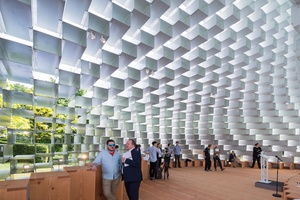
The compressed timeline of invitation, design and construction, from blank sheet to public opening within six months, is challenging. “We decided to work with one of the most basic elements of architecture – the brick wall,” says Ingels.
Constructed by stacking 1,800 open-ended fibreglass box frames, the apex of BIG’s pavilion is linear, while its base is ‘unzipped’ to form two surfaces, creating a sheltered, cathedral-like interior, open at both ends. The influence of Jørn Utzon’s ‘additive’ architecture, by using standard prefabricated forms to create new sculptural forms, is evident in his fellow Dane’s pavilion.
Externally, the pavilion’s lateral surfaces resemble undulating hillsides, rising to a height of 14m above the flat park landscape. Viewed from either end, the opaque fibreglass structure gives an illusion of solidity, but looking through the pavilion from either side or outwards from within, the structure is ethereally transparent. Bjarke describes the pavilion’s opacity and transparency as “unscripted possibilities, inside and outside”.
Although this lateral transparency was planned, the design team was surprised by how much transparency resulted. In hot weather the pavilion is cross-ventilated, cooling the interior promenade and seating areas. If it seems chilly when it’s wet or windy, the habitual stoicism of the English when confronting the vagaries of their summer weather will doubtless prevail.

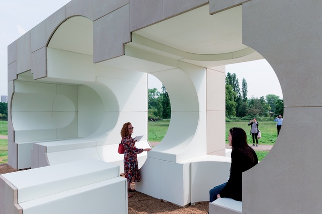
The annual pavilion was the brainchild of the gallery’s outgoing director, Julia Peyton-Jones, so it’s appropriate that the architecture programme was expanded this year to include four temporary summer houses, each 25m2, designed by four additional architects or practices. Each was required to respond to the nearby Queen Caroline’s Temple (1734), designed in neo-classical style by the architect and landscape designer William Kent (c.1685–1748).
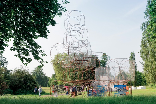
Nigerian architect Kunlé Adeyemi (NLÉ), American/German practice Barcow Leibinger (Frank Barcow and Regine Leibinger), Hungarian-born French architect Yona Friedman and British architect Asif Khan responded with four strikingly idiosyncratic summer houses.
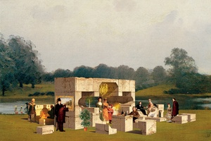
Adeyemi’s amusing faux-historic rendering of his deconstructed summer house, based on an inverse replica of Kent’s original, is populated by collaged figures wearing 18th, 19th and 20th-century costume, the latter including the unlikely figure of Joseph Stalin.
“Our composition generates basic elements of architecture – a room, a doorway and a window – for people to interact with the building, the environment and one another,” says Adeyemi. Built using rough sandstone blocks, similar to those used in Kent’s original, this ‘ruined’ summer house provides domestically-scaled spaces for visitors to rest, and some notional shelter.
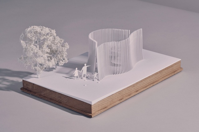
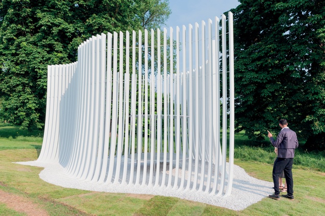
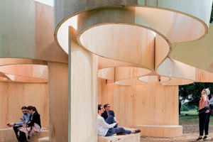
An earlier pavilion designed by Kent, which no longer exists, inspired the ‘in-the-round’ design of the Barcow Leibinger summer house. Located on top of an artificial hill, formed from soil removed during the excavation of the park’s Long Water, Kent’s pavilion rotated through 360 degrees. “Conceived as a series of undulating bands, it [our summer house] is reminiscent of a blind contour drawing [made without lifting the pencil up from the paper and only looking at the subject],” say the architects.
The horizontal banding of their curved plywood summer house recalls the layered coursing of Kent’s Queen Caroline Summer House but, unlike that structure, provides only unsheltered seating.
Less satisfactory are the summer houses designed by Friedman and Khan respectively, which are architectural gestures rather than satisfying robust structures. “My summer house is a ‘space-chain’ form that constitutes a fragment of a larger grid structure, originally conceived for [my project] La Ville Spatiale [begun in the late 1950s],” says Friedman.
It appears abstract, but its modular structure means that it can be broken down and rebuilt in different configurations. Although, particularly in incorporating his own painted designs, Friedman connects more closely with Le Corbusier than Kent, whose summer house design is devoid of any trace of egoism.
In researching his design, Khan established that Kent had aligned Queen Caroline’s Summer House with the direction of the rising sun on her birthday, 1 March, its effect amplified by the ‘mirror’ of the newly-created Long Water.
“In our summer house a polished metal platform and roof provide an intimate experience of this lost moment for the visitor to experience,” says Khan. But it’s unlikely that casual visitors will comprehend this detail, and in any case his summer house won’t be there on 1 March.

