Seaside luxe: Superette
Tucked behind Madam Woo’s restaurant down a back alley in the updated Takapuna precinct is the latest addition to Superette’s expanding inventory. Blossoming from humble beginnings as a brick-and-mortar store in its inaugural Drake Street location, Superette now has a series of stores in Auckland, a new one in Wellington and an expanding online shop.
With a growing headquarters struggling to house new staff and increasing amounts of stock, owners James Rigden and Ricky Dee began brainstorming locations and requirements for their largest project to date: a single location that could house a new head office, a sizeable stockroom plus a destination store.
While looking for a commercial site in Auckland, Rigden and Dee began renovations on their Wellington store with Material Creative interior designer, Toni Brandso. As she was putting her last touches on that locale, the designer received a call from Rigden, excited about the perfect building in Auckland’s increasingly gentrified North Shore suburb of Takapuna.
The designer raced to the site, which she says looked like “a bomb had been dropped on it”. Built in the early 1900s to house the North Shore Post Office, the multilevelled warehouse included tiny partitioned rooms blocked from natural light and dank, stained carpet covering the timber floors.
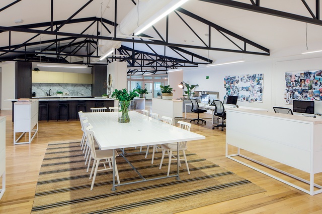
Yet, the designer recognised a diamond in the rough: “I immediately saw the potential with the already-existing interior structure and knew those elements were going to be perfect for creating an atmosphere to represent Superette’s distinctive vibe and brand.” She mentions the building’s pitched ceilings, large trusses, timber floors, wide-open spaces and perimeter windows.
The brief was to create a space reflective of the effortlessly luxurious Superette style and to align the interior design with Rigden and Dee’s wish for a minimalist space. “I wanted to create an unpretentious and luxurious resort environment, like something you would find in a California beach house. The building’s classic features were an immediate launching pad for the entire concept,” says the designer. Finding inspiration in 1970s’ California architecture and classic Hamptons beach homes, she was able to achieve the relaxed air the clients were seeking.
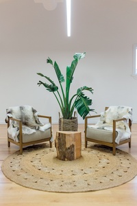
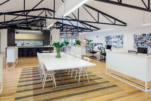
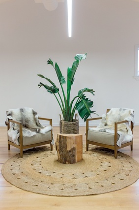
Walking up the wide staircase into the offices, one immediately feels as if one has just entered a beachside retreat. The vast open space, white walls and light timber floors work together to create a stylish backdrop to an assemblage of curios. Woven rugs and tall Californian-style greenery create smaller, more contained environments within the large, open space. The simple, white, powder-coated steel tubing, whitewashed timber desks and dining tables reclaimed from board tables mirror the look of casual, residential furniture.
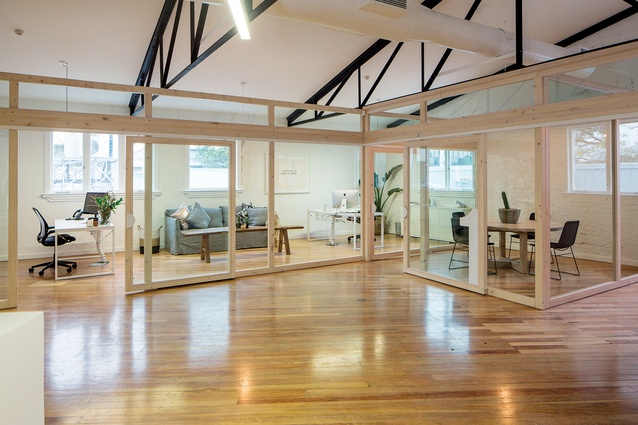
Blocking off space for meeting rooms, a main office and a showroom – but not wanting to take away light from the rest of the office – was a challenge for Brandso. “We wanted to keep a sense of the space, so we used large glass partitions and sliding doors. That means the perimeter windows still let in light, even when the meeting rooms are in use.” Light, whitewashed timber frames the partitions.
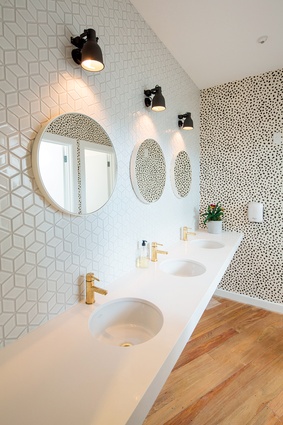
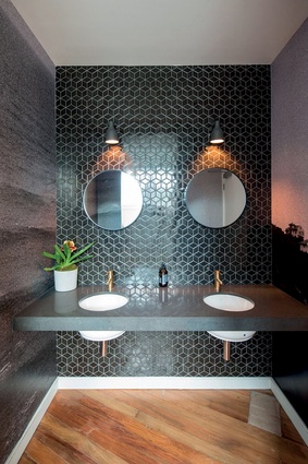
Brandso also designed bold, expressive rest rooms. A direct contrast from the office outside, the intimate bathrooms are wild and theatrical. The men’s room has a dark and brooding mood with black tiles and a dark vanity top. The brass tapware adds an unexpected touch of classic luxury, while the full-wall photograph of surfers catching waves ties the space to the ocean just one minute down the road. The ladies’ room next door is refined, with white tiles and a light vanity top, but it is punctuated with an emphatic animal-print wallpaper Brandso “couldn’t help importing” from Diva International.
The kitchen pod is the heart of the space, in which staff and clients gather for casual meetings over coffee or afternoon wines. Specifically wanting this area as a central focus, Brandso says she “designed it to stick out, to be the spot where everyone could go to be a little playful and to have some fun”.

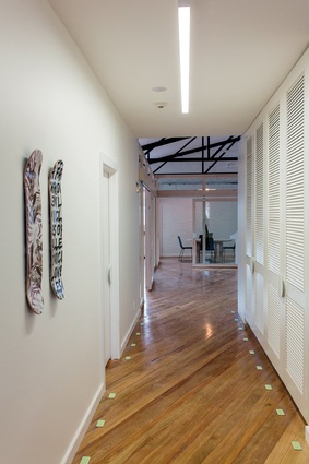
The contrasting mix of materials – from the marble splashback, gold metallic laminate cupboards and striking brass handles – produces a cheeky and inviting mood. The storage cupboards lining the back of the pod have bespoke louvred doors – a direct nod to the traditional Hamptons aesthetic.
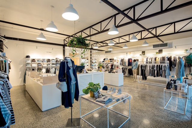
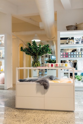
The design flows effortlessly from upstairs to downstairs, so the store becomes an extension of the office headquarters. Painting the concrete framework white softened the industrial backdrop and the perforated metal tray holding a hoard of greenery above the counter gives life to the idea of a relaxed retreat. “We continued with luxurious Hamptons style details, adding touches of brass and gold, placing louvred panels on the counter fronts and large palms to fill the lofty space,” says Brandso.
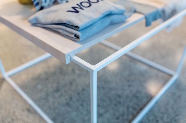
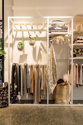
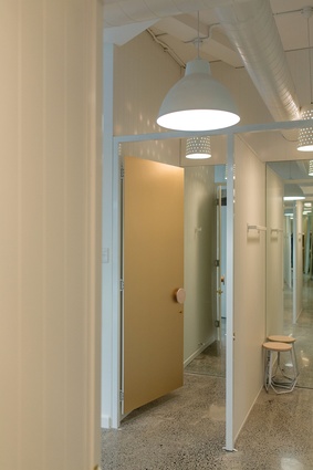
Bespoke display units can be reconfigured and altered to suit the ever-changing needs of the store. Made of steel tubing and whitewashed ply, the shelves and racks can be pulled apart or added on to one another. The fitting rooms are covered in white tongue-in-groove panelling with pinhole bucket lights suspended from the ceiling in a manner that Brandso says “feels like the inside of a boathouse”.
Bespoke circular timber handles adorn the gold metallic laminate that covers the doors of the fitting rooms. The large stockroom directly behind the shop allows the online store more room for storing products, packing and distributing.
Everything in the building works harmoniously to create a dynamic and usable space connecting all three elements – stock and online office, head office and store. Carefully orchestrated by Material Creative, the interior has a relaxed yet sumptuous narrative, befitting a store that values fine things.

