Sweet, sweet tonic
Winner of the retail category at the Interior Awards 2014, Tonic Room is one of the hot newcomers to an ultra-hip natural health scene that’s emerging in Auckland’s Kingsland.
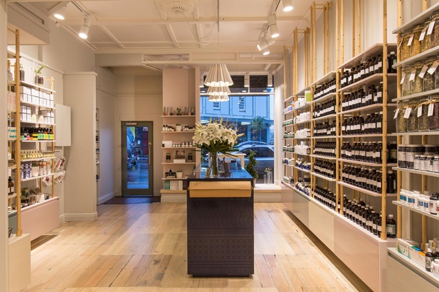
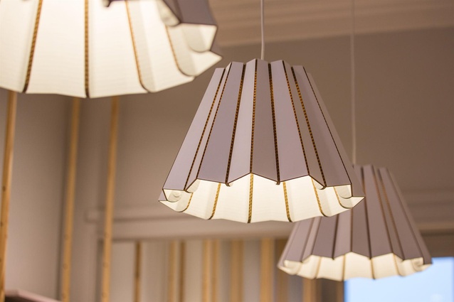
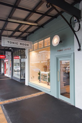
Tonic Room is an integrative holistic wellness clinic and modern apothecary located within a recently-refurbished two-level heritage space, identified from the street-level by its freshly-minted façade and frilled light fixture. Owner Katherine Lonsdale-Cooper purchased the business in 2012 under its former name, The Natural Health Centre, with a vision to bringing natural health products to a more mainstream crowd. “I really wanted to take away what scares people away from natural healthcare - the whole hippie mentality - and turn it into a boutique experience,” says the former naturopath. “On the journey there my passion for skincare came about, and that’s really my drive now; sourcing beautifully-packaged natural beauty products for Tonic Room.”
In late 2013 Lonsdale-Cooper engaged Material Creative to undertake a full refurb of the 47m2 street-level space. The brief was to open up and refresh the tired, poorly-lit and cluttered floor plan, and to integrate the new branding and identity, created by Hardhat in the preceding months, into the reconsidered interior.
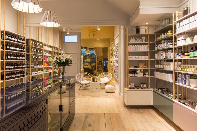
The design approach revolves around central themes of old-world apothecary and spa-like luxury, which are cleverly integrated throughout the space. Inspiration gleaned from turn of the century shelving display formats and the colours and ornamental patterning of ancient apothecary jars has informed various aspects of the interior design, including the muted colour palette. “We wanted to bring a real sense of refinement and modernity to the space, while incorporating these historical references and relating it back to Hardhat’s branding elements,” says Material Creative designer Toni Brandso, who headed the interior fit-out.
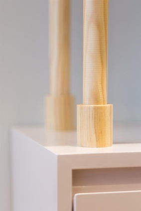
The former fixtures and ad hoc additions were stripped from the space and the challenge of light flow was addressed with the installation of new ceiling lighting, additional glazing in the front door and rock-salt bleaching of the existing dark-stained and patchy floorboards. New custom floor-to-ceiling shelving constructed by Stanley Joinery was then installed in the space. “We weren’t able to penetrate the heritage ceiling so we had to work with fixing all the shelving to the walls,” says Brandso. “The joiner and I came up with timber dowel plugs that connect to vertical strips of dowel, that then stretch to the ceiling with brass pins; a simple but beautiful fixing.”
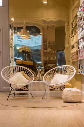
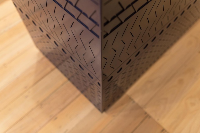
At the back of the store, a new, reflective brass-look wall adds a sense of height and warmth by bouncing light from the shop-front back into the space. This elegant addition complements another of the store’s highlights, a functional high-gloss navy counter routered with intricate CAD-drawn patterns.
Material Creative’s re-design of Tonic Room, which was completed in April 2014 and became the winner of the retail category at the recent Interior Awards, has taken the store out of the hippie-dippie space and into a new boutique retail category. “For me, the new space feels absolutely luxurious. It just exudes relaxation, calm and holistic wellness - all the things that we are as a business,” says Lonsdale-Cooper.
Interior Awards 2014 jury citation:
The designers behind Tonic Room have taken a tiny (47m2), dark, elongated retail space and conjured up something that, using their own words: “glows from within”. Thorough research and documentation served as backbone to this seamless collaboration between branding, graphic and spatial design. A brass reflective wall is evocative of ancient chemistry instruments while, at the same time, it bounces much-needed light into the space. Floor-to-ceiling shelving alludes to old pharmacies. Geometric patterns on the main counter hint at some mysterious message drafted in cuneiform. The colour scheme references ancient apothecary jars yet manages to breathe a new vibrancy into the naturopath industry. A delightful alchemy of narrative and attention to detail.

