Natural ease: Tanner House
Demonstrating that history doesn’t have to be erased to create a contemporary home, this thoughtful extension to a heritage house offers both drama and intimacy.
Only a stone’s throw from the Melbourne CBD, the streets of inner suburb Richmond are being transformed at a dizzying pace. It’s “blink and you’ll miss it” stuff, where century-old cottages disappear overnight to be replaced by cookie-cutter assemblages of render, glass balustrade and some new paper-thin cladding, or all of the above.
Of course, there are exceptions to every rule. Some projects mine the history of their site in thoughtful ways, such as Jackson Clements Burrow’s Old House, retaining some history by printing a 1:1 scale photograph of the demolished cottage onto its glass box replacement. Other projects, such as Tanner House by Inglis Architects, only a couple of streets over, retain and celebrate the existing building, working with the original fabric to extend the life of the building while simultaneously bringing it up to date.
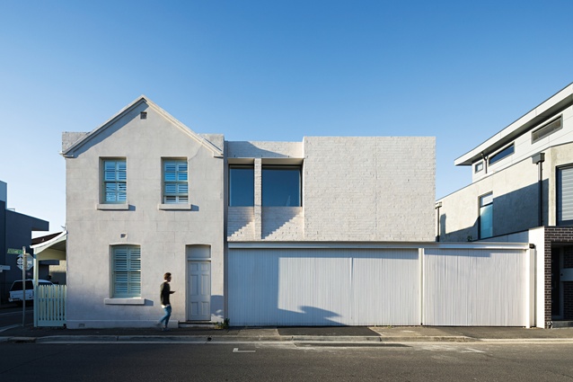
The success of this approach is such that when meeting the architect, I was found waiting patiently at the neighbour’s rather more flamboyantly contemporary doorstep, having walked straight past the polite heritage front of the house I was to review.
Due in equal parts to the client’s desire to retain the character of the original house and an existing heritage overlay, the exterior of this solid dwelling has been simply tidied and repainted, left intact to proudly occupy it’s corner on two typically narrow Richmond streets.
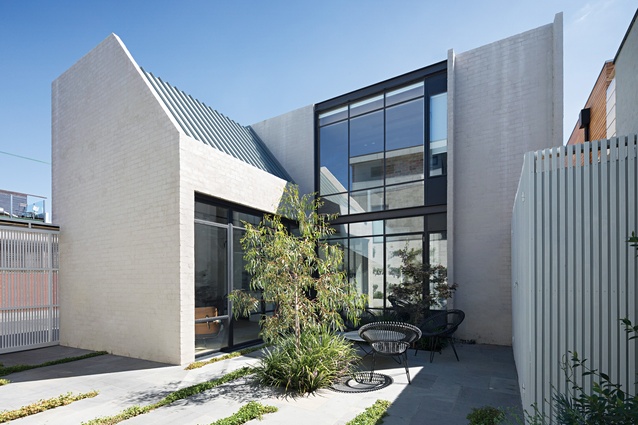
When queried on the client’s brief, Charles Inglis muses that there was exceptional trust placed in the process, leaving it to the architect to clear the inevitable lean-tos and transform the poky spaces, the only stipulation being to retain as much of the original character as made sense. Externally, the new element extends along the southern street boundary, a new mass of brick, punched with deep, shapely reveals that hover somewhat improbably over a delicately thin vertical screen.
There is a natural ease with which this heavy form, and its restrained palette of materials, grow out of the original building. By not mimicking the heritage front (it is clearly new) nor attempting to announce its newness from half-way down the street, the new form establishes itself without resorting to a pastiche of on-trend set dressings.
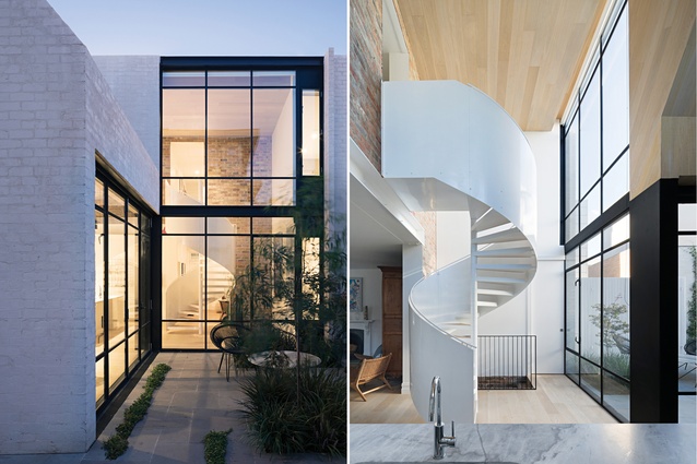
Internally, the architects made two major moves. The first was to remove an awkward stair that was encountered immediately upon entering the old home, replacing it with a spiral staircase in the new volume. The second move was to ensure the addition was double height, favouring the drama of additional volume in the living areas over an increase to the floor area of the upper level.

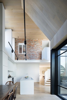
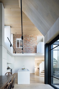
The compact and unfussy rooms of the original building have been given a lick of paint and re-floored, used now as a cosy sitting room and guest room-cum-study. When moving through these rooms you pass underneath the rear wall of the old house, which has been stripped back to raw bricks and held aloft by a sizeable new steel beam.
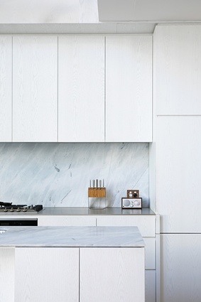
This insertion acts as a quite literal transition into the lofty new volumes of the kitchen and dining areas, both enjoying views into the north-facing courtyard through large black steel windows. The new kitchen is smartly detailed with white cabinetry and marble benchtops, while the warmly toned built-in banquettes maximize both floor space and storage, the whole forming a sharp yet warm palette that complements the wall of exposed red brick.
There is a curious dynamic at play between the stillness created by the tall volume and a series of sculptural elements found within. The sills of the high-level windows slope over the kitchen, mirroring the gesture used externally with the deep brick window reveals; the sharply raked timber-lined ceiling folds down over the lounge to create some intimacy, and finally, the curvaceous all-white spiral stair is used to draw the eye up the dramatically high volume. Each element contributes to a family of insertions into a “found” space, a successful interpretation of the client’s desire to create a warehouse feel despite the limited footprint.
Under the spiral stair is the original entry to the cellar. The rustic brick and timber treads were cleaned up and retained, much like the rest of the cellar, with a barrel chute (the home is thought to have been a local watering hole at one point) receiving a frosted glass lid to become a perfect light well and the timber ceilings and stone floor also cleaned and left intact to create a cosy retreat from the lofty spaces above.

Up the new stair, the sleeping areas occupy the original footprint, plus an opportunistic study nook inserted where the old stair previously existed. The subdued palette in the kitchen continues with whites, marble and pale timbers flowing into the generously proportioned and smartly detailed new bathrooms.
This project proves that history doesn’t have to be erased to create a contemporary home; in fact, as Charles put it, the “complexities of working within heritage constraints actually help to focus on the unexpected opportunities, something that doesn’t happen in a brand new home.” What better launch pad could you ask for when writing a new chapter in the history of a family home?
“There is a curious dynamic at play between the stillness created by the tall volume and a series of sculptural elements found within.”
This article was first published on ArchitectureAU.com

