Houses revisited: Tata Beach house
Four pavilions create a communal feel without compromising privacy at this simple yet comfortable holiday home. First published in 2013.
Tucked away on a gently sloping site above Golden Bay’s Tata Beach, this is a house that resonates everything a Kiwi bach should be.
“The attitude of the whole house is about ease and simplicity. It was designed as a place where you go and kick your shoes off and don’t put them on again until the end of the holiday,” architect Amy Hendry says.
“The clients had been coming to Tata Beach since the early 1980s. They had a very good sense of the prevailing winds, sun, and the views they wanted to capture. From the beginning they had the idea that they wanted distinctly separate areas within the house.”
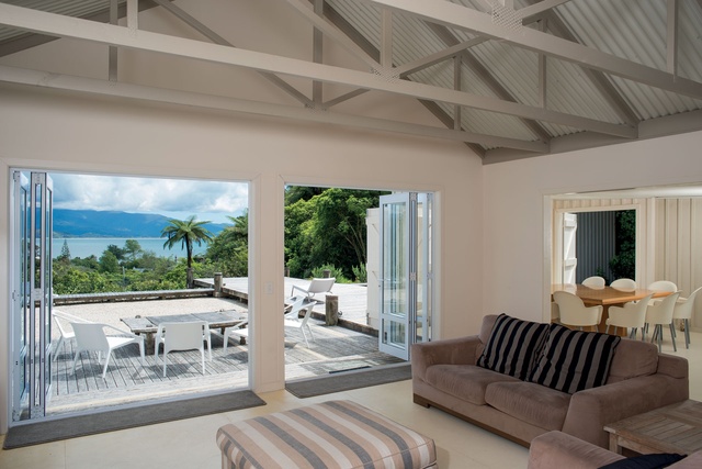
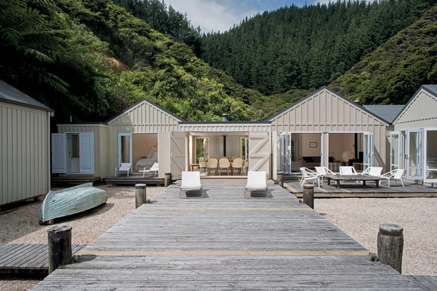
The resulting design incorporates four interconnecting pods that resemble boat sheds - their pitched roofs and slightly different neutral hues allow each to be a distinctive element of the whole. ”Originally it was going to be a compartmentalised house, but we didn’t want a large, sprawling property. The pods work well together, and provide privacy and a sense of separateness.”
The clients’ original vision was for a place where their adult children, and their partners and children, could converge at the same time, while still enjoying their own space.
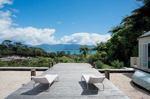
The central dining and living areas open onto a 14x4 metre deck, with a central ‘jetty’ element that juts out over the edge of the property, opening the space up to the native bush and ocean views below.

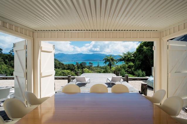
A simple table sits on wheels in the dining area at the head of the jetty component of the deck, ready to be wheeled outside at the first opportunity for al fresco dining. A row of citrus trees lines the front of the property, planted atop a 1.5-metre retaining wall, separating the levelled section from the gentle incline below.
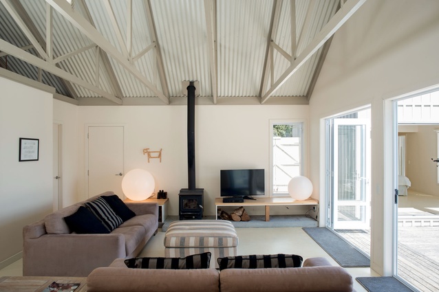
The nautical theme is encompassed inside and out, with the exterior ply cladding wrapping into the interior of the dining area, creating an in-between space. This room’s large wooden doors open the space on three sides. The only area of the house without a pitched roof, it connects the master bedroom to the left, and the living area to the right. The plywood floors throughout are lacquered in a marine paint, and the gib trusses of the bedroom and living area pods are exposed.
“Because the bedroom pods are relatively small, the high ceilings give them that boat shed feel,” Hendry says. The ensuites in the front two pods are at the rear of each space, separated from the bedroom only with a pane of glass, allowing expansive views out through the front of the pods across the bay. Louvered doors in the master ensuite open the shower area entirely to the elements.
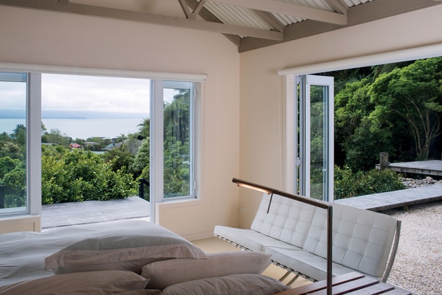
“The design merges a more traditional vernacular with the pitched roofs, with the nautical theme. The whole house was kept very neutral. The exterior ply and batten cladding is painted in different shades of neutral. Inside, neutral colours abound, with the exposed trusses a slightly darker hue, and the floors two shades darker than the walls.”
Commercial stainless steel units are the feature of the simple kitchen, which leave appliances exposed to view and tie the area in with the relaxed feel of the rest of the property.
An easterly facing deck off the kitchen, sheathed by the form of the house itself and the hills behind it, completes the outdoor living.
Click here to see more Houses Revisited. And sign up to our email newsletters to receive Houses Revisited straight to your inbox.
Note: These are stories from our archives and, since the time of writing, some details may have changed including names, personnel of specific firms, registration status, etc.

