Tattoo-inspired facades
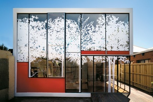
Tattoo House, Melbourne
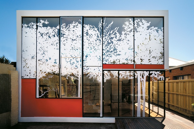
In this Andrew Maynard house, called Tattoo House, a small budget led the architect to design a simple box form. Colour, texture, materiality and screening all combined to give depth and interest to this tight, urban house. The extension to the rear of the section combined house with deck and enclosed a portion of the backyard. The glass box on its own would have defied council regulations for both second-floor opacity and how much it overlooked its neighbours so, rather than a separate screen, an intricate tattoo of stickers became a defining feature of the house as well as a practical device to cut glare and create privacy. Drawing inspiration from a neighbour with a manicured garden and a local park, a stencil of a tree motif was created for the tattoo. As well as this being a neighbourly gesture – the house retreats as another layer to their garden – the image throws ever-changing shadows across the inside of the home, giving a sense of playfulness.
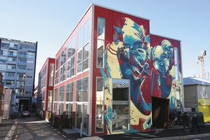
Tattoo Development, Wellington
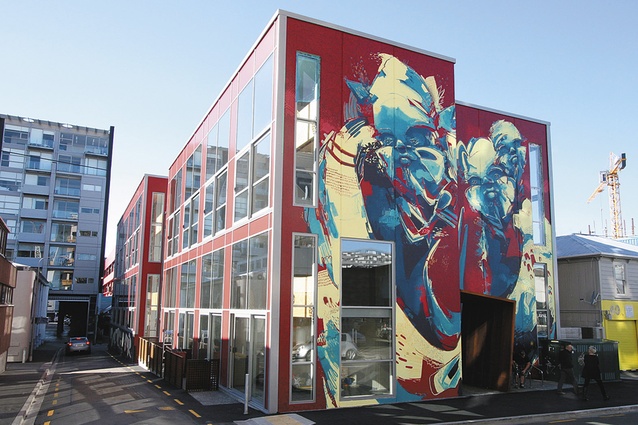
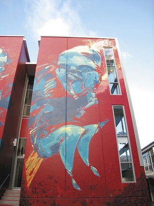
Also with tattoo in its name is the Tattoo Development by ArcHaus Architects in Wellington. The name comes from the site’s former occupant, the ‘Tattoo Museum’, but also sets up an expectation for a graphical and edgy take on architecture. The architects have said, “‘Tattoo’ is designed to provoke a response: one that need not always be favourable. It is a design to engage residents and the community alike, whilst challenging the preconceptions of high-density inner-city living.” The building uses pre-cast concrete and curtain wall glazing, while blank walls have been vibrantly activated with bold urban artworks on a huge scale. The painting isn’t necessarily considered a tattoo on the building, but the distinctive graphic picks this building out from the rest and is confident in its unique aesthetic choice – much like a person is who tattoos their skin. The bright and engaging artwork and contemporary building create a positive addition to the neighbourhood, known for its vibrancy, and insert themselves into the Cuba Street context rather than barracading themselves from the dynamic area.
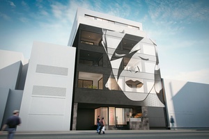
Tatu Apartments, Melbourne
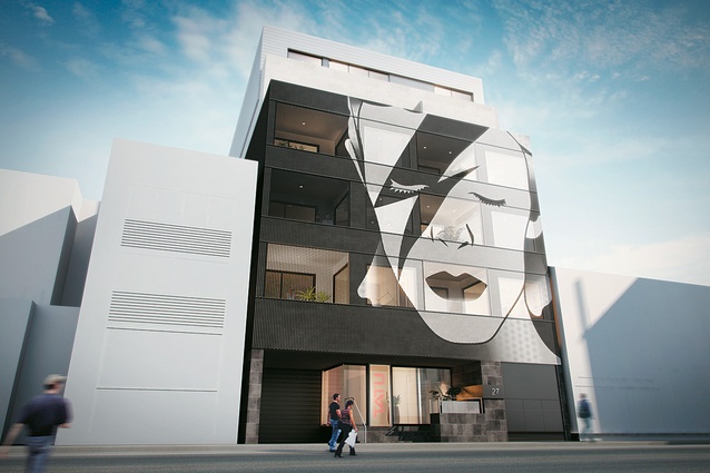
So tattoo gets a spelling change but the tattoo reference isn’t lost in this proposed Melbourne development, Tatu. The unusual and iconic David Bowie artwork has created a lot of attention for this design but, beyond the imagery, this is an interesting project set on stylish urban living. Designed by architecture firm ROTHELOWMAN along with façade designers Tin&Ed, the six-level building combines stylish details like concrete formwork ceilings with clever compact living.

