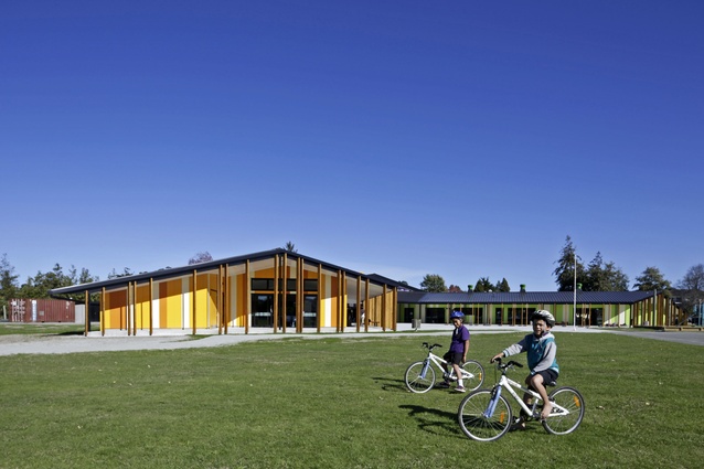
Te Kura Kaupapa Māori o Ngāti Kahungunu o Te Wairoa
Apparently, “when Alfred Watkins was riding around England’s Herefordshire hills in the early 1920s, he pulled up his horse to gaze across the landscape, and he had a sudden revelation,” stated Scottish writer Jo Woolf.
“In his vision, every landmark, whether natural or man-made, was linked by a network of straight lines, which he saw as glowing wires laid out over the surface of the land. The lines passed through hill summits and cairns, linking church spires, prehistoric settlements and burial sites, old encampments and sacred monuments.
“Following the routes that they took were trackways, straight roads that had been ancient and well trodden long before the coming of the Romans, along which the first settlers of this country would have travelled by day and night, their eyes keenly aware of waymarkers that we, in our age of all-seeing technology, are now almost blind to.”
Alfred Watkins, an English amateur archaeologist and a member of the Society for the Protection of Ancient Buildings, wrote The Old Straight Track in which he brought the term ‘ley lines’ into public awareness. Ley lines are considered generally to sit within the New Age camp, based on a belief that a grid of earth energies circles the globe, connecting important and sacred sites, such as the Egyptian Pyramids, Stonehenge and Machu Picchu, as well as unusual landmarks and neighbouring geological features, high mountains and valleys.
Indeed, ley lines are interpreted freshly in cultures around the world in each successive generation. The Chinese have feng shui, whereby every building, stone and planted tree is placed into a landscape to conform to the flow of ‘lung-mei’ or ‘Dragon currents’ along these lines. The Ancient Incas used ‘spirit-lines’ or ‘ceques’, described as sacred pathways, aligning the wak’as or revered forms, such as stones and springs, and often terminating near the summits of holy mountains.

In New Zealand, Māori also believe in sacred sites and energy centres; the sculpted limestone landforms known as Kura Tawhiti or Castle Hill, in Arthur’s Pass National Park (seen in the battle scene of the film Chronicles of Narnia: The Lion, the Witch and the Wardrobe) are believed to sit on a powerful ley line.
In the small town of Wairoa on the East Coast, midway between Gisborne and Napier, is a small kura kaupapa, or Māori immersion school, which has been built where ley lines are believed to sit – conceptually, at least, in the minds of the architects at RTA Studio. And, for the Māori client, it was important for the school that “there is a spiritual meaning to the design”, explains Mere Martin, the school’s administrator, since it is immersed in te reo Māori and culture.
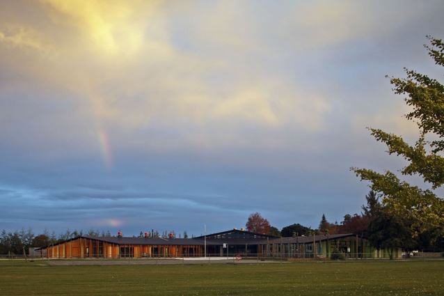
Te Kura Kaupapa Māori o Ngāti Kahungunu o Te Wairoa is sited in what is essentially a paddock near the outskirts of this town of 6,000 people, which has been built along the winding Wairoa River within the picturesque Hawkes’ Bay landscape. The adjacent area is steeped in history and includes an ancient pā site next door, and, across the road in the back hills, is a site where pre-European Māori wars occurred. The kura is one of three projects within RTA Studio’s office that are based conceptually around ley lines drawn from significant local landscape forms.
The concept began when the firm was designing a family house for Paul Tapsell, Professor of Māori Studies at the University of Otago, and the process became a collaborative design. Tapsell’s whakapapa could be traced back to the arrival of Māori to Aotearoa and regarded as custodians of the land where the house was to be built. The geometry of the design was laid out to connect with important local landmarks.
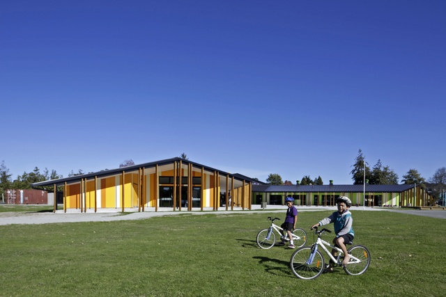
RTA Studio’s director Richard Naish describes the approach as an “interesting way to think about Māori architecture, as containing oral history and stories and along points of lines”. The firm’s design for Tarawera High School in Kawerau was laid out in much the same way. In Wairoa, Naish felt that it was natural to take the same approach. The original design began as a singular linear structure but the school wasn’t keen on that idea so the architects refined the form into a V-shape, which came about when the school talked about the double-hulled waka.
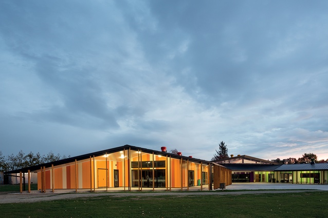
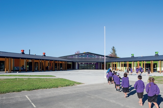
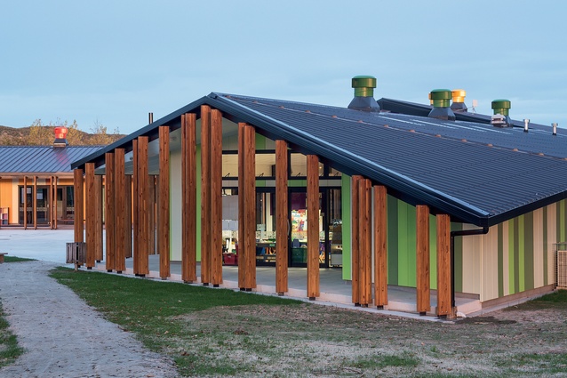
“We joked that the design was really their idea because the collaborative approach is very necessary when working with Māori clients – they should own it,” explains Naish. So, the geometry of the building became V-shaped with two wings or arms. As you approach from the car park, on the left, the green-painted junior wing points to Takitimu wharenui or meeting house, while the yellow wharekura, for seniors, points to the local maunga or mountain Whakapunake.
The apex of the ‘V’ points to the Wairoa River, which is where waka arrived during ancestral times. Naturally, the centre line of the V is pointed north, inevitably following good sustainability principles. This was a big move for the school, suggests Naish, because the previous ’60s classrooms, which were in a state of disrepair and were bowled down to make room, had no direct relationship to the locality. The school is designed to switch into ceremonial marae-mode and can be approached also from Black Street, where a waharoa or gateway invites visitors towards the welcoming arms of the building along a lengthy procession that accommodates pōwhiri.

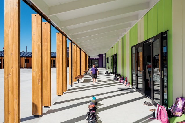
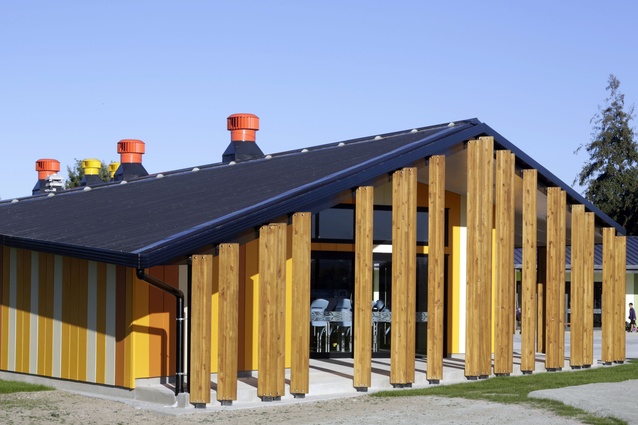
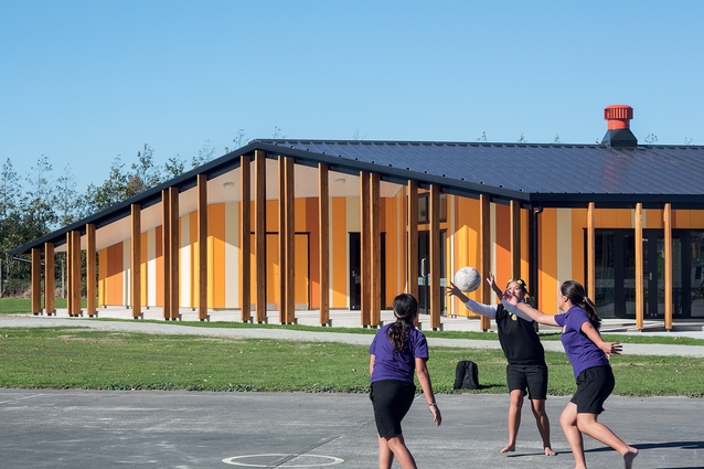
The form has been flattened, extended and massaged into a modern and expressive building. Ministry requirements stipulate a percentage of learning space to be outdoors, so RTA has created big, wide verandahs that act as outdoor learning areas for reading and art, etc. Timber fins along the verandahs match the vertical play of colour across the façades. The design is based on modern learning environments, although there were some limitations due to a small roll of up to 90 children of all ages: from Year 1 through to Year 13.
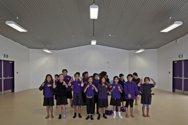
Colour-coding of the building was used for wayfinding and acts symbolically. Orange and yellow represent the sunrise, green the forest, and purple is the colour of the school uniform. Purple also symbolises the ‘heart’ centre of the building: both an assembly hall and a place where the community can congregate. A large kitchen in the junior wing is used for school lessons, as well as providing kai for large events.
Four million dollars is a tiny budget with which to build a school, so the architects had to use “the least expensive palette of compliant materials possible in the most expressive way”. It was a challenge to balance the budget throughout the project: “To be honest, we made a loss on the project but we consider it ‘the Robin Hood economy of practice’,” jokes Naish.
“The profitable commercial projects enable us to design projects like this. We just have to manage it carefully and limit jobs of this nature but it’s hugely rewarding seeing the smiles on the faces of the kids and the staff.” Mere Martin agrees: “It makes me so happy – some days I just want to hug that purple.”

