Telecom’s new tower
On the western fringe of the Auckland CBD, Architectus design a four-towered village for a developer and its telco client.
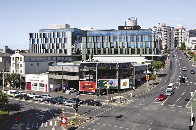
Auckland’s corporate head offices seem to be drifting north-west, lured no doubt by Big Things happening on the old City Workshops site, the Viaduct Harbour and the new Tank Farm development. This is also the western gateway to the CBD. Now Telecom has moved into a new purpose-built HQ not a couple of hundred metres from chief foe Vodafone. This is the central area’s former industrial quarter, with a collection of older buildings; an “unattractive and bleak place for pedestrians” as our Council quite frankly describes it.
Mansons developed the building speculatively and Telecom came along part way through, leasing the building for 12 years. These big outfits are keen to get all their staff together under one roof, although that’s a bit of a moot point with Telecom and its history of business division splits, with another coming up. But actually that’s why this building suits them – it’s not really one building, more like four low-rise blocks around an atrium. In their design for this site, Architectus picked up on the Council’s Victoria Quarter plan and the desire for a stronger north-south pedestrian link from the old City Workshops to the harbour. The building is four towers of several stories, each with its own core and lifts, on a big site split by through-site links north-south and east-west. Originally the pedestrian crossroads were open-air lanes, but with Telecom as tenant they now form a large atrium. Campus is the new buzzword for buildings like this. As the developers say, “taking an organisation and spreading it over a low-rise campus style development with a large floor-plate creates greater interactivity between employees than a high-rise design”.
The city seems to have scored a decent street out of this development, too. Hardinge Street to the east already had a few trees but the deployment of a main pedestrian entry there with a small courtyard and café and a bit more planting has produced a nice pedestrian-scaled precinct that contrasts with the wide concourse of Victoria Street West, where traffic charges up and down the hill. In a way, Architectus are creating a bit of a laneway vibe here that in future can be picked up by other developments; in cities such as Melbourne we see two grids, slightly offset, with pedestrians and slow traffic in one set of streets and heavier traffic in the other. The parking in this building is entirely underground and, unusually, the access is spread across the north face. However, it works perfectly well here as that face is on the edge of a steep drop to Fanshawe Street with a site in front that is bound to be developed soon, and the access effectively creates another pedestrian lane linking the two side streets.
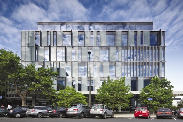
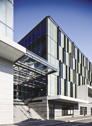
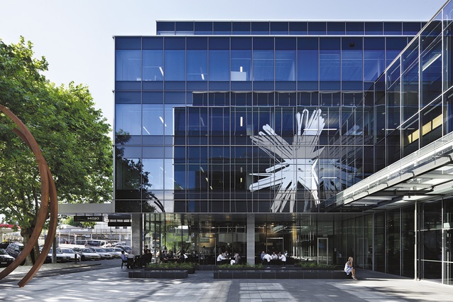
Of course it’s not an Architectus building if it doesn’t have fins. The façades of these four buildings are 50% glass, with a rhythmic alternation of solid and void and fin size seemingly related to width of window. For these architects, this is an especially lively display and I am sure in the Morse code of the panels and the semaphore of the fins some kind of message is being spelled out in a lingo I don’t understand. I have called Architectus cold-hearted rationalists in the past and in my attempt to find the front door of some of their past buildings I have even accused them of having a kind of architectural Asperger’s Syndrome: very, very smart, but prone to repetitive mannerisms and lacking in the social graces. But here the entries are plainly signaled in the centre of each façade and in a civic gesture they have even provided a verandah around all the three main frontages – an amenity oddly enough not required by the Council. Plainly Architectus have learned something from my criticism over the years (cough, cough, ahem, NZIA President’s Award, thanks Patrick).
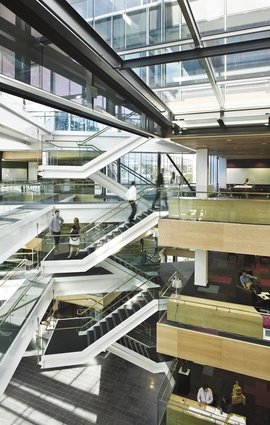
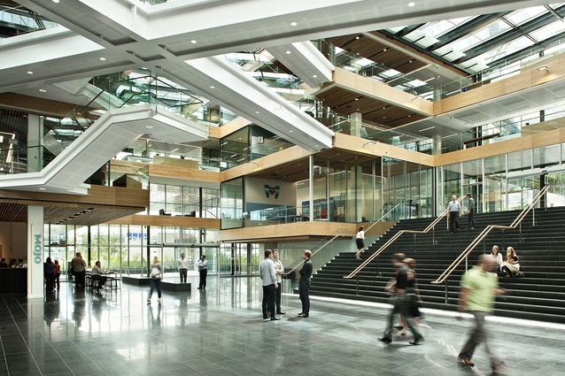
The atrium space is broad rather than tall with the floors of the buildings like vast trays and at the centre, a massive asterisk of bridges and stairs, in serendipitous synergy with the new Telecom logo. Like the open plan office floors, this form of internal circulation between the four blocks allows incidental meetings and promotes mingling. With more than a few thousand employees coming and going in this little low-rise village, as well as the public through site links, there is the critical mass to get retail working both inside with a sushi shop (and more lunch spots promised) and a café and obligatory Telecom shop on the outside. Getting retail going on this side of town is certainly an achievement.
This atrium grew on me over time. Architectus of course are subtle, much of which is lost on creatures such as myself – none of that Jasmax-esque exuberance here. From the eastern entry and courtyard, the east-west link is enlivened by a couple of cascades of steps, although at the western Dock Street end, it surveys the bum end of a very pedestrian group of townhouses. Never mind, they won’t be there forever, and I can see this route stepping on down hill to the park and Victoria Market: a much more pleasant journey than accompanying Victoria Street’s torrents of traffic as they plunge down hill. The north-south axis culminates in another courtyard on the edge of the cliff, a space that’s balcony-like, still big but more intimate allowing quiet contemplation of the enemy dead in the sights 360 feet due north. The central chandelier of circulation starts at first floor level, allowing the workplace towers to be locked off from the ground floor for functions or public use in the evenings and there is a 200-seat conference theatre space tucked under the eastern steps.
On those big shelves of floors, there are a lot of workstations and meeting places that fringe the atrium and pick up natural daylight. Indeed, with the current fashion for eclectic mixes of retro seats, chairs and sofas in little groups ready for casual meetings, there is a bit of the ambience of the furniture showroom. It is rather un-Architectus, and in fact the tenant fit-out was done by Warren and Mahoney. Mind you, those Telecom girls and boys are loving it. On my visit, those who weren’t criss-crossing the atrium floor – ear-budded careless walkers with minds set on Higher Priorities – were swanning about in the seats and dangling pods, Networking and pretending to have Important Meetings. No one here is tied down by land-line of course, like you and me. The atrium teems with staff marching to and fro, headphoned like air traffic controllers, buzzing with one-sided conversations. Telephones don’t crouch anymore, getting ready to ring, in locked-up offices while, to paraphrase Philip Larkin’s Aubade, the uncaring, intricate, rented world ignores them.
“Only connect”, pleaded EM Forster, a hundred years ago in Howard’s End, that great novel of a great city with its populace in constant movement, a tragedy of misunderstanding and miscommunication. Architectus are terrific planners, they can knit together urban fabric and repair hopeless parts of cities. It is apt that a communications provider has inhabited this place. We have watched this big green building growing up on this Victoria Street block for a while now; perhaps, in urban design terms, it will be a little seed that helps the Victoria Quarter renew itself. As always, Architectus have done another fine job. Just not sure about that grey-green colour in an Auckland summer though; it’s a bit sweaty looking. Good if you are a mangrove, but this is an urban Auckland epicentre, not an epiphyte.

