Telescopic vision: Annandale House
Making clever use of an extreme slope, this robust and detail-focused addition to a weatherboard cottage by Welsh and Major Architects extends across its site like a telescope, creating open, calm spaces in dense inner-Sydney.
Welsh and Major Architects doesn’t seem to have a predictable tactic or a recognizable style that the architects apply to every project. Even if it did, every site is different and every client is different. Each design that Christine Major and David Welsh produce must fit within the quirks and intricacies of each project’s specific circumstances, its literal and figurative topography. The physical topography of the site was one defining characteristic of the Annandale House project.
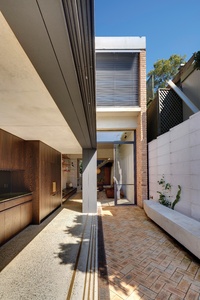
The slope is extreme, falling almost two full storeys from the main street to the rear lane. An existing single-storey weatherboard cottage occupies the main street address, spanning the full width of the narrow site. Broadly speaking, Welsh and Major’s additions are comprised of three blocks that step down the site, each smaller than the last, overlapping slightly like the segments of a telescope.
The nested forms begin with a full-width, two-storey block that contains the main bedroom upstairs and living areas below, and step down to a single-storey galley kitchen and finally to a stair and an entry vestibule that meets the rear lane. They also step away from the northern boundary, running hard up against the southern boundary to maximize the opportunity for winter light to enter the courtyards and interiors.
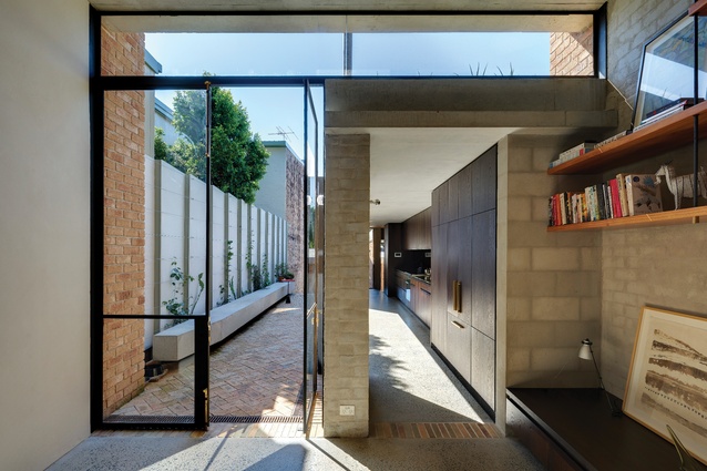
Like many houses that squeeze a lot of rooms into a tight urban site, the project is quite inwardly focused. Welsh and Major chose not to extend the cottage directly. Instead, they demolished the existing assortment of additions and created a gap in between, allowing the old and new some breathing space. The family of four-plus-dog wanted a calm vibe for their house in the dense, inner-western Sydney suburb and one way to do this was to leave some of the site “empty.”
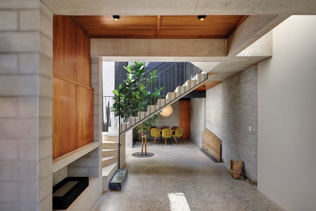
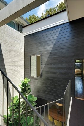
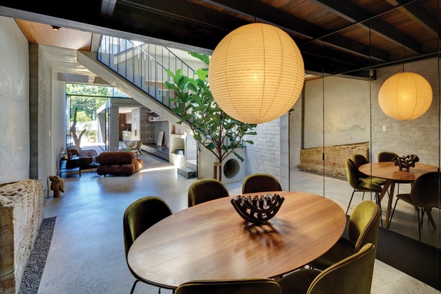
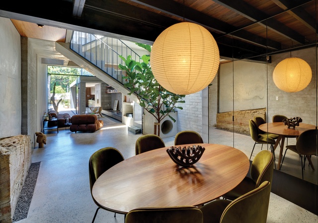
The gap is not programmed to function as “entertaining” or “outdoor dining” or anything specific, but is simply to be experienced as open space. A walkway that extends from the corridor of the existing cottage flies over the top of it, as the ground level drops away. A semi-mature fiddle-leaf fig was planted in a hole in the new concrete slab and the whole space can be covered at a moment’s notice by a mechanically powered sliding glass roof, creating an indoor/outdoor ambiguity.
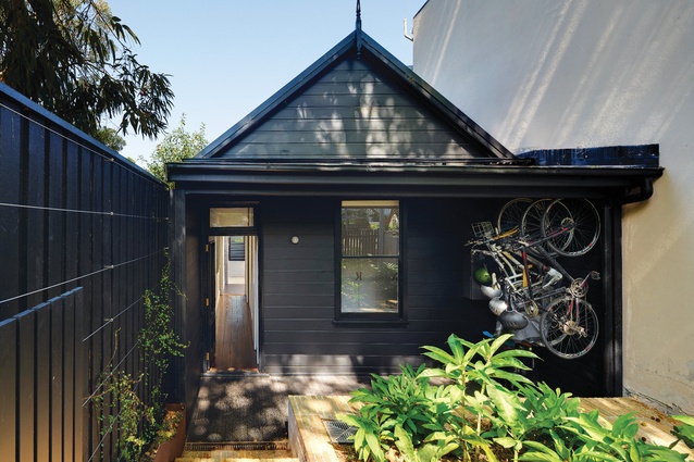
Council requirements, like the client brief, comprise some of the “figurative topography” of the project. In this part of Annandale, the council wanted to preserve all existing weatherboard houses. This included Welsh and Major’s site, even though little of the built fabric was original. In response, Welsh and Major has highlighted the cottage’s last remaining “heritage” feature – its house-shaped silhouette. By painting it black, they suppressed the non-original materials and details. In a similar but inverse strategy, the interior of the cottage was painted white.

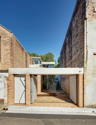
The cottage has been turned into a private children’s zone, containing two bedrooms and a loft playspace, and this end of the site has become the rear. The clients almost exclusively use the laneway entry and Welsh and Major designed the laneway elevation accordingly. It has a formal street number and a gate with a bespoke brass handle that announces its importance. This gate opens into the first courtyard and reveals the enormously tall front door.
The narrow, dark and high-ceilinged entry stair then releases you into light and air in the main public floor. The lane elevation is the only moment of “exterior architecture” and it is the details that take the limelight. Triangular notches in the ends of the concrete roofs could be mistaken for artful quirks, until you realize that they perform the function of letting excess rainwater overflow from the box gutters.
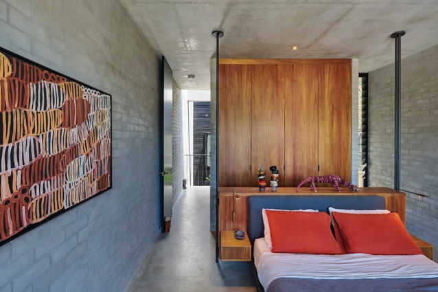
Throughout the house, the focus is on details rather than external views. Materials are highlighted through contrast and juxtaposition. Finely finished timber is inserted into raw concrete; a solid block of green marble forms the last stair tread at the bottom of the elevated walkway. In the ensuite, brown tiles cascade sensuously over the lip of the custom-designed, box-shaped bath to merge with the floor. Timber joinery is suspended or hung from thin black steel supports, delicate against the robust masonry and concrete structure.
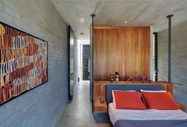
There is one spot with beautiful views – the main bedroom takes full advantage of its high position, looking down on the roofs of the other two forms that telescope out from underneath it. These roofs have been turned into garden “facades,” planted with aloe. In a happy coincidence, landscape consultant Sue Barnsley’s suggestion of aloe for the roof gardens recalled the client’s dad, who was an “aloe hunter” in South Africa, as David puts it.
The last time I reviewed a project by Welsh and Major it was a house extension composed mostly of reclaimed materials and superficially nothing like the Annandale House. If there were a connecting thread between the two, it would be the focus on details, particularly the juxtaposition of materials: hard against soft, rough against smooth, new against old. In Annandale, the scenario is different, but there is a similar ethos and sensibility at work.
This article was first published on ArchitectureAU.com.

