The aspiring lawyer
The moniker ‘the aspiring lawyer’ was aptly given to the contemporary reinvention of Russell McVeagh, one of New Zealand’s oldest legal firms, and with it the breaking of age-old legal hierarchies.
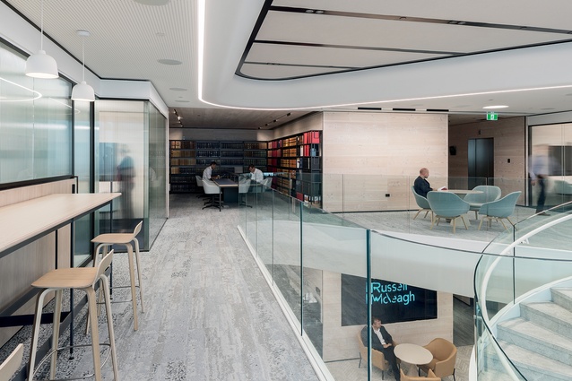
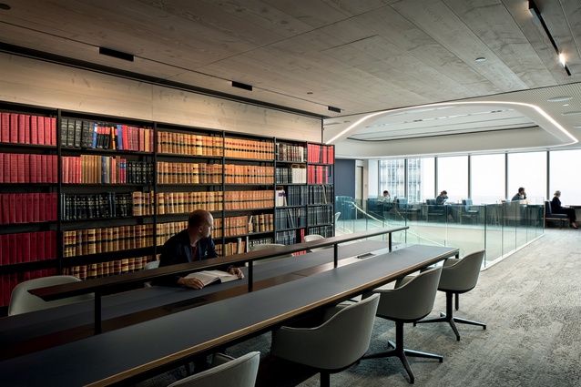
A library room of precious, antique legal tomes in Russell McVeagh’s new internal workspace, is where the privileged few bright young lawyers who’ve made it into the fold can experience the history and prestige of one of New Zealand’s oldest and most well-known legal firms.
What might once have been an experience reserved for partners of the firm is now accessible to all – a key revision in the reimagining of both the brand and its employee’s workspace. The jewel in the crown of Auckland’s Vero Centre, Russell McVeagh teamed up with Warren and Mahoney (WaM) to transition their internal office space into an open, collaborative environment.

Globally, legal firms’ move into open working environments is one that’s beginning to gain traction, yet Russell McVeagh is the most significant firm to have done so here in New Zealand.
WaM principal Scott Compton says moving to an open working environment is often financially driven, but this was not the case at Russell McVeagh. “The world of law has moved on; the people coming on board work in a similar fashion to a lot of knowledge workers, in the sense that they are open and comfortable in collaborative environments that don’t require walls.”
In the old iteration of a legal firm, the ‘office’ was effectively hierarchical. Offices with views were reserved for partners, artwork was placed to please the few and a large mahogany desk was a marker that you’d ‘arrived’. “There was a notion that it was about acoustics and privacy; but if you really unwound all of that, it truly was more of a status symbol,” says Compton.
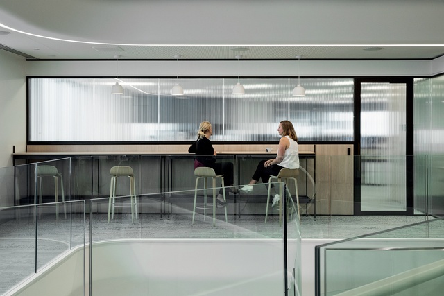
Correspondingly, the new workspace eschews the hierarchical model. Workstations run organically around the perimeter of the building, ensuring an Auckland Harbour view for all; the notable collection of fine art is dispersed throughout the space; and an investment in a number of high-tech meeting ‘pods’ and conference spaces ensures privacy can be accessed.
“There’s 40-something clerks who come in here. They must be aged between 20 and 25 – you can spot them a mile off, they’re so youthful. And they get to share and indulge in these experiences just like the partners, which would never have happened before.”
It is the breaking of social strata and sharing of experiences with the millennial members of the team that provided the moniker for the transformation of the space. “We grasped ‘it’ as we were doing the construction. This space is all about the aspiring lawyer,” says Compton. “What meets the aspirations of the millennial member of the legal team? It’s the digitisation, it’s the freedom of movement, it’s the ability to share.”
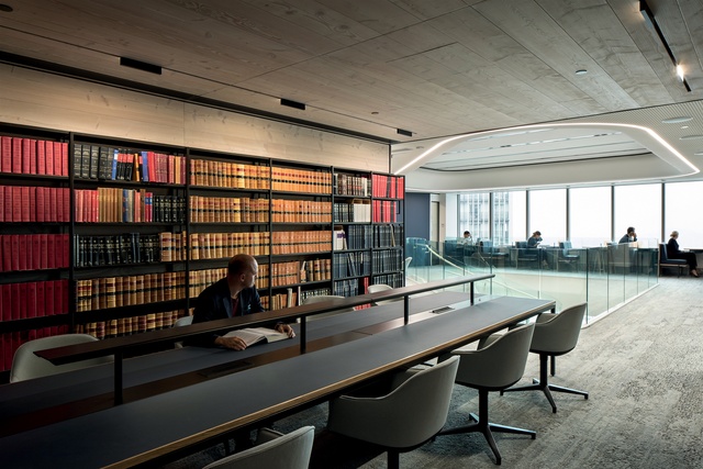
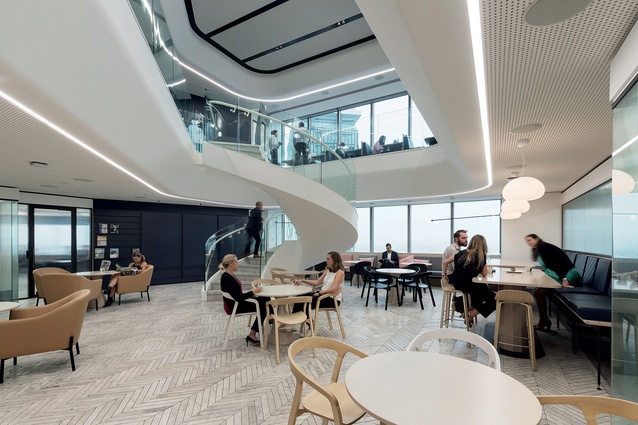
In embracing a new mode of working – and a new kind of employee – the interior did away with black, mahogany and dark timbers. But history wasn’t thrown out; the internal areas are clad in young, knotted Douglas Fir timber – a restyling of the old institution. There’s a deliberate transition between the timber-clad inner core of the building, and the bright white, almost futuristic social hub.
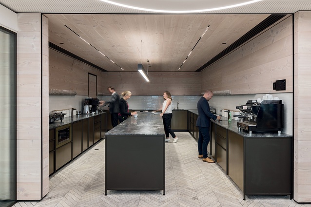
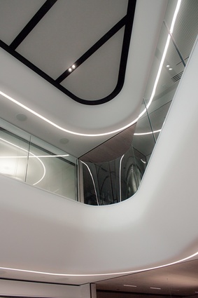
The juxtaposition of the bold, white curves of the stairwell and the sweeping, monolithic staircase leading down to the social area, against the black steel and timber of the staff kitchen and library signals an important change in approach for the firm: we are not forgetting our roots, we are simply reappraising them.
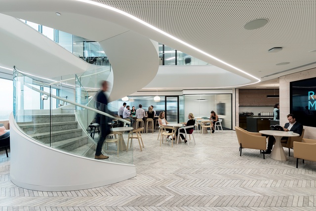
WaM worked with IMO in the kitchen and library spaces, creating bespoke versions of systems they already produce. This was an important relationship for Russell McVeagh, which appreciated the undertone of a pioneering New Zealand narrative.
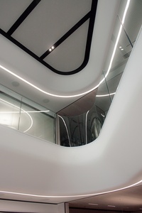
Artworks by New Zealand artists are hung throughout, reaffirming this position, and are an experience available to all 260 staff over the two-and-a-half floors of office space. Breathing space for these works is evident: visual ‘noise’ has been reduced with each staff member at the helm of a flexible sit/stand work point and the entire perimeter of the offices are fitted out with custom storage to take up any potential clutter. Furniture and storage units are all stripped back of detail, framing a ‘pure’ environment with little visual distraction.
The mix of work-point types means rigid patterns are avoided and the office space has an organic flow. The meeting pods have the same fluidity and were custom-engineered with seamless Blonde Oak timber and benefit from the latest technology and connectivity available.
While office walls have been swapped out in favour of an open working environment, Compton says the quality of the experience underpins the value Russell McVeagh is putting on its staff. “They may have taken away an ‘office’ but look at the standard of it – they’ve really tried to give their best to make sure that the people in here do not want for anything.”

