Terracotta trope: The Beehive
The Beehive, designed by Raffaello Rosselli Architect with Luigi Rosselli Architects, is a poetic exploration of the aesthetic and structural potential of recycled materials as applied to the design of this architectural family’s own Surry Hills studio.
A new building designed to house an architect’s own studio is an interesting typology – it becomes an expression of their way of practice. Their ideals and aspirations, often tempered by budget, are laid bare for all to see. Throw in the fact that this project is actually a collaboration, between Raffaello Rosselli Architect and Luigi Rosselli Architects, and an interesting working dynamic ensues.
The project has been dubbed the Beehive by the architects. Beehives for the most part are robust, pragmatic and tough on the outside, while activity consumes the interior. What architect wouldn’t be drawn to such an analogy when designing a new building for themselves?
The project documents the influences and evolution of two generations of architects working in close collaboration. Raffaello Rosselli was the lead designer, while his father Luigi Rosselli acted in a role more akin to that of client but also as collaborator.
The work of Luigi Rosselli Architects is always rigorous and personable, identifiable without being dogmatic. Raffaello, in his short career to date, has already produced a couple of inspired works and his approach is also identifiable.

Using “recycled materials from the start, rather than as an afterthought” taps into Raffaello’s interest in maximizing resource life, which can be seen in his earlier Tinshed project in Redfern. When the opportunity arose to access a stash of recycled terracotta tiles, he jumped at the chance to explore his interest in repurposing materials, process and prototyping.
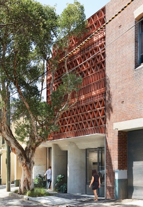
The new building is positioned on a rare vacant site between a narrow terrace house and a warehouse in Sydney’s Surry Hills. An elevated brise-soleil assembled from the salvaged terracotta roof tiles has been used by the architects to scaffold a multiplicity of ideas.
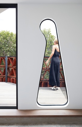
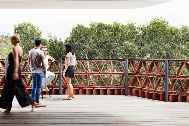
At its most pragmatic, the brise-soleil serves to mitigate the effects of the sun on the western elevation, really the only elevation available to the architects for expression. It also operates as a filter between the building’s occupants and the neighbours directly opposite, allowing the spaces behind to be lit via seat-to-ceiling-height glazing.
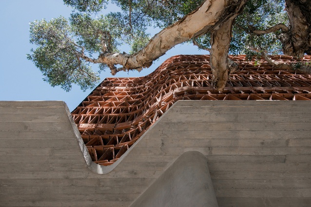
The facade has a curved kink in plan that acts as a yoke between the quite different buildings on either side. The section too folds upward, the tapered concrete lintel like a cupped hand softly holding the brise-soleil up above the ground-floor spaces that face the street.
The curved line of the plan expands the surface of the facade, turning it slightly up the street toward the north, while the fold of the lintel allows the architects to navigate the section of the facade: higher at the north end to allow maximum height in the entry foyer, lower toward the south end to maximize floor-to-ceiling heights in the studio spaces above.
The quality of light that is filtered into the building through the terracotta is reminiscent of buildings that can be found in Vietnam, which Raffaello was exposed to during a stint in Hanoi working for Vo Trong Nghia Architects. At the time the practice was experimenting with the material in the Nonoco Showroom terracotta facade in Hanoi, which was subsequently realized. However, it wasn’t so much the material itself that Raffaello became interested in, but the way that Vo Trong Nghia Architects used “modules to create complex results,” while working on a series of bamboo projects.
It is interesting to analyse how the viewer perceives the Beehive at street level. On first impression you notice something unusual, but not out of place. The textures and colours of the building and the way the paperbark tree in front of it dapples light onto the facade together create a kind of shimmering depth.
You then notice that the terracotta is, in fact, an assembly of roof tiles seemingly doing something they shouldn’t do. In a slow dance across the building, like the notes in a musical score each tile is slightly different – some set at the same pitch, others in an altogether different tone.
The tiles are assembled in a series of diagonal braces, set in rows or staves. An accidental ornamentality is created in the facade that uses the idea of chance: how one material unit might be different from another can’t really be planned, but it can be allowed for. The activation of the diagonal also hints vaguely at the European heritage of the architects, recalling among others material patterns found in the facade of Mario Botta’s Casa Unifamiliare in Morbio Superiore, Switzerland.
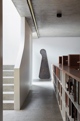
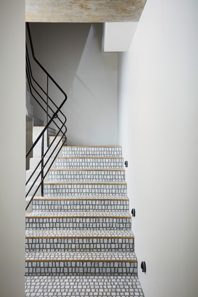
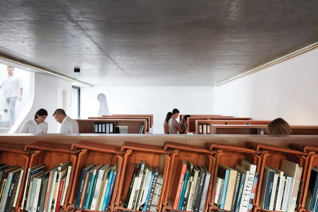
The internal spaces are accessed through a tall steel door that leads through a foyer to stairs lined with small marble tiles and a lift. Internally the building is simply a series of calm concrete spaces lit naturally through the western facade and through windows set into the rear of the northern facade. Elegant, pragmatic workstations are set up through the studio spaces, with the tiles making a cameo in the interior, this time coming together to form library shelving that wraps around the meeting table.
A skylight is tempered by a “mantle” in the form of a perforated metal stair with supersized treads and risers, which filters the light down into the centre of the floor plate while also providing access to the roof. It subtly shifts the direction of the plan, setting up a moment to pause and move from vertical ascent to travel in plan.
In a lecture titled “The Hard Core of Beauty” that also appears in his book Thinking Architecture, Peter Zumthor mulls over the question of how an architect might obtain the depth and multiplicity found in works of art that move us. He asks, “Can vagueness and openness be planned?”
It seems to me that he is looking for order and, at the same time, for the rich patterns offered by uncertainty. The Beehive is a project that doesn’t shy away from that uncertainty. It shows what might be possible, through process and prototype, and strongly suggests that this search is worthwhile.
This article was first published on architectureau.com

