The eagle has landed: Tara Iti house
Early New Zealand modernism, a respect for the sea views and a touch of golf inspired this pavilion – by architecture firm Box – on the shores of Mangawhai.
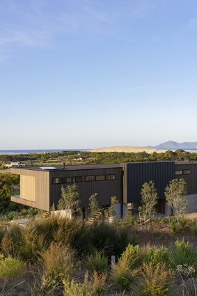
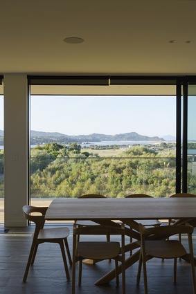
Some sites are blessed with an embarrassment of riches and this one, five minutes from the Tara Iti golf course in Mangawhai, is just such a place. Presented with a gently rolling section amidst waving grasses where the land meets the sea, and views that stretched away to the Hen and Chickens Islands, was like securing a hole in one for Tony Borland-Lye, design manager at Box. When he was asked to conceptualise a holiday escape on this north-facing section, he was determined to pull a birdie out of the bag.
The owner had some definite ideas for the dwelling. He came armed with an inspiration sheet of modernist images, including his own home in Auckland – a mid-century gem by Czechoslovakian émigré Vlad Cacala.
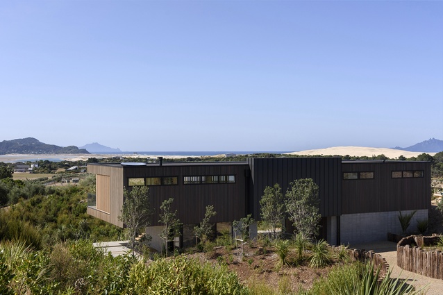
Modernist influences aside, designing for the context was front of mind when Borland-Lye took up his pencil and began to sketch. The building needed to function for his client but also be neighbourly and considerate of its position in this dress circle of houses. “We wanted a horizontal form that was anchored to the ground at just one point, rather than a two-storeyed monolith that obliterated the outlook,” he says.

When the client was presented with the computerised 3D model of his thoughts – a way to peel back the walls so that the relationship of the home to the land was easy to envisage - Borland-Lye was given a verdict: the perfect approach shot.
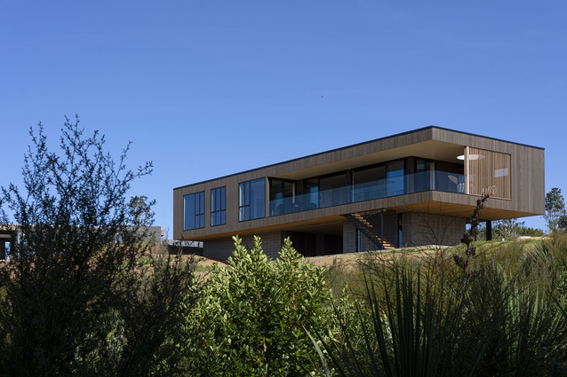
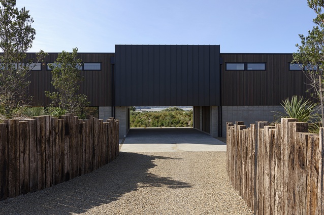
In essence, the home is a lightweight pavilion on a concrete-block plinth, held up like a treasured object on display. Crucially however, there is a punch-through aperture at the centre of the plinth – an opening which gives a clear view of the ocean on approach to the property. When the owners are in residence, this aperture is used as an under-building ‘carport’ (for cars and the golf cart).
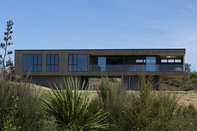
The house hunkers into a natural depression on the site. At 28 metres long, the upper storey cantilevers beyond the lower level by 4 metres each side and by 2.5 metres at the front of the home, an expression of high-end engineering that allows the form to float in space.

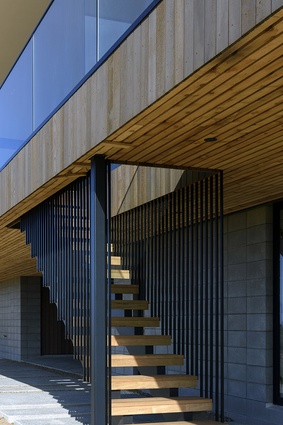
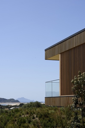
When it came to the palette of products used to piece it together, low-key simplicity was the driving ethos. Borland-Lye turned to the vernacular of rural buildings as his material muse. These robust products he expressed in a sophisticated way. Stained cedar clads the bulk of the shape - “we used it as a vertical element to soften the horizontal lines of the house a little” – and, on the southern elevation, a central ‘connector’ that runs over the carport is zinc tray. Closed-in soffits tidy up the structural moves: “That was important because a lot of the underside of the home is on show.” And black aluminium joinery is recessive so as not to interrupt the rationalised nature of the slim-line geometry.
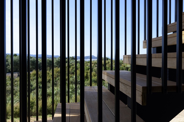
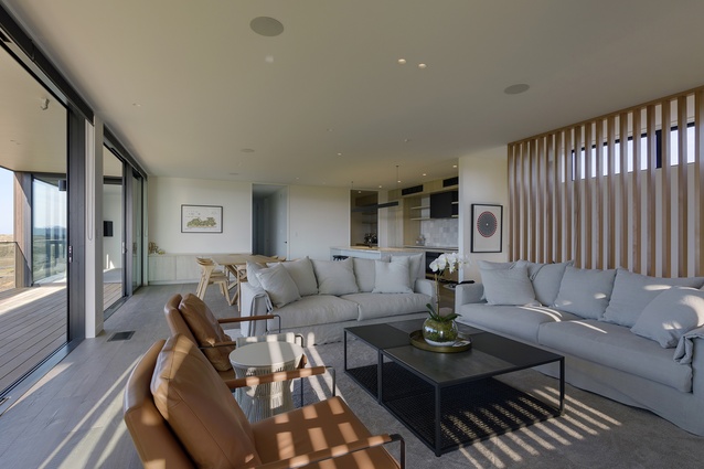
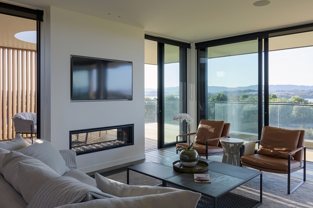
An open-tread stair, suspended in space, leads up to the body of the home where the pale palette leaves the landscape as celebration. The long, narrow rectangle incorporates three bedrooms and a large open-plan living and dining area in a layout which makes good use of its fairly limited footprint.
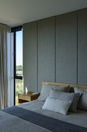
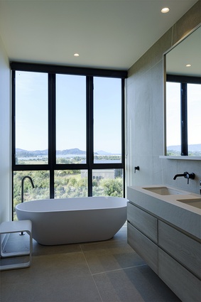
Calming hues in the aged oak flooring, white walls and whitened oak cabinetry are a contrast to the dark tones of the exterior. Built-in timber features such as room dividers, storage cabinets and, in the bedrooms, headboards and bedside tables, hark back to the modernist mood favoured by the client.
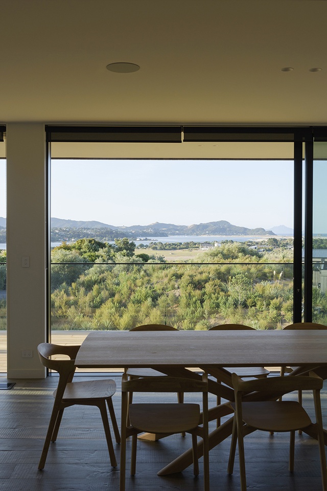
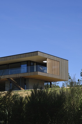
These internal spaces come alive with dappled light cast through timber fins on the west-facing elevation that filter the late-afternoon sun. “While there are no moving parts, there is a sense of dynamism here as the changing light provides a visual treat,” says Borland-Lye.
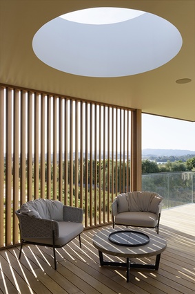
Carved out of the rectangle, the deck that wraps around two sides of the building is set within the outline. “We essentially took a bite out of the form to express the internal workings of the house and create outdoor areas without altering the simple proportions of the structure and roof.” A porthole skylight in the covered outdoor room to the west provides a spherical slice of the wide skies.
In such a spectacular setting, it’s only right that any project be subject to approval of a design review group which included architects Pip Cheshire and Pete Bossley. The home earned its stripes. “In a sub-division of this quality, there are naturally strict covenants. Although this is a holiday home with a relaxed feel, it needed a level of formality to fit seamlessly alongside the other buildings in the development,” says Borland-Lye.
This is a dwelling that responds to the privilege of its environment - and extends and amplifies the aesthetic Box has become known for. “It incorporates features from many homes in our existing portfolio but dials up the architecture a notch.”

