The Hole of Yellow Archipelago
The latest iteration of the Creative Learning Centre in Auckland Art Gallery represents a new version of an old process. This is a collaboration with a twist, as Community Learning Coordinator Meg Nicoll explains: “Every year, we’ve worked with a different artist to create an interactive space for children to explore art and artistic practice. This year we decided to do something completely different with the Creative Learning Centre. We wanted to get the end-users – the children – involved in the creative process right from the start.”
The process began through a series of three in-classroom workshops. In the first two, the students met Darragh, learned about her and her art, and then made their own artworks. “The great thing is that [the children] make stuff without overloading it, or thinking about it too much. It’s a very quick connection with materials,” Darragh says.
In the third workshop, the students worked on a design brief – integrating what they thought was important about Darragh’s art, and what they felt should be in the Creative Learning Centre. “We worked with Year 4 students because they’re at just the right age,” Nicoll says. “They’re still within the age demographic for the Creative Learning Centre, but they have the skills to engage with a longer-term project. They can actively participate in a back-and-forth discussion about problem-solving and communicate their ideas in a robust way.”

Led by Andrew Douglas and Sue Gallagher, the designers of TurnSpace Collective from AUT University’s Spatial Design department connected the students’ ideas to the use and constraints of the space. The proposed design was presented to the students. TurnSpace took the students’ feedback on board and made a final plan.
“One of the aims of the project was to make sure that the kids were involved in every part of the process and it’s really given them a feeling of ownership and a real sense of being involved in a project not just as an add-on but as a central part of it,” says the teacher-in-charge, Andrew Te Aotonga.
Nicoll describes the resulting space: “Glittery. Bright. Sculptural. These are the things they identified from the start as being important to what they saw in Judy’s artistic practice and what attracted them. That’s what they said they wanted in this space, and I think that’s what they’ve gotten.”

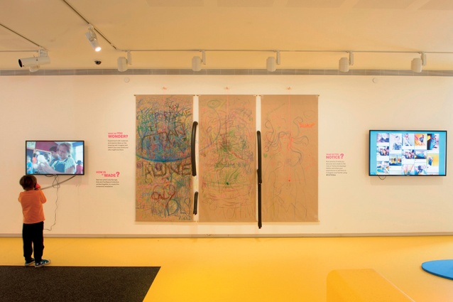
Just inside the entrance, a ‘drawing wall’ is comprised of three large panels of brown paper, with crayons attached to strings above. “Restriction breeds creativity,” Nicholl points out. The panels are changed out as they are filled. “Before we take them down, we upload a photo, with our hashtag. We’re keeping all the sheets for now… we’re not quite sure what we’ll end up doing with them, but they’ll get incorporated into something, I’m sure,” she continues.
Uploading these basic, crayon scribbles quickly bridges the gap between lo-tech and the digital age – next to the drawing wall, a screen presents a streaming display of all the online images hash-tagged #clcyellow.
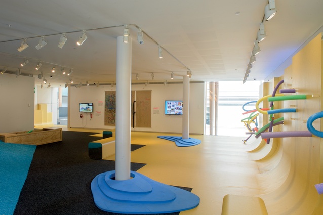
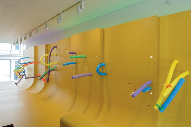
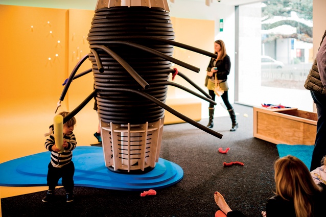
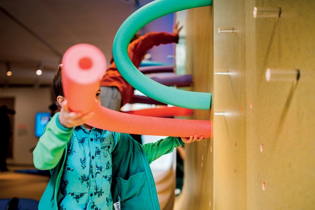
Pearlazzo panels in Pantone 9721 Sunrise swoop up and rise to nearly the full elevation of the longest wall. A series of holes at varying heights allows colourful foam pool noodles and clear acrylic pegs to be moved and reconfigured at will. These panels flow down onto the floor, seeming to roll themselves into low bench seats. The remainder of the floor is topped with blue EVA foam.
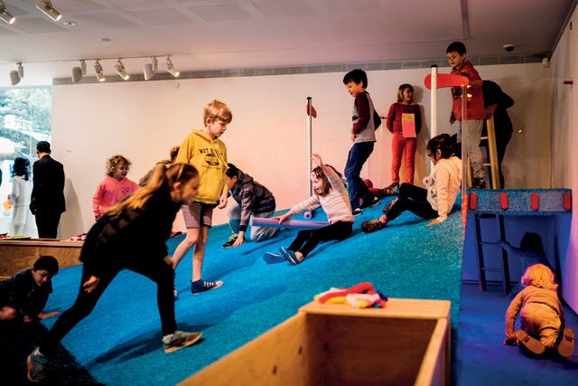
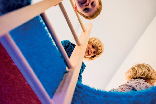
A low hill, covered in ‘Cookie Monster Blue’ coloured grass from Super Turf anchors the opposite wall and is a catalyst for imaginative play. There’s a hole at the top of the hill, with a ladder descending, and tunnel-like access from either side. As the final element in the fit-out, the Balmoral students built small-scale works to populate the black-lit ‘Underworld’. These creatures are displayed as an exhibition under the hill, behind an acrylic panel.
The concept and materiality of the hill evolved over time. In early conversations, the students were very enthusiastic about magnets – and the idea of sticking things together – but there were a few health and safety concerns. During the workshops, though, the students and TurnSpace kept coming back to the ideas of attraction and magnetism.
Andrew Douglas explains, “Moving beyond the basic concept of magnets, we then came to view the hill as an attractor within the space… and thinking about how many different ways could [the kids] attach themselves to the hill. We purposely set the hill at an angle that’s a little bit too steep to walk up easily. So it works as a slide, or they tend to crawl up.”
“The angle of the slope, the slippery surface of the coloured ‘grass’, and gravity allows the kids to slowly slide down the hill,” adds Sue Gallagher. “The first thing most kids do, is they come in and they roll down that hill,” Darragh says with a laugh.

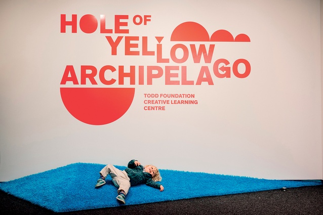
Finding a name for the space was a collaboration, too. Nicoll explains: “Judy had always liked the word ‘archipelago’ in relation to this project. Early on, one of the students made an artwork composed of a lot of yellow stickers, and called it ‘The Hole of Yellow’. Those two phrases seemed to go together – they sound like something that’s fun and intriguing.”
Just outside, in the gallery’s main atrium, seven fluorescent, painted shapes are suspended overhead. It’s Limbo, a new hanging sculpture by Darragh. Limbo’s metal foil construction suggests everyday aluminium foil, while the crumpled free-form shapes resemble meteors and scatter reflected light across the space like a mirror ball.

