The light within: Ballarat House
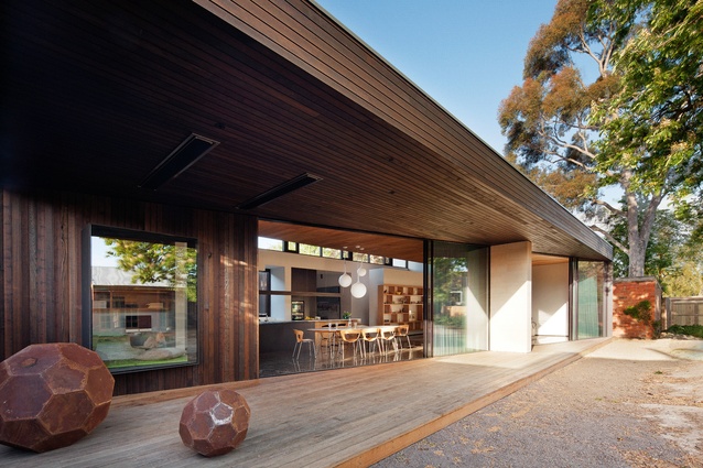
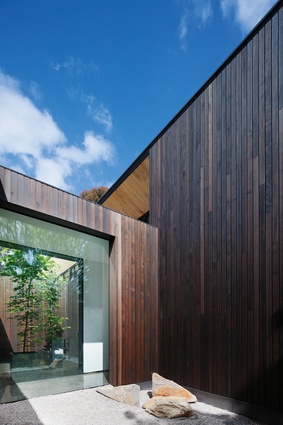
Light and bright inside but with a darker, more dramatic exterior, this timber-clad extension to a late-nineteenth-century home in blends contemporary design with a historical context.
Ballarat is heritage-heavy. The Victorian city boomed into life with the gold rush in the 1850s and rapidly built a hefty stock of architectural piles. Along Webster Street, the houses are generous in scale – less the houses of goldminers than of goldmine owners. Protected by heritage regulations, these dwellings are unlikely ever to be demolished, but the rear additions ebb and flow with the latest fashions and lifestyle changes.
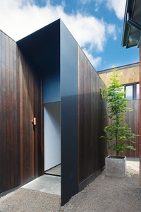
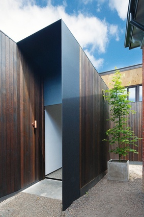
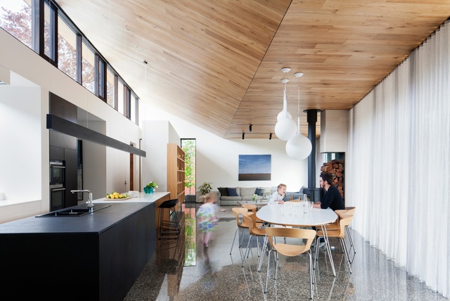
The Ballarat House by Moloney Architects is an alteration and addition to a late-nineteenth-century home. The old house acts like a prelude, setting the tone and mood for the overture that is Moloney Architects’ rear addition. There is a new front door, an informal entry, where you walk down the side of the house and go straight into the new open-planned living/lounge/kitchen, but the formal entry sequence introduces the architects’ new design moves in pieces, an experience that builds to a carefully orchestrated crescendo. “With the extension, we felt we had to match the level of grandeur of the existing house,” explains Mick Moloney, co-founder of the practice along with Jules Moloney.
The scale of the original interior is remarkable. Classical plaster decoration, four-metre-high ceilings, a fine art collection and plush carpeted floors contribute to a museum-like atmosphere (aided on the day I visit by the fact that the clients’ four young children are playing in the extension, not here). The first subtle piece of contemporary addition is a pair of timber bookshelves, one either side of a fireplace. They don’t touch the floor, as if to suggest that contemporary design has overcome the constraints of gravity. The weightless act is leveraging the solidity of the old house’s masonry structure.
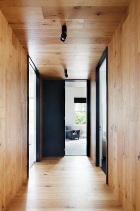
Honey-coloured wood unfolds as a motif, a sign of the new. It appears where changes have been made to the existing architecture, around new door openings and lowered ceilings. Black steel plate performs a similar function on the exterior, surrounding new window openings that have been inserted into the old brickwork. Mick cites a love of Italian architecture in general, and the work of Carlo Scarpa in particular. Scarpa was famous for his blending of contemporary design with historical contexts, always making the two identifiable and distinct.
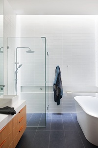
Only one new window in the extension was designed to look like an old one, a decision made with the local council’s heritage consultant, to create a balanced pair within a bedroom wall. Skylights in new bathrooms cut right up into the pitch of the existing roof, hiding the light source. As in a niche in a baroque cathedral, the light spills down and illuminates – in this case not a statue – regular grids of ordinary ceramic tiles, revealing their texture in a play of light and shadow.

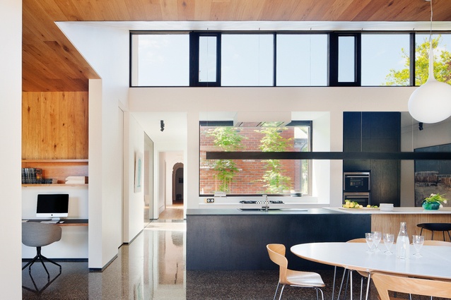
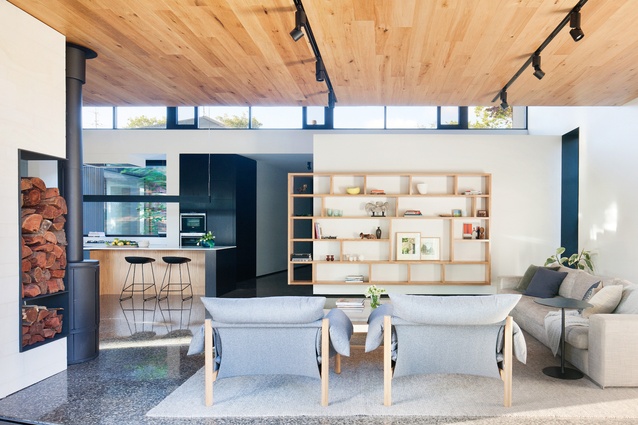
Glimpses of the big, new timber-clad box appear from within the old house. In finely crafted timber, it looks like more joinery that has escaped and been enlarged to become habitable architecture. The addition is separated with a glazed link, politely but not exactly humbly. Existing ceiling heights are matched, and the feeling of light and spaciousness exceeded. It isn’t a straight box. The southern glazed wall cuts inside on a diagonal line, producing a variation in cosiness level between the two ends of the new living space: study nook at one end, lounge at the other. The roof and floor carry on to complete the box, the leftover covered outdoor space becoming a deck area.
The most interesting moment in the design journey for me was halfway in, at the kids’ bedrooms in the rear of the old house. The line between heritage and contemporary elements is ambiguous here, in a way that is controlled carefully by the architect. Optical tricks confuse the eye: How thick are the walls? Is that new or existing? Lightweight partition walls have returns, clever corner details that give the impression of great thickness, of substantiality, in tune with the existing mansion. “You never see a ninety-millimetre stud wall end in the house,” says Mick. The intense level of detail in the design of the storage cupboards-cum-window seats is delightful.
In the twenty-first century, Ballarat is experiencing significant population growth, caused in part by people moving out of Melbourne’s increasingly unaffordable property market. For one hundred and fifty years Ballarat stayed more or less inert and, though changing, today remains a conservative place. Mick moved to Ballarat from Melbourne in 2007, and could be seen as part of the “new” Ballarat. “It helps that my wife is from Ballarat,” he says.
Most of Moloney Architects’ jobs, this one included, have involved knocking down the accretions of the twentieth century. The Ballarat House extension certainly has a level of grandeur about it, but in timber it also seems less permanent than the existing dwelling and its setback would allow its easy disassembly should it be required. Not that this is what Mick had in mind. “The ideal would be that the addition would itself get heritage protection one day,” he says. Will it stand against the rise and fall of the tides of fashion? Only time will tell. For now, it’s best to savour and appreciate beauty while it’s there.

