The long hall: Carlton Cloister
With a compelling ten-metre-long, red brick hallway that offers far more than circulation space, this extension to a Victorian terrace shows just how much can be achieved with a small footprint.
For many Carlton North residents the thought of moving from their beloved inner-city locale is nothing short of unfathomable. The Melbourne suburb has an easy charm (despite waves of gentrification) best defined by its tree-lined streets, delightful cafes and assortment of bespoke retail offerings. With seemingly endless rows of Victorian or Edwardian terrace houses completing the urban fabric, the suburb’s distinct character and identity are unquestionably appealing.
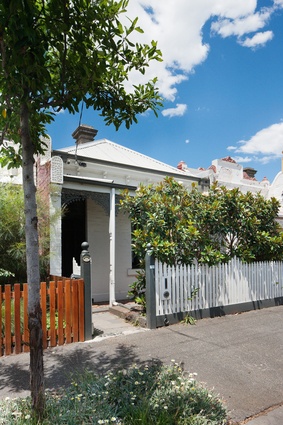
But while everything may look good on the outside – and a strict Heritage Overlay on the area ensures this remains the case – living in a terrace house isn’t always what it’s cracked up to be. Light penetration, ventilation and tight space constraints are obstacles when trying to comfortably accommodate a growing family. The only option is to extend, building back rather than up because new additions aren’t permitted to be visible from the street under heritage provisions.
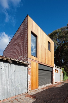
So when Antony Martin’s clients, a couple with two young children, came to him asking for an extra bedroom plus ensuite, there wasn’t much space in which to play. The founder of Melbourne-based MRTN Architects immediately reinstated the garage at the rear of the single-fronted Victorian terrace’s property and proposed that the new main bedroom and ensuite be built above it. Finding a way to connect this rear addition to the existing house became the real challenge. As Antony explains, “I joked for a long time that this was my corridor project, because it’s essentially about that link between the new bedroom and the main house.”
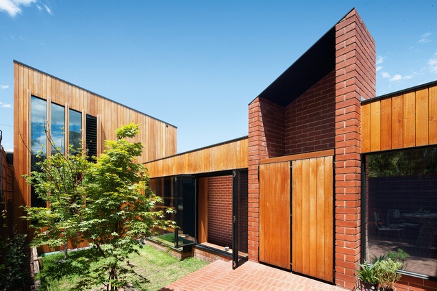
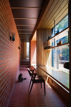
This uncomplicated plan is a clever design solution, allowing for a new courtyard that provides the interior with much-needed exposure to northern light. The corridor running east–west, however, is anything but simple and at almost ten metres in length it offers a hyper-level of functionality. “Circulation space is only useful when you’re circulating down it, but you do need a minimal width for it to feel comfortable and actually be useable,” says Antony. By taking that extra 700 millimetres away from the courtyard and making the corridor almost 1.5 metres at its widest, he was able to build in extra storage space, a study and seating area.
But the threshold is still considered very much part of the garden, with a large square window that, when open, transforms the seating area into an informal doorway. The boundary between inside and outside is blurred and the intentional change in level, in which the corridor is lower than both the courtyard and the existing house, lends the scheme a subterranean sensibility. It was always conceptualized as a cloister and Antony took inspiration from The Cloisters museum and gardens in Upper Manhattan, a favourite place to visit when he previously lived in New York.
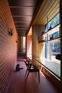
His use of red brick for the corridor’s floor and walls may seamlessly extend the outside pavers inside, but it also lends the space an invitingly immersive quality. With its series of compressions and expansions, coupled with a black ceiling that echoes the night sky, the threshold feels self-contained in a way no other room on the property does. It makes the transition into the light, bright upstairs main bedroom via the carpeted staircase all the more dramatic.
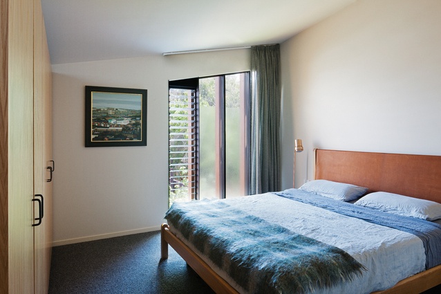
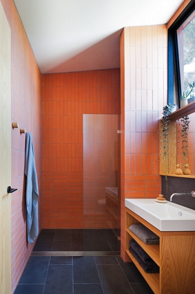
While the terracotta tiles in the ensuite reference the red brick, the bedroom itself is an elegant nod to Scandinavian ingenuity. Floating American oak joinery is built in as a balustrade and the sloped ceiling injects an unexpectedly expressive character. As Antony notes, “This project is one of those jobs that’s so small you can afford to be a little bit more experimental in the detail.” Unlikely accents are also found in the joinery’s black doorhandles and staircase’s bespoke copper handrail.
The design’s most compelling expression, however, is revealed via the view from the upstairs window. Looking across the courtyard and corridor toward the front of the terrace at street level, you see the extension’s roof – a dynamic configuration of planes, slopes and peaks. Antony has created the surrounding Carlton North roofscape in miniature, while his rich yet restrained material palette celebrates the area’s distinctly eclectic laneways. Blackbutt complements the red brick and black steel in the form of cladding, and industrial-style window frames offer bold contrast.

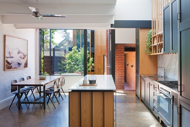
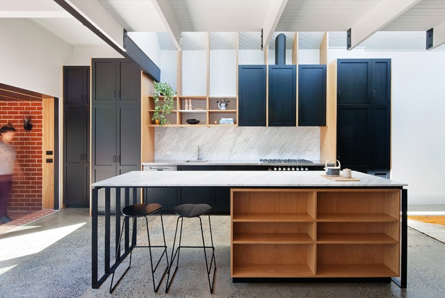
Surprisingly, the kitchen’s renovation was not part of the initial brief; construction on the extension was almost complete when the clients thought it could do with a refresh. A hugely beneficial decision, it only served to improve the flow between old and new, with visual cues borrowed from elsewhere in the scheme to reinforce this cohesion. Antony also exercised a high level of detailing in the kitchen and the joinery’s bespoke solid timber fins, adjustable shelving and black-stained timber cabinets are particularly well conceived. They allow for a sense of lightness in the space, highlighting the judicious use of marble and existing concrete floor.
It’s hard to believe that even with the addition, this family home still only measures about 180 square metres. But Antony’s planning is highly efficient and each space works hard to provide both comfort and functionality. The zoning is thoughtful without being inflexible and the courtyard was never an afterthought. “This project is a good example of how much living space you actually need for a family in the inner city,” he says. “It’s how this type of housing should work.”

