The new curiosity shoppe
All the ‘c’ words: coveted, collected, curated. Those are what I like,” says Jade Hurst. “I like the real functionality of industrial pieces and the prettiness of Victorian for the effort and craftsmanship that goes into it.”
It’s an unusually succinct and apt description of a home-owner’s aesthetic. But that’s what 32-year-old Hurst, a branding specialist who has worked with Nike, Huffer, Stolen Girlfriends Club, Casio and others, does for a living. She identifies and cultivates brands’ personalities to help bring them to life. So it’s no surprise that she not only has a strong sense of her own personality and can translate that into a very specific décor, but can sum it up so well.
She lived with her husband Ben Hurst, 35, in the Ponsonby, Auckland, house for five years as a tenant. When the time came to buy, the pair looked around at what was for sale in the neighbourhood but weren’t impressed – “We found it really competitive and really hard work; other places didn’t have the heart our place did,” says Hurst – so they approached the owners about purchasing the small, flat-fronted villa. Purchase made, the couple commissioned architect John Irving, who had designed a Waiheke boatshed-esque dwelling for the couple (which was never made), to renovate the 300m² house.
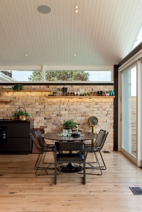
“One of the really nice things about them was their brief was quite focused on quality not quantity,” says Irving. “We decided on a barn: minimal in form but [made from] materials a lot warmer than your average white box so that it was not austere, not a place in which you felt you had to whisper.”
“We started with a really basic list: it had to be brick with a tongue-and-groove ceiling,” says Hurst. “Then there were a lot of practicalities that Ben brought up. Ben and I are a really good team like that. He’s a big picture guy, whereas I’m into the details. John then took the thinking from the Waiheke place and made it fit for here.”
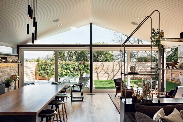
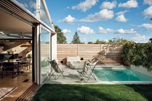
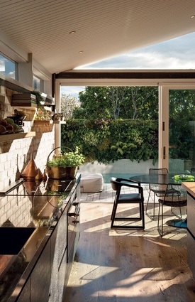
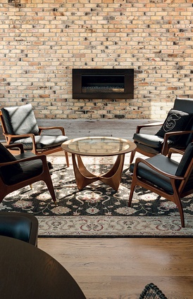
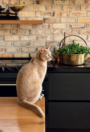
That meant a high stud and mono pitch in the new, modern back of the house that now contains one large living-kitchendining area. The working parts of the kitchen – fridge and pantry – and a laundry are concealed in a scullery so as not to cover up the vintage bricks (once part of Victoria Park Market’s chimney) that make up the kitchen wall. Glass ‘walls’ across the back and one side of the extension mean that half of the space can be opened completely to the outdoors. Just beyond the glass, a pocket lawn and a small pool take up the remainder of the section.
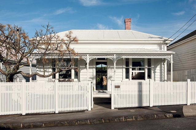
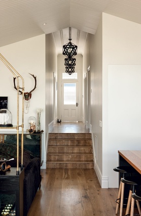
The front of the dwelling belies the modernity inside by retaining its villa form. “It’s a heritage site so there were a lot of restrictions,” explains Irving. “It’s difficult with villas as, on the street, you have to play the ‘villa’ game.” “We’re not ostentatious people; it wasn’t about the house standing out on the street,” says Hurst. “The front of it is similar to how it was, although we raised the lawn to the verandah and that’s made the verandah a bit more of a usable place. Inside, the new flows into the old part of the house.”
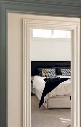
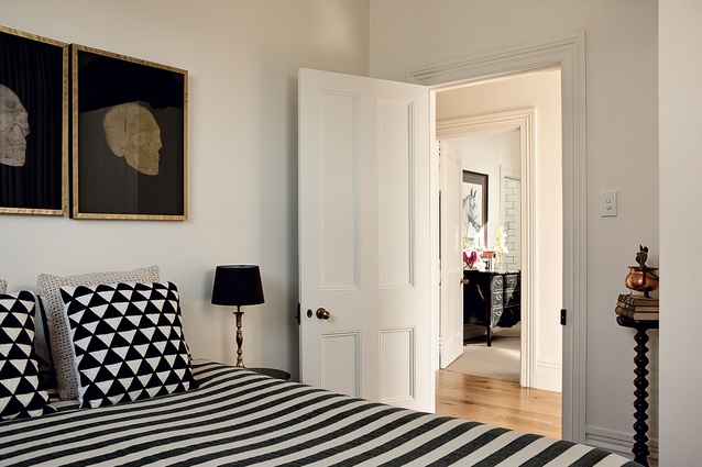
At the front of the house, three bedrooms, a bathroom and an ensuite are now in residence. A fourth bedroom could be added by carving out a part of the spacious living area. That was part of Irving’s architectural plan: “Because of the small site, we created a three-bedroomed home. It was about getting the quality in without doing a monster, which would have meant two storeys out the back. It’s got a nice, simple quality and an extra room can be easily added.”
Building, completed by 505 Construction, started on the house in July 2012 and was finished four months later and a few months before the arrival of the Hursts’ first child, Ivy. During the renovation, the owners lived next door. “They threw lots of guys at it and got it done really quickly. The whole thing was really manageable. The only thing to worry about was how much money we were spending,” says Hurst.
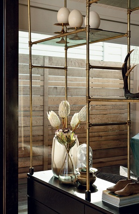
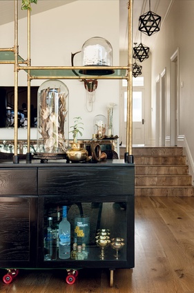
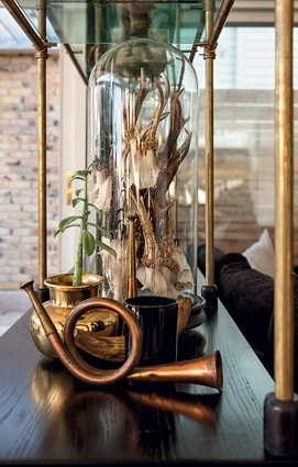
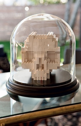
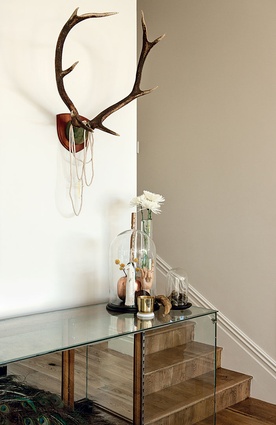
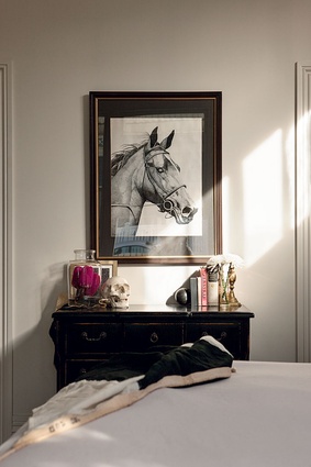
The interior took a little longer, but the finished décor has a palette of black, touches of white, and a little burnished brass used for detailing. A custom-made room divider that splits the two sitting areas is a perfect example of that aesthetic. It was designed by the Hursts to look like a museum display cabinet, constructed by Tim Laing at Meister Design in black cabinetry, green glass and brass and now displays top hats, ostrich eggs, antlers and other curios collected by the owners. Across the room, a vintage cabinet from Flotsam & Jetsam is home to a stuffed peacock Ben bought for Jade when she started Raw, her branding business, five years ago.
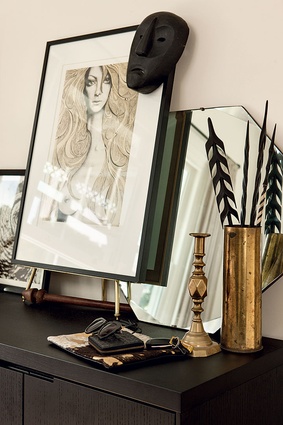
“I’m really aware that you’ve got to pair up the rough and the smooth,” explains Hurst. “A lot of our things are renovated; we took our time and did a lot of customising. I’m a bit of a fossicker. I like to find things and give them a new home… I never wanted to be an artist or a fashion designer but if I wasn’t doing what I am doing, I’d be doing interiors or have an online store.”
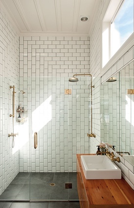
“There is a clear, eclectic taste that they have. They are rock ’n’ roll people,” says Irving. “The process was fun because of that: one of the most enjoyable projects I’ve ever worked on. It’s a fun house and a good party house. It’s not an uptight house.” Hurst’s favourite parts of the house are the bathrooms and the kitchen, while Ben’s is the square swimming pool. “It’s the functional things that I like,” she says. “The house feels like the same house but so much lighter and better. Everything we did was based on what we like, not resale, because, for us, it has to have a lot of feeling and heart. Now, people walk in here and say ‘this is very you’.”

